

Dastardly technological technicalities, aye Corry?
Sunrise - This was a good little comic and featured some nice build up for your story. I recommend trying to showcase your opponent in a full body panel shot, but that is just me, certainly not a requirement. On the first page in panel two you could have had a couple more layers giving the reader more depth into the background but the unfinished construction feel works. Tam seems to have her work cut out for her so I send my best wishes. Good work and good luck!
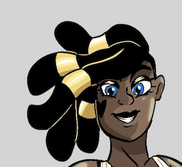
"Knight Owl" Corry vs. Tam Orkan
Critiques & Comments
# 6
Posted:
May 13 2020, 02:31 PM

# 5
Posted:
May 11 2020, 02:17 AM
Darius: Aaa sorry to see a default. Hope things are okay. Looking forward to you coming back raring to go on the next comic!
Sunrise: Can I say I absolutely LOVE your interpretation of Void City. You make it almost seem like an eldritch being with it changing and being sentient to a degree. Pushing that angle, I love it. Your coloring is nice, but its also too safe. It's mostly flats, don't be afraid to work on more dynamic looking shadows and highlights. Also look up references on helmets. It looks like Tam's is very claustraphobic, where you have the 4th panel of a view inside the helmet makes it look much more spacious. Add a little gap from the cheeks to the helmet. The 5th panel on the first page I didn't understand what was going on. Some dude pulling a gun on Tam? The direct above angle hindered what was going on so be careful when doing very lateral angles. The writing is nice, I love it. Still think Tam trying to escape the city is a great story I want to see developed more. Also, I feel a lot of pages feel cramped with how all the panels have no space gaps between them like on page 3 and 4.
AAAAA I love Tam cant wait for morrrreeeeeee

# 4
Posted:
May 11 2020, 12:06 AM
Darius: Sucks that you forgot to upload it but I hope to see it all as a BB in the future.
Sunrise: I like Tam ( I wanna battle space cat but am too busy with other projects) and I like how you build up the city I also like the backgrounds you do for this.
My crit is with the colors, you are using colors that are way too bright. Both of Tam's orange and red are max saturation which is grating on the eye. When it comes to choosing colors on the color wheel you want to stick towards mostly the middle area avoiding both extremes. You should find some movie color pallets you like and try doing comics with only colors for those palletes or play around with the Zorn palletes. also when you have panels with just a flat color as a background you should play around with stuff like gradients or small texture to add a little more personality to them.
Also you should put more gutter space inbetween panels, when they're all connected by one thin border it effects the readability since the border isn't enough of a break to stop the eye from wondering to panels in incorrect orders. I would say give each panel a border and put white space between them. Hoewver page 5 is an amazing one composition wise and great job on that.
I look forward to seeing more Tam and when I'm less busy, fighting her.

# 3
Posted:
May 8 2020, 05:15 PM
Sunrise, Per our private conversation: Once I was unable to get in to scan my pages, this slipped my mind until today. Forgive me as I hate dropped submissions as much as the next person. I'll post them just so you can see them.

# 2
Posted:
May 8 2020, 03:48 AM
Sunrise - This is such an interesting take on Void City. The almost space station look, and I love this idea you have of it eating itself alive! I liked the ominous dialogue and how you used that bright red on page 5 to explain it all. The establishing shot on the first page was great, as was that abstract last page. The grasping hands at the bottom, oof.
I said Corry gives off a good foreboding air on page 5, but I think you could haves pushed it more, for instance making the first panel larger and including shadows to make the extreme angle more obvious. Aside from the establishing shots, a lot of panels felt quite flat due to the simply coloured backgrounds in many of them. There were also times the characters didn’t feel part of a scene, because they were too bright, didn’t have shadows, and were lined while the environment wasn’t, such as panel 5 page 1.
I said Corry gives off a good foreboding air on page 5, but I think you could haves pushed it more, for instance making the first panel larger and including shadows to make the extreme angle more obvious. Aside from the establishing shots, a lot of panels felt quite flat due to the simply coloured backgrounds in many of them. There were also times the characters didn’t feel part of a scene, because they were too bright, didn’t have shadows, and were lined while the environment wasn’t, such as panel 5 page 1.
# 1
Posted:
May 7 2020, 04:48 PM
Darius - I hope everything is going okay with you!
Sunrise - I really like the color choices and the background work in this! The story is also very intriguing, I'm interested in what will happen with Tam trying to get out and if she'll succeed.
Sunrise - I really like the color choices and the background work in this! The story is also very intriguing, I'm interested in what will happen with Tam trying to get out and if she'll succeed.
Comic Details

Regular Match
Drawing Time:
4 weeks
Ended:
May 14th, 2020
Votes Cast:
17
Page Views:
1315
Winner:
Sunrise
Add to Playlist
Newest Comments

Spilt Milk
King vs. Morrigan
@ 7:31 PM May 10th

HR99 Spring 2024 Shorts
HR99
@ 8:04 AM May 7th
Jump Start - 2024
Mayor Miranda Munroe, Craven, La Estrellita Demonica, Songbird, and Darren J. Cardinalis
@ 8:02 AM May 7th
The Great Switcheroo
Colbitzer vs. Veruca Chance
@ 10:01 PM May 5th
The Great Switcheroo
Ghost vs. Itami
@ 9:55 PM May 5th
Newest Characters


Open Challenges
Random Comic


Most Wanted


Latest Topics
| ||
| ||
| ||
| ||
|


Artist
Sunrise - Ominous! Can't wait for the next installment. I must say, your comic is a breeze to read. I did not get confused by panels and speech bubbles and the colors are nice and vibrant. Only nitpick is that I know Tam wanted to leave the city but I wish I found out more about the why does he have to leave? Where did he come from? No need for giant walls of text but a brief internal monologue would've helped the audience to get invested in Tam's story more. I am sure these had been touched on had I read previous comics but it's always good to assume that readers only stumbled upon your comic for the first time