Invitational Tournament 2010: Round 1 / David Birch vs. Turtle

Critiques & Comments

# 13
Posted:
Aug 6 2010, 06:44 PM
Thanks for the crit, kuro! I was afraid if I made that font too small it would be hard for to read, but it's good to know it was huge (I was having a bad time trying to fit the speech bubbles nicely).

# 12
Posted:
Aug 5 2010, 08:02 AM
Orion, dark on dark like this only really works well when there's occasionally a highlight. Not only does it help provide depth, it also makes things stand out a bit more. So instead of full color, just adding a highlight to something like this would've really helped. If you're in a pinch though next time, lighten the background more.
Art wise, those lines are way too thick for the size you're drawing. When line art's that chunky & you try to get details, it's gonna get ugly. Whatever you used for the speedlines behind Turtle in that one panel, that'd be more like it. Also, it seems like you're only drawing the characters how we're going to see them in the panel. When you start doing that, it starts getting flat & distorted. To remedy this, sketch out more of the figure, even if we're not going to see it. But get the anatomy of the figure right & then decide how much is cropped out where. Regardless of where it cuts off, the anatomy's still going to look ok. But keep at it.
Jethro, The anatomy was rushed in spots, but ultimately, I think your side turned out pretty ok. It tells a clear & concise story & you conveyed characters well. The abrupt cut of them having dealt with the threat was awkward. It may have been a time thing, but it would've been nice to see what happened between them getting ready to clobber & them tuckered out. And silly nitpick, but the lettering was HUGE. You're taking away from space you could be giving us more art. Shrink'em down some.
# 11
Posted:
Aug 5 2010, 12:13 AM
Thanks for the feedback, Dan! I was a little worried about that gap and how jumpy it was, but thanks for pointing that out for me. I've been doing a lot of practice with digital coloring for the past few months- glad to see that it's starting to pay off.
Hope you stay tuned! It only gets better from here on out!
Hope you stay tuned! It only gets better from here on out!

# 10
Posted:
Aug 3 2010, 11:12 PM
Yeah I wanted to at least give some semblance of mood so I opted for a catch all color for the background. I will definitely be changing that around in a future fix of this comic. But yeah I think this one could use some more varried color to bring out what has been homogenized to flatness.
Thanks for the feed back. With the way the votes are going I have a deep hole to dig myself out of with my next few comics...
Thanks for the feed back. With the way the votes are going I have a deep hole to dig myself out of with my next few comics...

# 9
Posted:
Aug 3 2010, 02:58 PM
Orion - Unfortunate you couldn't get more done. And I'm not sure how I feel about the darkness of it all. With no valuing, everything is just hard to see. Keep working on your anatomy, and next time if you can't color your entry, just keep it black and white.
jethro - Nice work! Colors are good, and I enjoyed Turtle's mute antics. Tho I feel there is a disconnect between page 7 and 8. They're getting ready for another attack, and the next panel, lying down. We need to see that action, even if it's only a couple of montage panels. Tho I understand the need to cut things for the sake of time.
Looking forward to more!
# 8
Posted:
Aug 2 2010, 09:53 PM
Well you can bet to find this one in a Beyond Battle some time soon.  There is an ending (for that matter there is a beginning) and I liked it and i hope you will too.
Rock on man!
There is an ending (for that matter there is a beginning) and I liked it and i hope you will too.Rock on man!
# 7
Posted:
Aug 2 2010, 08:22 PM
Orion -> It was hard for me to think of a way for these guys to interact, too- I got the feeling neither of them would attack unless they had a really good reason. I really liked where your story was going. I think you came up with an awesome reason to provoke Turtle into a battle. It's too bad you weren't able to finish this up- it's like I'm on a never-ending cliff hanger! :c But I hope we can duke it out in again in a rematch!
Thanks for the crit, too! I'll definitely be looking out to keep my anatomy and consistency of the characters' features in check a lot better in the future.
Thanks for the battle, and good luck to you too!
Thanks for the crit, too! I'll definitely be looking out to keep my anatomy and consistency of the characters' features in check a lot better in the future.
Thanks for the battle, and good luck to you too!
# 6
Posted:
Aug 2 2010, 07:38 PM
Great work on this one Tullzy. Even when I tried planning mine I could not see a valid reason for these two guys to fight each other with out contrivance but this was nice. I loved the way you portrayed David as just a guy doing his job and caring more about a kid he found then himself. That seems like David to me he can be a little abrasive as far as his work but a good guy.
I loved the coloring and the expressiveness of the characters. I mean most people can't even get to coloring all their pages by deadline but you had all of them down. I salute you the characters expressiveness really lends its as a benefit to the comic narrative. I loved Turtle's mime routine to try and tell David about the alligator/dinosaur thing.
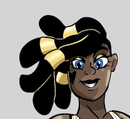
There were a few hiccups of anatomy and consistency such as the hair and head size but they were small potatoes compared to the final product. I am glad to been able to battle ya man even if my submission was, truthfully, even sub par in my eyes. I have learned quiet a bit from this round and I hope I can fight you again in the future and learn much more. I will make sure by then my skills will be up to the challenge.
I wish you the best of luck in the tourney and hope to see more work in the future.
Rock on!
Even when I tried planning mine I could not see a valid reason for these two guys to fight each other with out contrivance but this was nice. I loved the way you portrayed David as just a guy doing his job and caring more about a kid he found then himself. That seems like David to me he can be a little abrasive as far as his work but a good guy.I loved the coloring and the expressiveness of the characters. I mean most people can't even get to coloring all their pages by deadline but you had all of them down. I salute you the characters expressiveness really lends its as a benefit to the comic narrative. I loved Turtle's mime routine to try and tell David about the alligator/dinosaur thing.
There were a few hiccups of anatomy and consistency such as the hair and head size but they were small potatoes compared to the final product. I am glad to been able to battle ya man even if my submission was, truthfully, even sub par in my eyes. I have learned quiet a bit from this round and I hope I can fight you again in the future and learn much more. I will make sure by then my skills will be up to the challenge.
I wish you the best of luck in the tourney and hope to see more work in the future.
Rock on!
# 5
Posted:
Aug 1 2010, 10:14 PM
Awright, my pages are uploaded!
# 4
Posted:
Jul 26 2010, 12:31 PM
Good luck you two.
I want to fight you both.
I want to fight you both.

# 3
Posted:
Jul 26 2010, 12:53 AM
Welcome to void you two, just remember to do your best, the minimum is a mere 3 pages too! And yes I am going to say this to everybody.
# 2
Posted:
Jul 25 2010, 09:45 PM
Thanks this ought to be great fun.

# 1
Posted:
Jul 25 2010, 09:14 PM
Good luck guys!
Comic Details

Tournament Match
Drawing Time:
1 week
Ended:
Aug 8th, 2010
Votes Cast:
34
Page Views:
1880
Winner:
jethro-tullzy
Add to Playlist
Newest Comments

Spilt Milk
King vs. Morrigan
@ 7:31 PM May 10th

HR99 Spring 2024 Shorts
HR99
@ 8:04 AM May 7th
Jump Start - 2024
Mayor Miranda Munroe, Craven, La Estrellita Demonica, Songbird, and Darren J. Cardinalis
@ 8:02 AM May 7th
The Great Switcheroo
Colbitzer vs. Veruca Chance
@ 10:01 PM May 5th
The Great Switcheroo
Ghost vs. Itami
@ 9:55 PM May 5th
Newest Characters


Open Challenges
Random Comic

Most Wanted


Latest Topics
| ||
| ||
| ||
| ||
|


Latest Members
Users online
103 Guests, 0 Users
Most Online Today: 161.
Most Online Ever: 1,184 (Jan 13, 2020, 06:21 PM)
Artist
Thanks for the crit, kuro. Its more then I get elsewhere and makes me gala I can to this site. Though admittedly wish I had brought more of a concerted effort or ability. I can see that much effective planning and faster thinking is going to be needs on my part if I am going to improve. This is showing me where I am and how I can bring my A-game next time.