


I'm gonna look through my stash of photoshop brushes and see if I have a more solid version of what I used for this piece, or design my own similar brush.

Le Fred: Hats, I don't want to impose any more pressure on you than those difficulties already have, BUT we were kind of all counting on you to rock our world, here.
Just saying.


Spilt Milk
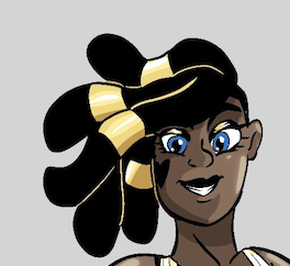
King vs. Morrigan
@ 7:31 PM May 10th

HR99 Spring 2024 Shorts
HR99
@ 8:04 AM May 7th
Jump Start - 2024
Mayor Miranda Munroe, Craven, La Estrellita Demonica, Songbird, and Darren J. Cardinalis
@ 8:02 AM May 7th
The Great Switcheroo
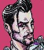
Colbitzer vs. Veruca Chance
@ 10:01 PM May 5th
The Great Switcheroo
Ghost vs. Itami
@ 9:55 PM May 5th


| ||
| ||
| ||
| ||
|


Artist