

Thank you guys all so much for your feedback!
Sucks to see how many issues there were with the comic, but I'm gonna do my best job to improve on the things you guys've mentioned! I'm probably not gonna do as many battles for a bit, and just try to do some collabs, while practicing on skills that it's been mentioned I need work on, for a bit.
So put simply, I'm going to try figuring out how to do speech bubbles in a way that looks appealing within my comics, I'm going to work on perspective, I'm going to work out my posing, I'm gonna try experimenting with color some more and go a bit easier on the shines, and I'm going to try figuring out how the heck you compose nice thumbnails and scripts! (I actually have no clue how to figure out the last thing, but I'm gonna do my best! I really wanna improve, and I hope you guys enjoy future things from me.)
Anyway thanks again so much for all the wonderful feedback!
Also, Cat, thanks so much for battling me, I had a lot of fun going up against you, and I hope your future battles go really well! >w</
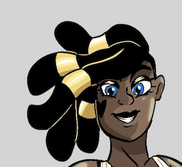
A Snowy Symphony / Detroit vs. Cadenza
Critiques & Comments
# 12
Posted:
Nov 15 2017, 09:59 AM

# 11
Posted:
Nov 14 2017, 05:57 PM
Sorry I don't have a lot of energy lately for full critiques, but just a few things I wanted to get off my chest real quick.
Desichan: Your word balloons are hurting your comics. I'm not a fan of colored word balloons in general but if you're going to stick with them then my advice is this: choose a complementary color, something on the opposite side of a color wheel. I understand that you're matching the color to the character's theme which is neat in the sense that it makes it clear who is saying what. But because your comics have such full colors, they don't stand out. If this was a comic with lots of white and negative space that would work better. It's not gonna work for the way you currently do things. So if you choose a complementary color, they'll stand out more. Your palettes are so analogous that it means everything starts blending together at some point. And that means you end up doing a less effective job at guiding the reader's eyes. So either complementary or go white, since your comic lacks a lot of white as it is. I'd also go a little less on the white highlights. I understand it's a signature of your style but it's haphazard right now. Go with a little less on the highlights and use them to illustrate the direction of light sources. Also not fond of the patterns you use around the word balloons. Especially because they aren't proper patterns, but rather just marks you're making that just makes them look a little sloppy. My recommendation is make a mask or a vector or some shape you can easily copy paste for your patterns that's a little more polished. Either that or just get rid of it altogether, it's not helping you.
Saavy: You also have a very cool and distinctive style. I like the limited reds here. Your pages have good balance in regards to negative space. You do have a problem with word balloons. Don't make the edges different line widths. Use a standard one throughout the whole comic. (I generally use 10 pixels in PS) Experiment with font but also make the font a little smaller and a little more centered. Readability is important but it could stand to be smaller. I think you ran out of time, but backgrounds hurt you here. The lack of them. The first page you have a very nice establishing shot but the rest of the comic is too empty.

# 10
Posted:
Nov 14 2017, 05:17 PM
Desi: That's an impressive page count, especially considering it's full color. The use of color seems more refined this time around, and when the contrast, the colors, and the font size are just right, the "look" really shines. It doesn't always, though, and sometimes text is hard to read, or the characters or objects of focus get drowned out by the surrounding color. Sometimes the poses are a little awkward, but the characters are still very appealing with cute expressions.
Saavy: Such cuties! That a is a super cute way to do simplified backgrounds and coloring. I see it getting maybe a little too simple at times, but overall it doesn't stand out as much as it could. Not sure if I really got what was happening with Fawn's fan dance other than that she was doing something that Cadenza was manipulating with her powers, but everyone leading up to and coming after it gave it enough context to work.
Saavy: Such cuties! That a is a super cute way to do simplified backgrounds and coloring. I see it getting maybe a little too simple at times, but overall it doesn't stand out as much as it could. Not sure if I really got what was happening with Fawn's fan dance other than that she was doing something that Cadenza was manipulating with her powers, but everyone leading up to and coming after it gave it enough context to work.

# 9
Posted:
Nov 13 2017, 09:50 PM
Desi - As someone who likes making longer comics (whenever possible, anyway), I have to say that it's really impressive you're cranking out all these pages. Seems like it drags on a bit, though. That's pretty much all I have to say.
Saavy - I'm seeing some rather unusual page layouts in some of the pages (i.e. the first and third pages), otherwise, neat story.
Saavy - I'm seeing some rather unusual page layouts in some of the pages (i.e. the first and third pages), otherwise, neat story.

# 8
Posted:
Nov 12 2017, 07:05 PM
ADORABLE COMICS Y’ALL
@desi
Look at you busting out so many pages and makin us all look bad.
I love the style that you are going for with lined characters and unlined backgrounds. However, the backgrounds start feeling a little flat with no dimension going on, something you might want to do is add more shading to the backgrounds. Also I would love to see you play around with more colors. A lot of your comics end up being pink or reddish, the backgrounds and the characters. It makes some of the pages feel a little to one note, start branching out and using more colors. You also use characters base colors almost all the time even when lighting changes. EX: the first 3 pages are supposed to be in a dark room but the characters are colored in the same way through the whole comic. Changing their colors to match the lighting can really add to a comic.
Final note, your story was cute but watch your speech bubbles. Sometimes they get to small to read and other times they are jam packed with text. Try and spread out your text a bit more and always double check to make sure it’s big enough to read.
All in all hella cute comic
@Savy
I DIG THEM SELECTIVE COLORS!
Not to much to say here, i love the colors and the style. The pacing is fun, i like seeing Cadenza use her powers and i wanna fite her. I got a couple of little nit picks. Fawn’s proportions feel a bit wonky at times. Like page 2 the middle panel, her head feels to big for her tiny lil arms. I would have liked to see more of Cadenza controlling Fawn, but as it is, it works perfectly. Nice short story.
All in all very cute comics, and i can't wait to see more.
# 7
Posted:
Nov 12 2017, 04:57 PM
DESI-- I suggest you cut out the excessive dialog. Page 5, for example, has Fawn saying all this stuff that's crammed into a small speech bubble that, when the page is at full view, asks me to squint to read it. I'm assuming that anything a character says or does in a story is essential, but this could have been done differently. Like Julz said, you need to do more showing than telling. And to start, you need to write what's essential to the story, then build upon it to better flesh out both your characters and plot.
I'm also gonna suggest that if there's going to be settings that aren't the house, please pick a palette that doesn't closely resemble the house's. It creates confusion when you do.
SAAVY--The limited palette is pretty nice, but I might have preferred a more dynamic battle between Cadenza and Fawn's would-be murderers. Pretty nice that Bach gets the final fight beat, tho. -rimshot-

# 6
Posted:
Nov 10 2017, 04:10 PM
Desi- Everyone's too shiny and cramped. Give your characters more breathing room. Poses are often very awkward, for example, Cadenza pg 5 panel 3. Backgrounds are very simplistic and the perspective is always a tad off. Often you leave out the background entirely. It's okay for blank backgrounds every couple of panels, but all page 7 has is a very simple fence. Every panel is busy and either crowded with a character, or a colorful busy background, and readers need negative space. Also i recommend adding more detail, or maybe making objects being interacted with a bit sharper, so you can tell what they are. For instance page 15 bottom panel took 2 read-throughs to realize it was a bed. I'm sure it's meant to look soft and cute, like the character, but it comes off as sloppy and you'd be far better off with a more crisp take to backgrounds.
So in conclusion:
Perspective,
natural poses,
negative space,
background detail
Saavy- Nice lineart! Poses are cute and dynamic. Somethings amiss with the font. Doesn't really match well in my opinion. Also your text balloons are too small for the text inside them. It's a general rule to give them an "O" in space all around the text. Backgrounds are a bit simplistic here too, but they at least convey location. Would like to see pushed colors, but the red and white are nice. Some parts look incomplete. Were you running short on time?
Overall- CUTE NICE COMIX GUYS WOW.

# 5
Posted:
Nov 9 2017, 11:08 AM
Desi: I can only be honest, it's very hard to follow what is happening in your comic. I think you get a bit too caught up on dialogue because characters talk waaay too much. In comics, you need to "show not tell" and a good exercise would be to check your thumbnail sketches and see if you can tell what is going on without the dialogue.
Saavy: I want to fight Cadenza even more now. You have a simple story that's done well, but I kind of wish I got to see exactly what Cadenza's music/conductor magic does, as it's not particularly clear how she's helping fawn on Page 7. Some dialogue sounds a little weird (I can eat?) but I'm going to assume that was a bad google mistranslation.
Saavy: I want to fight Cadenza even more now. You have a simple story that's done well, but I kind of wish I got to see exactly what Cadenza's music/conductor magic does, as it's not particularly clear how she's helping fawn on Page 7. Some dialogue sounds a little weird (I can eat?) but I'm going to assume that was a bad google mistranslation.
# 4
Posted:
Nov 8 2017, 08:07 AM
Ohmigosh...
Saavy, your comic is absolutely adorably amazing!! I found myself giggling the whole way through, and it was super cute and fun to read!I really love how you portrayed Fawn! And yeah, your comic is so so freaking epic!!! >w</
I had a lot of fun battling you, and I hope you had a fun time as well! I hope you enjoy the comic I made for you!

# 3
Posted:
Oct 24 2017, 03:37 PM
Oooooh what a great matchup!
Cuteness galore!
Cuteness galore!

# 2
Posted:
Oct 24 2017, 11:03 AM
YESS ITS GONNA BE SO CUTE!
# 1
Posted:
Oct 24 2017, 10:56 AM
Wah this is gonna be a ton of fun! >w</
Good luck Saavy! Let's both do our best!!!
Good luck Saavy! Let's both do our best!!!
Comic Details

Regular Match
Drawing Time:
2 weeks
Ended:
Nov 14th, 2017
Votes Cast:
20
Page Views:
1518
Winner:
cats
Add to Playlist
Newest Comments

Spilt Milk
King vs. Morrigan
@ 10:14 PM May 12th
HR99 Spring 2024 Shorts
HR99
@ 8:04 AM May 7th
Jump Start - 2024
Mayor Miranda Munroe, Craven, La Estrellita Demonica, Songbird, and Darren J. Cardinalis
@ 8:02 AM May 7th
The Great Switcheroo
Colbitzer vs. Veruca Chance
@ 10:01 PM May 5th
The Great Switcheroo
Ghost vs. Itami
@ 9:55 PM May 5th
Newest Characters


Open Challenges
Random Comic

Most Wanted


Latest Topics
| ||
| ||
| ||
| ||
|


Latest Members
Users online
53 Guests, 3 Users
[] [Global Moderator]
Most Online Today: 140.
Most Online Ever: 1,184 (Jan 13, 2020, 06:21 PM)
Artist
Thanks for being a super awesome opponent, Desi! <33