

Hey, welcome to the party!
Interested to see where this character goes. Although, First page, first panel. Did you forget to put some text in that black box?
Next time I'd personally like to see a clearer font, too. The one you have is expressive and works well for the yelling. But honestly it was tough wading through a whole comic lettered in it.
Your pages get very dark and confused quickly and, like Plumsweet said, using proper gutters will help this. Making your gutters smaller and composing the panels more carefully will help give your art some room to breathe. Give your characters and word bubbles a little more space to work with each other, since right now it's like they're fighting for space in the panels!
Black guttering is great for building atmosphere- but since your linework is chunky, it can muddy the imagery. Page 2 panel 4 & 8 are working well, where you've used this to your advantage and used bolder or lighter colours. With huge dark areas it's important to give your readers somewhere to rest their eyes from time to time. Using lighter and more vibrant colours overall will help bring this to life when you do decide use heavy blacks.
Your cell style is amazing. It's really fun and enjoyable! This comic would have probably suffered from shading since it's so dark anyway but going forward i'd love to see you add some depth and colour with shading, too.
Thanks very much for sharing, and can't wait to see more!
Intro Story / Kill Joy
Critiques & Comments
# 3
Posted:
Jun 15 2015, 09:56 PM
# 2
Posted:
Jun 13 2015, 01:36 PM
I have to admit to something. Im a harsh critic when it comes to actually enjoying comics. I very much so judge a book by its cover and for some reason I grew up loathing those wrestling masks. Dunno why. I also can't stand bowties unless they're plaid (even on tuxedos) and other random things. Chock it up to weird OCD.
The reason I tell this is because the pacing, the design of your character, it all grabbed me and pulled me past my initial judgement of "Ugh these masks" which would've otherwise given me a slight bias against how much I liked it.
Now I'm really excited to see more.
As for critiques, I don't know if it's the black for the paneling on top of the spacing but it made it initially kind of hard to look at, like I had to lean back a little if that makes sense at all. I think black paneling works best with black and white works, not color in general personally otherwise it can kind of get overwhelming.
# 1
Posted:
Jun 13 2015, 11:30 AM
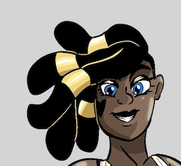
Hey Mauimicrowave!
Nice Intro story.
It is a tense and aggressive story, which is why the real close up views of the characters work, but I think you need to give a bit more space in future comics. It sets the scene, gives you a better view and understanding of the characters.
Also, I don't know if it was on purpose, but I really like the pixelated look.
Welcome to Void!
Comic Details

Beyond Battle
Ended:
Jun 20th, 2015
Votes Cast:
10
Page Views:
1322
Add to Playlist
Newest Comments

Spilt Milk
King vs. Morrigan
@ 10:14 PM May 12th
HR99 Spring 2024 Shorts
HR99
@ 8:04 AM May 7th
Jump Start - 2024
Mayor Miranda Munroe, Craven, La Estrellita Demonica, Songbird, and Darren J. Cardinalis
@ 8:02 AM May 7th
The Great Switcheroo
Colbitzer vs. Veruca Chance
@ 10:01 PM May 5th
The Great Switcheroo
Ghost vs. Itami
@ 9:55 PM May 5th
Newest Characters


Open Challenges
Random Comic
Most Wanted


Latest Topics
| ||
| ||
| ||
| ||
|


Latest Members
Users online
157 Guests, 1 User
Most Online Today: 261.
Most Online Ever: 1,184 (Jan 13, 2020, 06:21 PM)
Artist
Nae bad first try! Although i must say i kinda found it a bit hard to tell whats going on - i think bc of ur black gutters and really thick linework some panels kinda blended in a bit? And sometimes its nice to have a few more shots further away from their faces and mabee like try different angles.
I did however enjoy the read and defo giggled at the our lord bit! That was hilarious!
Now. GO BATTLE SOMEONE GOGOGOGOGO