Angie's Big Overall Guide on How to Make You a Better ColoristIntroductionNow that you know all the techniques, it's time to take it a step further. Fancy rendering can only do so much if you haven't put a lot of thought behind what you do. I used to think that fancy rendering was all I would need to be a good colorist and after getting
http://www.amazon.com/DC-Comics-Guide-Coloring-Lettering/dp/0823010309/ref=sr_1_1?ie=UTF8&s=books&qid=1284909649&sr=8-1this book, I realized oh there's a lot of things I never thought about when coloring comics. A lot of this information I learned from this book, I'm just giving the same information from my own point of view so I'm not doing a straight up word for word write up from the book. I'm not going to be covering everything I learned, for that you can buy the book if you really want to know everything. I am just teaching you the stuff I felt was important.
Coloring is just like any other art form, you need to think about what you do. While some people may see being a colorist as someone that just gets paid to essentially color coloring books, it is up to you to decide if you want to be a glorified 5 year old or someone that's serious and cares about what they do.
Now before you go down the path of being a pro colorist, remember that it's a somewhat thankless job. As the colorist you are not the star and are paid less than the penciler. You will often get lineart that's a pain in the ass to color since no one really cares about how the colorist may feel about unnecessary detail lines and open gaps. Even though we're undervalued, keep in mind that you're extremely important in telling the story even though people may not realize it. I chose to color professionally because I love to do it and it's quite a bit less pressure than being a penciler. So if you are okay with making magic behind the velvet curtain then read onward!
Applying Color Theory to ComicsMany of us have taken color theory classes and a lot of us never think to use what we've learned in comics. You can use your knowledge of color theory to help your composition and push things to the foreground by using
I'm not going to go in much depth explaining each of them but essentially
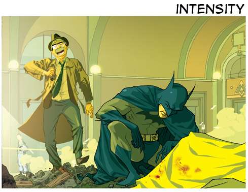
value-using lighting to make a character pop from the background. Whether it be making a character dark vs. a light background or light vs a dark background. It's usually not a good practice to have the character be the same as the background unless you want to make them blend in. This may lead to some occasional unrealistic lighting situations, but in comics clarity is a big thing you want to always have so it's okay to bend the rules some.
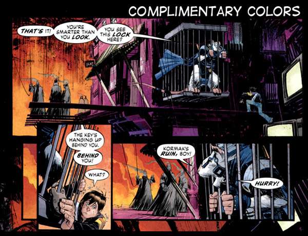
To be a great colorist it's important to know where it is appropriate to toss realism out the window. You're trying to tell a story, not paint a still life.complimentary colors-this one is extremely common in comics. In Joe the Barbarian there you can see that that's not really the most realistic lighting situation. By making all the objects in the foreground cool colors and the background colors all very warm, we focus on the foreground. Realistically everything would overall be very warm but the foreground wouldn't pop nearly as well.
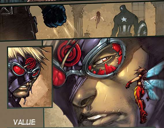
intensity/saturation-in classes most of us are taught that the further an object is away from us, the duller it should appear and this is essentially that. In this panel here the characters are extremely vibrant, whereas the background while still somewhat vibrant, is quite a bit duller in comparison to the characters.
http://zsabreuser.deviantart.com/gallery/ especially uses this a lot and you all should too as it adds more depth to your colors. A lot of super heroes have extremely vibrant color schemes because it helps them easily pop from backgrounds.
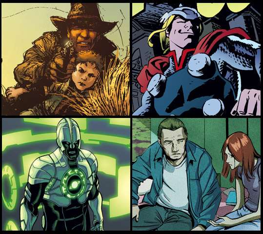
StyleWhen you look at a comic, which ones do you think have the best colors? What do you think makes a good colorist?
Who do you think has the best coloring technique from these examples?

You don't have to tell me your answer, but most people will probably say that #3 is the best due to the fact it's the most realistic and traditionally well done. Since we're a community of artists everyone's answer might be a bit different since we can see past the technical level. The right answer is all of these are great in some way or another and I find them all to be equal.
Each image is colored in a way that suits the lineart. What would #2 look like with #5's colors, what would #4 look like with #3's colors? They probably wouldn't work nearly as well because the colors suit the style of the lineart in each image.
As amateur colorists, we all fall into the trap of trying to color things the same. It wasn't until recently that I learned oh hey, maybe I don't have to color every single comic the same way. Being able to color in different ways not only helps you figure out ways to color any kind of lineart, it also makes you more valuable since companies and clients might want you to color in a ton of different styles.
I mean, look at this badass
That looks like a different person colored each one but it was only one guy,
http://fatheadwilson.deviantart.com/ Using Color to Show EmotionWhen we're starting out, a lot of us don't consider that color can be used to increase the impact of a scene or give a certain feeling to the story.
These are all recent examples of color work I have done. I've chosen stuff I've worked on because it's far easier for me to explain how
I used color than to try to bullshit how and why someone else did it. All of these are somewhat similar in intent but I like to think they're all different enough to have their own little category.
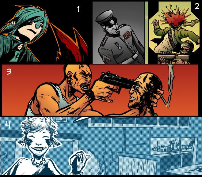
1.
Color to Show Impact-in this example most of the comic is colored in a very simple and stylistic way which made it easier for me to alter the palette so the panel would have more impact. Something kind of makes her feel emotionally shocked so I wanted to use color to not only express her shock, but to make it feel like time has frozen. So for this I wanted kind of an odd color. I didn't do a straight up blue because it would feel more somber and I didn't go with a warm color for her as it would make the panel feel angry.
One thing to consider with this is you don't want to use it too much, or it will lessen the impact. Use color to show impact very sparingly.
2.
Color to Establish a Setting-These two panels are from the same page and are right next to each other. Essentially the soldiers are fighting guys in the middle east and as it happens you see scenes of him being honored with medals. Now these soldier scenes are actually part of a flashback as well. In the present the character is a drug addict and has a miserable life. So when he thought about his glory days of being awarded for bravery I wanted the panels to feel kind of somber so I went with grayscale. I left anything that was red in color because these scenes are taking place next to a blood bath so it felt appropriate and reflective of what was going on. I also made sure each scene has a drastically different palette so the viewer knows it is a different scene.
3.
Color to Show Emotion-This goes kind of hand in hand with #1, this one I only messed with the color in the background. This is actually taking place during the day with a blue sky. But for this panel I made the background red to reflect on the anger of this guy. To me it just didn't feel right to have a guy holding a gun to someone's head with a peaceful blue sky in the background. The purpose here was just to show the emotion, not to have a significant impact.
4.
Color to Establish an Overall Mood-in this last example the whole comic is done in an unrealistic palette. Because the story is very slice of life I wanted kind of a calm feeling. While the whole comic doesn't have pleasant things happening, when I thought of the story everything felt very dream and winter like. Now this will sound like bullshit talk to you but to get quite what I wanted this story to feel like, have you ever gone outside during the winter as it snowed and had to go to a dark parking lot or poorly lit area? Now in this kind of area have you ever looked towards a streetlight and noticed the snow slowly falling down in the light while everything around the light is pure darkness? I'm always taken aback when I watch this during the winter since for me it's very beautiful since it feels as though time is standing still outside of that little light. That's kind of the feeling I wanted with the colors so they're very wintery and cool.
So if you want to give a little more impact to the overall feel of the story, color is a great way to do it.
In Conclusion...Color is a valuable tool that's important to help tell the story. If any of you go the route to being a pro colorist then hopefully this advice has helped you. For me I never noticed how much talking the color really did until it was pointed out to me, so hopefully I have opened your eyes a little.


HR99 Spring 2024 Shorts
HR99
@ 8:04 AM May 7th