

Great work both teams!
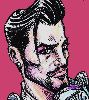
jetster/sabulive - All your characters are really animated and attractive, which is awesome. I think the Johnnys stole the show, and of course your story was really well crafted, too.
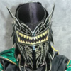
vision/knomer - Good to see you two in action. Some of your angles and panels were amazingly dramatic, and overall I like how you render people.
2013 Tag Tournament: Round 1 / Johnny Patch and Johnny Sweet vs. Maximus and Res
Critiques & Comments
# 17
Posted:
Mar 3 2013, 06:31 PM

# 16
Posted:
Mar 3 2013, 01:19 PM
jetser/sabu: Consistent work throughout for me, except for a lack of shading which would help. Page 14 is comedy gold. This is my first time reading these characters in action due to my long absence, but anything with dinosaurs is a good idea.
vision/Knomer: This is probably one of my favorite comics in the round when it comes to the lineart, and on my first read of it I was blown away. But on a second read, I definitely see problems. The colors are muddied up sometimes, detracting from the powerful blacks by a significant degree. I feel the colors should have been just as hard and wild as the lines. Also, the extremely basic word bubbles/text are taking away from the overall production value.
vision/Knomer: This is probably one of my favorite comics in the round when it comes to the lineart, and on my first read of it I was blown away. But on a second read, I definitely see problems. The colors are muddied up sometimes, detracting from the powerful blacks by a significant degree. I feel the colors should have been just as hard and wild as the lines. Also, the extremely basic word bubbles/text are taking away from the overall production value.

# 15
Posted:
Feb 27 2013, 12:03 PM
jetster & sabu- I wish this whole thing had been shaded! the panels that do have it are lovely, and definitely give a needed dimension to an otherwise flat looking comic. this was fun though, fun story, good drawings and lines. nice work!
vis & knome- the color and size are really hurting these pages! seriously, it looks almost like dodge n burn tools were used? coupled with the heavy black shading, it's not working. and, I'm assuming because of the large size, some of these pages look really blurry. and it sucks because it was a fun lil action comic with some really good drawings in there. which brings me to my last point- while there are some phenomenal drawings, there are a few really weird looking ones. clearly you guys know how to draw a person, so I'm chalking it up to the looser style used, maybe time contraints, whatever. PS- those lines on the bottom of page 11? unnecessary and an eye sore, don't do it.
vis & knome- the color and size are really hurting these pages! seriously, it looks almost like dodge n burn tools were used? coupled with the heavy black shading, it's not working. and, I'm assuming because of the large size, some of these pages look really blurry. and it sucks because it was a fun lil action comic with some really good drawings in there. which brings me to my last point- while there are some phenomenal drawings, there are a few really weird looking ones. clearly you guys know how to draw a person, so I'm chalking it up to the looser style used, maybe time contraints, whatever. PS- those lines on the bottom of page 11? unnecessary and an eye sore, don't do it.

# 14
Posted:
Feb 26 2013, 11:42 PM
JETSER & SABUALIVE- Definitely a creative take on pairing up these two. I really like how each fighter involved in this tournament really took this challenge in their own way and fashioned it to make an entertaining story. It looks like you two worked well based on the look of your pages alone. Cohesive, uniform and hooray- complete! I found it amusing Patch was such a nark, but one no one believed to boot! Also, right on with a Paddy McBastard cameo! Fitting for him to be running a Void jail and also a good in for Sweet to make her appearance. I amused by Patch's potty mouth, which by Void standards is adorably juvenile- pee pee brain? really? XD
Granted, I know jail mess halls tend to be bare, but the look of it on pg7 felt really lacking. A catwalk with police walking over it to observe or some lights would've really added to what felt like a pretty bare square. The ensuing riot and way Patch gets in had me chuckling. Only that guy would think to use the most ridiculous way to blow himself in! I can see how some would say Sweet didn't pull her weight in fighting back, but I feel her dinos are extensions of her and were her 'fists' in getting the job doen. the crotch crunch was a great final blow.
KNOMER & VISION- Not gonna lie, the sizing of your pages and wonky shapes made this a difficult read. I kept scrolling back and forth to make sure I got everything, but after reading it through I feel like I still missed something. I also wasn't sure what the deal was with the cloudy highlights that were added to the characters/environments. I'm uncertain if it was meant to actually be a source of light or bid for atmosphere. In any case, it made your panels feel like I was viewing them with a growing fog. I did enjoy the ensuing action between both teams as your loose style really gave it a sense of movement and flow. I do agree the dialogue was weird and in all honesty I think the comic would've stood well through visuals alone/without dialogue.
# 13
Posted:
Feb 26 2013, 09:53 PM
Sabs/Jets
I was expecting big things but you blew it out of the water, firing on all cylinders with great teamwork and probably the best stand alone story of the Round. The division of labor seems pretty massive but I suppose thats how the pros do it, one coloring and one drawing- it does lend itself to a beautiful consistency throughout the work and you managed to do a fully complete story which few can boast. You’ve got great characterization, nicely established setting, tons of humor and fantastic action. This comic has everything and for me it’s the highlight of the first Round of the Tournament.
Lovely color palette, the olive drabs pop against the acidic eye gouging yellows and oranges. It has the pretty/ugly quality of 80s action comics, like the Watchmen’s Tom Higgins. Could do with more consistency throughout but the attempt in such a short time is impressive. I'm never sure how you digital folks manage.
The impact on the bottom of page 4 could be more explosive or tangled and awkward- its weirdly off balance and an odd moment choice for it. You expressions are fantastic throughout, Patch in particular. Sound effects are silly and awkward onomatopeoias.- maybe invest some more time in making the fonts pop to match the sound.
Page 8’s reaction from the inmates to the news of a breakout- awesome. The missed opportunity of a reaction when he said theyd all be dead, bummer. In the chat when you said, “I need to draw a butthole!†I knew you were aspiring to true greatness but I could not have foreseen how truly great!â€
Page 12, you’ve got good panel variety and flow for the most part throughout but some weird shapes here and perhaps all the super chunky borders are problematic. Triangles and Pentagon panels- rarely work. Page 14 amazes and the color shift is well accomplished, probably the coolest twist and tournament winningest moment! As for the conclusion, “Dinosaurs are older than telepathy.†Never saw him coming. I don't think anyone saw you gals coming either.
Knomer/Vision
Establishing shot is badass, mood in the colors overall is very ominous though I think they block out too much of Knomer’s smudgy inks. Very economic style that covers alot of ground and has a few cool tricks. The choppers are a great effect and the minimalist, camera moving cinematic techniques in widescreen glory are well done. I think the big pages actually worked well as it broke the mostly rectangle panels apart like a movie, but the text and dialogue kinda hurts the presentation. So bare bones and gaudy in relation to the art itself. Lots of tight face shots for some reason, though the glasses on page 5 is super nice looking. The smoky explosives and high octane battle scene is really well done, clearly the strength of the comic although the fall panels are odd in the way they flow through the page- I love all the motion blur inkyness and scratchy masses, though some of the effect is lost in the rampart smokey, browns/greys of the coloring. The violent, torrential inks of Knomer in the action sequences are well paced and the right moments are picked for each shot tho the suplex gets a little lost- we should see the overarching hike suspended in midair as his mass doubles over. Panels 1 and 2 on page 12 are redundant- but that whole page is on point otherwise.
Dunno how pressed for time you were but that dialogue is all bad 80s action flick stuff and the fonts reek of cheese. I love your art styles with the Darrowesque Vision and Adlardesque Knomer but the simple story couldn't make up for it altogether. Still, awesome to see you cats in action, definitely tore it up.

# 12
Posted:
Feb 26 2013, 08:01 AM
Jet/Sabu: A truly excellent comic. I liked how we were able to see what the characters looked like in JEt's style on the cover. Lines and colors were crisp and well placed. I do have a problem though with how long the faces are. The nose are far too large in comparison to the eyes and you're going to have to practice reeling that in. And while I like the color choices and thought they were great, shadows are also inconsistent here, existing only to serve the mood when it happens. Foreshortening and perspective also needs tightening where available. Dialogue and storytelling was tight and the prison scenario is a good one. Really you guys are a powerhouse, just try not to place the eyes so high or the noses so long. Also the last panel is my favorite.
Vision/Knomer: Sure it's been harped on but the page size is killing me. It's a rookie mistake and really dampens the whole experience. The blacks are a bit too loose for my tastes and have a deep contrast to the shading, it doesn't work all that well together. I'm not terribly fond of the blurry photoshop effects either. I'm not sure what font is being used here but you guys should have tried out some others, it's not great. I will indeed praise your sense of style and action, the movements and angles are great, it's super dynamic and this is where you guys shine. There's a lot of great moments and action is the true calling here, it's just a pity you've got so much working against you guys when it comes to the overall presentation here.
Vision/Knomer: Sure it's been harped on but the page size is killing me. It's a rookie mistake and really dampens the whole experience. The blacks are a bit too loose for my tastes and have a deep contrast to the shading, it doesn't work all that well together. I'm not terribly fond of the blurry photoshop effects either. I'm not sure what font is being used here but you guys should have tried out some others, it's not great. I will indeed praise your sense of style and action, the movements and angles are great, it's super dynamic and this is where you guys shine. There's a lot of great moments and action is the true calling here, it's just a pity you've got so much working against you guys when it comes to the overall presentation here.

# 11
Posted:
Feb 25 2013, 06:07 PM
Jetster/Sabulive: I think the largest highlight in this comic is that since i only knew one character, all three characters in this comic was well established that I knew who had what problem in the story (as in I didn't need to read any bio to get what's going on). Something about the color palette is very odd. The whole thing is like a rainbow of colors, and the colors don't seem to match up with the situation. Especially on page 8, where one of the major keypoints in the story takes place. Here, we see the emotions like shock, confusion, happiness. I feel that the bright red panel on the bottom overpowers the rest of the page, in which I believe the two most important panels are panel one and two (so basically, a more saturated color for those panels, and dull down the bright red panel, to put more emphasis on the important part of the story on the page). Color theory is different for every situation and drawing, and sometimes a bright color isn't what you're looking for...the rules in this stuff is complicated. I don't know how to explain it very well, but yellow things don't need to be yellow...er...look up 'monochromatic' studies in color theory.
Vision/Knomer: I'm gonna point out to you that bigger is not always better-make sure the pages aren't so gigantic next time. This comic has very nice, powerful action in it. I would recommend that you stick a few sound effects here and there, just so the transition between the action shots make a little more sense though. Color wise, I think you're trying to do way too much for the color--you've got flat shading here, soft shading there (the airbrush/fuzzy brush), and crazy contrast in shadows flying over the place. Try to limit it to one main style, to keep it consistent-because the lines are so intense and black, I would recommend flat shading to compliment the bold lines. Whoever did the lines in the beginning and during the fight scenes, congratulations, it did an excellent job creating the dark, powerful mood. I'm going to say the opposite of what I just said to jetster and sabu, so I'm going to contradict myself, but the color scheme in some of their clothing is incredible inconsistent.The color of Johnny changes too much, especially her jacket. Colors are complicated. Time to study up a little on monochromatic color theory too. It would be wise to expand your brushes for better variety, or you may consider sticking to only one or two brushes for consistent color texture.
congratulations of round one!

# 10
Posted:
Feb 25 2013, 07:59 AM
sabs and jets: Beautiful. Especially page 14, which made me just about DIE. The humor throughout the whole comic was wonderful. I love it so much I want to read it again. Thanks guys, this made me happy. To give you at least a little bit of helpful critique, there were some backgrounds and colors that felt a little unfinished... but I'm almost 100% sure that's because of the time constraint and how much you guys did in that time! Awesome job, both of you!
vision and Knomer: your font! What happened?! Also, the pages were really big, even on my large monitor, and that only made some of the lower-quality parts stand out even more. I really like your action, but the backgrounds felt really sketchy and unfinished. I got a little confused because of that, as well as the dialogue, which didn't make all that much sense to me. I hope we get to see more from you guys, with maybe a little more finish on the artwork (and smaller pages).
vision and Knomer: your font! What happened?! Also, the pages were really big, even on my large monitor, and that only made some of the lower-quality parts stand out even more. I really like your action, but the backgrounds felt really sketchy and unfinished. I got a little confused because of that, as well as the dialogue, which didn't make all that much sense to me. I hope we get to see more from you guys, with maybe a little more finish on the artwork (and smaller pages).
# 9
Posted:
Feb 24 2013, 11:23 PM
Checking in from trfic lites cos I feel ill, Sabu ur mai hero
# 8
Posted:
Feb 24 2013, 11:17 PM
WE UPLOADED!
SABU SUFFERED A HEART ATTACK.
SHE WANTS TO CRY FROM THE STRESS
SABU SUFFERED A HEART ATTACK.
SHE WANTS TO CRY FROM THE STRESS
# 7
Posted:
Feb 11 2013, 08:18 PM
CUE CHEESY DANCE OFF: http://www.youtube.com/watch?v=TLGWQfK-6DY
# 6
Posted:
Feb 11 2013, 07:42 PM
YEAH, TEAM JOHNNY CAN DO THIS >:U
# 5
Posted:
Feb 11 2013, 01:16 PM
JESUS CHRIST, GOOD LUCK
# 4
Posted:
Feb 11 2013, 11:20 AM
Team Johnny vs. Team MaxiRes! Can't wait  Good luck all!
Good luck all!# 3
Posted:
Feb 11 2013, 09:57 AM
good luck!
# 2
Posted:
Feb 11 2013, 09:00 AM
RoflQu said it! I can't wait to see how this goes down. So much talent in one place...

# 1
Posted:
Feb 11 2013, 08:41 AM
A stellar example of new-school vs old-school. Which school will triumph?
Comic Details

Add to Playlist
Newest Comments

99 Problems and a Cat
Croi Desai vs. HR99
@ 12:30 AM Apr 23rd

einsam
Colbitzer
@ 3:32 PM Apr 17th

Birthright
Saal, Louise Ambre-Aliona, and Llaana
@ 3:44 PM Apr 16th
Help Needed
Theakon
@ 2:19 PM Apr 16th

The Great Switcheroo
Louise Ambre-Aliona vs. Luniel Gekka
@ 3:26 AM Apr 15th
Newest Characters


Open Challenges
Random Comic


Most Wanted


Latest Topics
| ||
| ||
| ||
| ||
|

Latest Members
Users online
247 Guests, 0 Users
Most Online Today: 284.
Most Online Ever: 1,184 (Jan 13, 2020, 06:21 PM)
Artist