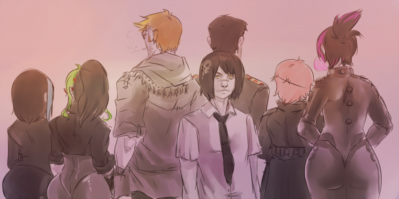
Your comic pages are lovely but I am very confused as to what is going on.
Like Wei and the others said, it's clear you're pretty talented aesthetically but if you could just make the comic flow a bit clearer cause maybe it's me but I'm not sure what he just tried to do? Did he save them?
Also your perspective on the buildings is very off. At first glance it looks okay but on second glance and if you look closer they don't look right.
Lovely otherwise.
Actually the vanishing points on all her lines in the backgrounds seem to end up at the same spot if you take any kind of straight edge and measure.
I agree with you on the flow, but it may also be partially because there's no clear distinction between the beginning and end of each page the way she's got them posted. Plot-wise I was able to understand the comic completely.
Perhaps I might've read it wrong. Reading it again it makes a bit more sense so that was my mistake on that part.
But I simply do not agree with you on her perspective. Because there are two major perspective mistakes that I can see, and maybe I wasn't being specific on exactly what it was.
The first one being the first panel, where the girls are standing together. They are not standing perpendicular to the road. This is basing it on the angle of their standing position and the direction of the road lines. The environment suggests that it's horizontally flat. Kinda shown from the other panels. But there the road's curved and looks like they're going uphill or something.
The second would be the second panel which was my main concern and what caught my eye, looks like an attempt at 3 point perspective but alas there is a lot of distortion going on especially on the glass building to the side where the lines are crooked. Lastly the lines detailing on the building with the plants don't converge.
Sorry if I didn't properly give you a detailed crit explaining what exactly was needed to be fixed. So I hope this helps clear things up. u_u;
 I'll leave this here.