Invitational Tournament 2012: Round 3 / Dr. Flan vs. Toro Joe

Invitational Tournament 2012: Round 3 — Dr. Flan vs. Toro Joe

This comic has not been rated; viewer discretion advised.

Icon for Dr. Flan49%
916 points
Page 1Page 2Page 3Page 4Page 5Page 6Page 7

Crit level: No preference


by TINMAN

This comic has not been rated; viewer discretion advised.

Icon for Toro Joe51%
955 points
Page 1Page 2Page 3Page 4Page 5Page 6Page 7Page 8Page 9Page 10Page 11Page 12

Crit level: No preference


Critiques & Comments
Please register or log in to comment


Thresher
Artist
166 comments
# 30   Posted: May 19 2012, 10:48 AM
Oh man this was a tough match.

Soth!
That first page really made me reevaluate your abilitity, it was quite above what you've been putting out before.
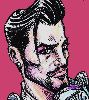
Did Del Toro have a hole through his chest? From a bull horn? Because that is awesome.
I wasn't too fond of your panelling on the first, the odd angles didn't feel right.

You pick it up well though, when Dr Flan emerges from the cage you have some awesome layouts. Especially the red cloth thing, that was cool.

Oh man his hair! So cruel. That entire page was pretty solid, but then when he runs you have ti as a far out side on shot, which you could have certainly done better.

You tend to neglect your backgrounds in big scenes, which is they're needed most! Throw some more details in there, they serve to subtly direct the eyes and direct the character of the scene.
Your flat's are simple but effective, you've got a good eye for picking out good colour combinations. I do think you could have pushed those a bit mire, but hey! A weeks a week.

Sorry to see you bow out of the tournament, hope to see you battling around soon!

TinWoodsman!
That opening cover was incredible, but I think you could have used your time a bit better. This would have been a great thing to add in the voting week, but it kinda ate up your time for the rest of the comic. It is beautiful and I love it but it doesn't really help your comic besides going "LOOK HOW AWESOME I CAN BE" before continuing into your comic, which sadly doesn't fare as well next  to it.

It looks like your pages area little skewiff, as if they were scanned in at a slightly odd angle. Which is a shame, that drew attention away from the pages themselves.

Oh wow, it's obvious you're using the fill tool on these pages, page 3 has been done a little sloppily in that upper left corner. A ToroJoe was half filled in, and the darkness on the other side of the lowest one is not darkened.
This problem shows up on later pages, and it really detracts when it's spotted.

The panelling is fantastic, imaginative and not standard at all. Your action benefits really well from it, and you've got some excellent movement.

I really enjoy the characterful dialogue, it can be a bit roundabout at times but it gets the point across.

Unlike Slothvert, you really make good use of your backgrounds, although he certainly beat you in time management.
Those unfinished pages make me sad.

Sadly not up to par with your previous rounds due to being unfinished, and sloppily filled, but certainly a great entry.
Good luck in the next round!

jho
Artist
485 comments
# 29   Posted: May 8 2012, 07:10 PM
sloth: fun little comic, I liked the joke but I think the pacing was SLIIIGHTLY a bit too slow for the kind of joke it was going for :) it could've more dynamic shots to spice up things a little, if you'd like to keep the pace, just to make it more interesting.Try to pull back a little, drawing maybe crowds from afar, or just play up your sense of scale and angle so not everything is roughly the same size on every page. Otherwise, good job.

tin: I really enjoy your usage of blacks, also your typography is great, but a bit of breathing space around the words (inside the baloons) would probably help a lot with your stark black and white comics! I was a bit confused on the flow on page 4 but the rest of your pagers are marvelous, albeit unfinished on some parts but it was no problem for me. Even though it's different in pacing and caricature style, your overal comic feel reminds me of corto maltese era.  I also enjoy the dialogues, it really sets the toro joe character. I think one of the good points I find from the way you've drawn things is you're not afraid on drawing different scales- everything is dynamic, which is always a good thing. great job.

clappings times 20 for both of you

TINMAN
Artist
140 comments
# 28   Posted: May 8 2012, 11:43 AM
Gregly: Jimmy Boom is clearly the Hero Void deserves, I'm just trying to cultivate a worthy foil as VOID is a city made for villains and all manner of criminal scum and freaks. That whole city layout took ages, note to self: Use image refs in the future. Drawing architecture from scratch is a royal pain.

Gibbo: That is indeed Azelle on my cover, I included everyone in this round and a few others to pad it out some. I strive to develop environments to ground my stories in, they're quite fun to design and toy with panel compositions with I find, whatever keeps it interesting for me to draw. Fills definitely are a pain with my microscopic detail on some things, I'll need to learn to open up going forward when it comes to digital aspects.

Atomicfish: I'm pleased Toro got a laugh out of you. I do make every effort to cram in the sly nods to other characters and unify the world as much as possible. Think of my pages as a Where's Waldo and see if you can't find them all. They bear further investigation and deeper reading.

Gregly
Artist
201 comments
# 27   Posted: May 8 2012, 05:44 AM
Toro Joe is the craziest fucker around.
Like everyone else said, I really like how developed the surrounding city and everything is! It looks like Jimmy Boom is becoming quite the celebrity at Void City.

Gibbo
Artist
82 comments
# 26   Posted: May 8 2012, 03:01 AM
Sloth: The Minotoad made me laugh, like people looking up from their desks sorta laugh. Great job with portraying what has to be the strangest bull fight yet  XD

Tin: You have an uncanny knack with creating a fully living/breathing world, the amount of detail is crazy! Only thing that stood out as a bit odd was a few cases where it looks like you were filling in the background colour but the area detection was off (like page 3 where it fills in Toro's head/torso on the fire-escape, or page 4 with Flan's leg filled in). Well done on this one!

Atomicfish
Artist
115 comments
# 25   Posted: May 7 2012, 09:43 PM
You guys. Holy crap. You guys. Why can't there be a tie? ah, my emotions.
They're both fun and well executed, I really enjoy Sloth's use of paneling, especially in that cape twirling page, plus Dr. Flan is really cute in his bull costume. Toro Joe's also got some cool/cheesy one-liners, those are always a win for me. The Easter eggs were fun too, I giggled when I saw the Jimmy poster on Flan's refrigerator, actually didn't even notice them until a second read-through.

Con
Artist
92 comments
# 24   Posted: May 7 2012, 09:42 PM
This is the nail biter of round three! Great work from both of you guys for srs.

TINMAN
Artist
140 comments
# 23   Posted: May 7 2012, 09:20 PM
Perhaps a soundtrack to set the mood- http://www.youtube.com/watch?v=Yinf-E3t2yA.

Kinuch: Cattbutt is silent but deadly son- follow your nose!

Animeshen: It seems we've met our match.

Sloth: We must all carry on in Underwoods mournful absentia. BRING ON THE CAMEOS. I'll draw the whole VoidVerse if I have to.

Animeshen
Artist
1490 comments
# 22   Posted: May 7 2012, 08:08 PM
hahaha you guys are .1 percent apart! Great comics both! The quality was amazing, and they both made me laugh!

Kinu
Artist
150 comments
# 21   Posted: May 7 2012, 08:00 PM
I saw a bunch lol! I think the most well-placed was Catbutt. I almost didn't notice him

slothvert
Artist
71 comments
# 20   Posted: May 7 2012, 03:45 PM
I dig your composition on the cape swirling page, nice cameos too. Looks like this third round is the battle of who can include the most cameos!
Quote

Underwoodwriter won that game in Round 2. We can only dream, now.

bl00chikin
Artist
54 comments
# 19   Posted: May 7 2012, 12:07 PM
I seriously hope this turns out to be draw... heh-heh heh
Nice work, the both a yas!
Sloth: that bit with the hair... priceless.

TINMAN
Artist
140 comments
# 18   Posted: May 7 2012, 12:04 PM
Thank you Kinuchio- I had to give our boy Jimmy B a nod and a jab in there. I love him so. Also watch for the Jimmy Butt on Flans fridge, among the many other character Easter eggs/cameos I've laced throughout my pages. See if you can find them all!

Kinu
Artist
150 comments
# 17   Posted: May 7 2012, 12:01 PM
At the time I am viewing this, the scores are DEAD even. Makes sense, cuz you guys were both great! You both won in my opinion!

TINMAN
Artist
140 comments
# 16   Posted: May 7 2012, 11:20 AM
High Concept and Epic Scale, that's how I roll. I had a great time playing leap frog with Flan and imagining what his B-Movie Monster Motives Might B. Definitely boned up on my Godzilla and King Kong flicks as inspiration. Threw a little science and sexiness for good measure.

Those Cityscapes are a bastard tho- Fuck You Brian Hitch! (Ultimates artist)

I dig your composition on the cape swirling page, nice cameos too. Looks like this third round is the battle of who can include the most cameos!

slothvert
Artist
71 comments
# 15   Posted: May 7 2012, 09:33 AM
Wow, Tinman, that was really... gross.

You really went way over the top with this one! Haha.

TINMAN
Artist
140 comments
# 14   Posted: May 6 2012, 07:40 AM
Oh yes, this shall be a battle of BEASTLY proportions indeed.

slothvert
Artist
71 comments
# 13   Posted: May 5 2012, 09:44 PM
Comic done and uploaded, chicas. And a whole day to spare! Better get on to the next one...

Popokoli
Artist
16 comments
# 12   Posted: May 5 2012, 04:47 PM
I NEED TO READ THIS NOW

Mister Kent
Artist
958 comments
# 11   Posted: May 4 2012, 02:07 PM
Stupendous! Can't wait

The Sketch Fighter
Artist
18 comments
# 10   Posted: Apr 30 2012, 06:43 PM
Will this become a battle of "Beauty vs the Beast"? Gonna look forward to this match.

slothvert
Artist
71 comments
# 9   Posted: Apr 30 2012, 01:03 PM
DEFAULT, DEFAULT

WHERE IS THE EMERGENCY EJECT BUTTON

space-aged
Artist
26 comments
# 8   Posted: Apr 30 2012, 12:21 PM
Excellent!

bl00chikin
Artist
54 comments
# 7   Posted: Apr 30 2012, 12:21 PM
This should certainly be interesting!

Kinu
Artist
150 comments
# 6   Posted: Apr 30 2012, 12:02 PM
I creamed. Good luck guys!

Thanan
Artist
18 comments
# 5   Posted: Apr 30 2012, 11:05 AM
this is gonna be big!

Tofubeast
Artist
254 comments
# 4   Posted: Apr 30 2012, 10:59 AM
It's on now, son

Qyzex
Artist
670 comments
# 3   Posted: Apr 30 2012, 10:28 AM
this'll be one rad ride

Con
Artist
92 comments
# 2   Posted: Apr 30 2012, 09:43 AM
Ooh I can already tell this is gonna be a good pair.

Gibbo
Artist
82 comments
# 1   Posted: Apr 30 2012, 07:07 AM
Great match-up, looking forward to it!

Comic Details -

 
Tournament Match
Drawing Time: 1 week
Ended: May 13th, 2012
Votes Cast: 42
Page Views: 2350
Winner: TINMAN
 

Add to Playlist -


Newest Comments -


Newest Characters -

 
Morrigan KingAugustus ThomasTheakonRod ChirpwoodHuskMizz BonzaiSpidella WidowsMyrmidonGhoulArcher Heart Mercury
 

Open Challenges -

 
No open challenges
Create a new challenge
 

Random Comic -


Most Wanted -

 
RantuBlack SwanCelifChickenMannUltraNagoreDairyuGhostTheakonRickter & GusHana RahalItamiMadd


Latest Topics -

 
All News, All The Time 
Last updated: Staff Bot - Apr 22, 2024, 11:47 PM
Revelarts images 
Last updated: Revelarts - Apr 16, 2024, 02:38 PM
Revelarts-ubator  
Last updated: Revelarts - Apr 15, 2024, 10:25 PM
Clown Jam 
Last updated: Radji - Feb 11, 2024, 04:51 AM
INTRODUCE YOURSELF 
Last updated: Maz - Nov 06, 2023, 04:13 PM
 

Latest Members -


Users online -

 
242 Guests, 2 Users


Most Online Today: 284.
Most Online Ever: 1,184 (Jan 13, 2020, 06:21 PM)


About Us

We exist to provide an environment for artists to learn and improve their sequential art skills competitively. Our community is designed to give critical feedback and encouragement to our many members the world over, at all skill levels.

Follow Us