Im new to this whole tutorial thing so lemmi know how this all sounds
Kure’s Inking Tutorial!After considering what I should talk about in this tutorial I decided that the best thing for me to do would be to show people how I myself ink, I cannot promise that this stuff will work for everyone but I can show people things I have discovered whilst inking and share some techniques and such with you.
Ill begin my section of the tutorial by talking about quills and telling you my tools of the trade
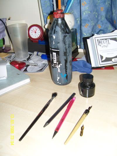
Quill pen, with interchangeable quill (make sure when you get the pen part that the actual quill fits it and fits it well so it isn’t falling out whilst you ink)
Black India ink. Windsor Newton have good black India ink as do Daler Rowney if you get the acrylic variety. The kind I’m currently using is made by Ocaldo and comes in a big squeezy bottle
Phat HB Graphite pencil, nice and chunky, good for throwing down shapes and easy to rub out
Technical pencil HB, good for facial and costume details that the phat graphite pencil is just too PHAT to handle.
Now as far as teaching people how to ink with a quill im afraid that is beyond my abilities. The truth is that the best way to learn to use quills is to buy some for yourself and mess around. I can tell you a little about the pit falls of using quills and show you what a quill pen can do but other than that there’s not much more to tell youz.
Quills can be a tricky bitch to use, mainly because there isn’t a constant stream of ink so you constantly have to dip them, also you have to clean them, ideally after each dip, to make sure they don’t clog up and make funky instead of fluid lines. Just use toilet paper or scraps of fabric for this and if any ink does dry onto the quill you can scratch it off with something sharp like a compass.
They also have a tendency to catch the paper when you first start using them, this gives a cool little flick of ink than can royally fuck up a picture.
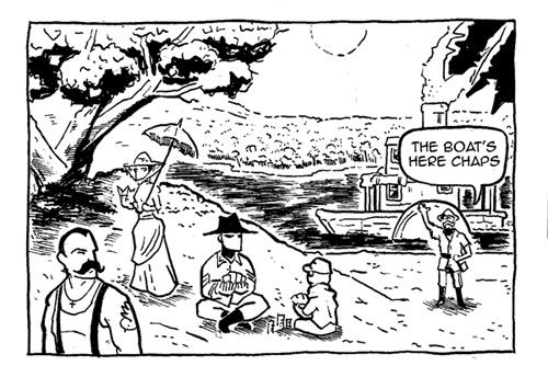
So the question is, why use them in the first place? Well the line quality of a quill is unlike any traditional fine liner, this is because the quill is pressure sensitive! Now you might be thinking well BIG DEAL who needs to have pressure sensitive lines? Well here I shall show you a picture of a characters face done with a quill so you can get an idea of how quill based work can look.
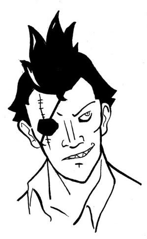
All of this image was done with one pen, and all the lines were done in one stroke (except the solid black bits obviously).
LINE WIDTHWidth of line is an inking basic and should be mastered by ALL.
Here are two pictures
This one is all one line width
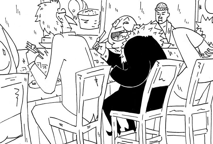
Now at a first glance you might not think that the inking is that bad. I mean it shows you the image right? But if it wasn’t for Dr Fabulous’s suit there wouldn’t be anything to catch your eye and the lack of depth makes the image confusing and you have to work at understanding the image, it might be only for a split second, but if you have a book full of images people have to struggle to look at then they’re gunna soon tire of reading your work.
Now for the GOOD inks
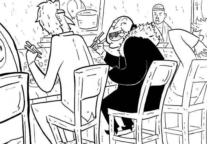
Notice how the image has depth and is much easier to comprehend!
Now the question is HOW did I do this? Well that’s easy enough to answer. Line width has certain rules and I follow a mixture of the rules.
Graphical line width.In graphics they teach you that any edge that leads to a surface you cannot see should have a thicker line as shown by this generic graphical diagram
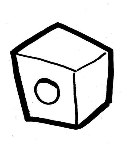
You can see that I’ve done this with the chairs.
Cartoon network line widthYou all remember Dexter’s lab right? Or the Powerpuff girls? Well they all had on massive black outline around the characters. In all honesty it looked ugly but it gives you the basic idea which is putting a thicker line around characters and important things to make them stand out. The focal points of this picture are Dr Fabulous and Morty which is why they have a thicker black outline around them. This also sets them apart form the background. You may notice that most of the background is done with a thinner line than the characters so that they don’t get lost amongst the lines.
Perspective line widthSimple, things closer to you are bigger and this can be shown with a thicker line (as shown by the guy sat next to Morty). On the opposite end of the spectrum is the use of thin indistinct lines for things far away. The guy next to Dr Fabulous has a thin line to show distance as does the chef and background elements. Also the further things are the hazier and harder to determine they are therefore there is no need to draw far away things massively detailed since it will simply look odd (for example a building that’s 10 feet away from you should look more detailed than the same building 5 miles away from you)
If people would like to practice this I have the blue pencils for this image that you can ink yourself
http://smg.photobucket.com/albums/v154/Oldvwcamper/?action=view¤t=fabulousbluepencilssmall.jpgAdvanced inking techniquesShading with inksI love solid black shading, it can add a real density to a piece for work, the only problem is that it can also fuck your work up royally!
Here I’ll show you a couple of things I’ve learnt (mainly from reading Hellboy books)
If you’re good at cell shading you should be able to pick up on this pretty quickly since you’re basically replacing the darker colour you would use with black.
Here are some figures done with solid shading to show you how it would be applied.
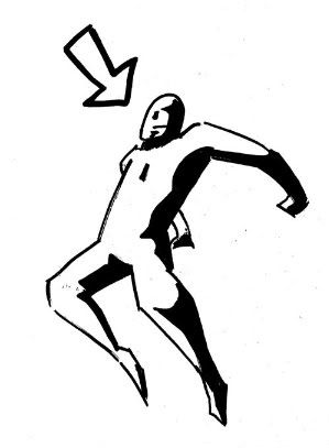
And for you to practice! Click here. ->
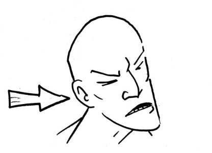
http://smg.photobucket.com/albums/v154/Oldvwcamper/?action=view¤t=DO-IT-URSELF.jpg I have included a blank picture of a pose and several arrows, choose your arrow and use that as a light source and practice application of black!
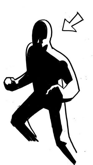
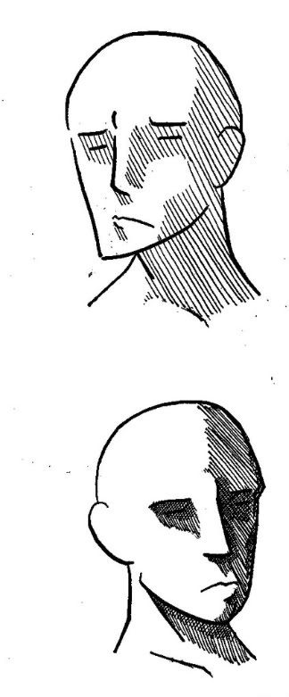
Now for more detail on the face!
When conveying a strong light source the application of black becomes simple. Nearly always the eyes and under the chin are in shade. An important point to remember is to leave the cheeks white, since it’s easy to assume that they would be in shadow though they rarely are.
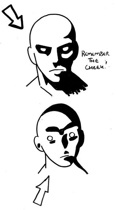
Solid black can be used to convey some moods. Here we have intensity and sinisterness.
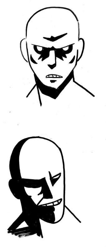
When conveying mood this is where the rules of light kinda go out the window and style comes in. Notice how in the intense one the black has pooled around the eyes so it sucks people into the face, since the tension is high I made sure to use sharp shapes which people associate with anxiety.
The sinister one has more subtle shading using curves reflecting a calm yet cruel nature. I’ve also made sure to keep one eye in shadow, don’t ask me why but one focused eye just looks sinister.
CROSS HATCHINGThis is a tricky thing to do with out making your stuff look over worked so if you’re gunna shade using ink you should either do it sparingly or go the whole hog with it. In between doesn’t really cut it.
A little- (top one)
A lot-(bottom one)
Cross hatching requires a steady hand and more important than that patience. If you take your time and try to make the distances between the lines as similar as possible your stuff will look good. You must also make sure you’re using a thinner line than with the majority of your work or things can look pretty messy.
Inking FXOften unnecessary but fun none the less these techniques can add a little something to your pictures.
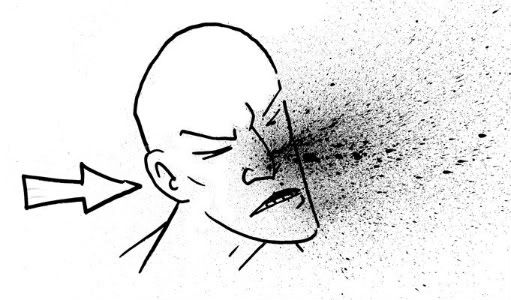
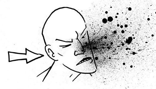
Blood spray,
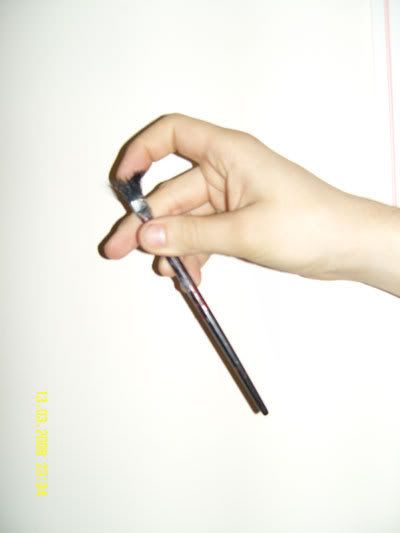
A nice easy one, get a brush, like a tooth brush or a hard bristled brush and you basically run your fingers through the brush so that it flicks a fine spray of black ink onto your picture.
Choose the angle of the spray
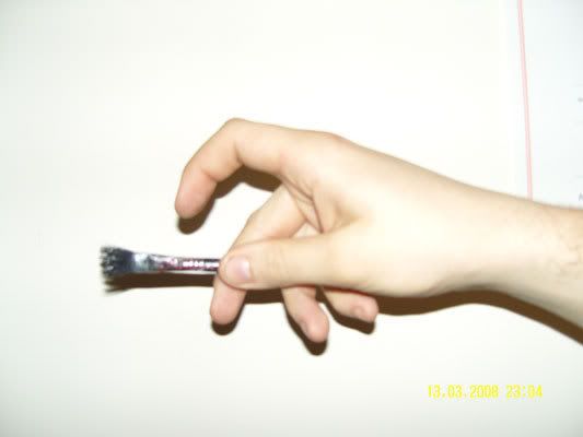
(this is how to hold the brush)
Flick from that direction
You can also get bigger droplets by having ink on your brush and tapping the side of the brush
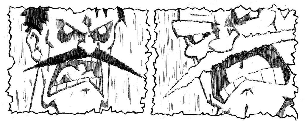
 Impact,
A neat way to show impact or tension is with broken lines as shown in this picture from the moustache battle.
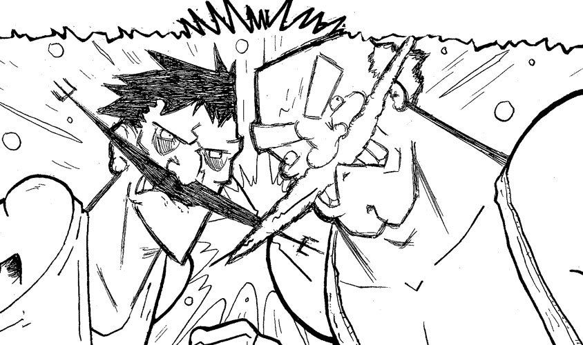
I got this effect by using many lines to make the one line and by making the black areas in much the same way. This gives a blurred effect to the image suggesting intense movement. It works for on lots of thins such as a fist impacting upon a face or a car crashing and it’s a really easy technique to learn.
Motion Speedlines. These are done in the same manner as the impact ones only the lines that make up the image all have to point in the same direction. I wanted to imply a movement in air pressure akin to Dragonball Z in these panels so I drew out the image in pencils and then inked the lines all pointing vertically implying upward (or indeed downward movement). This can be applied to any movement so long as the lines all point in the direction of the movement.
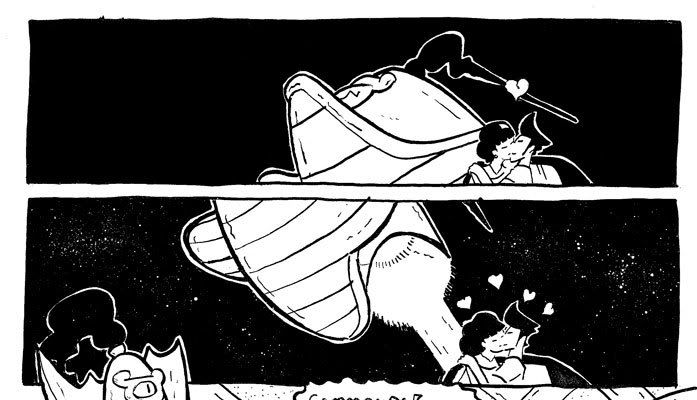
 Stars.
 Here we can see two panels showing the night sky, one with stars and one without just so you can see how much this technique can add to a piece. You follow the same principals as the blood splatter only hold the brush further away from the picture so that it falls like a sprinkling of chemical snow.
Hopefully some of this will have helped you fine people!