Rama: Undead horses, bacon and gore?

Re: Ramas lousy colors.
« Reply #25 on: Oct 08, 2010, 07:27 PM »
I tried to fix the tiny feet and hands. Cleaned up more thoroughly, too.


War Gorilla portrait. I'm trying to settle on a look, as gorillas have very individual facial features.
I left the eyes colourless, because they looked freaky when I coloured them quickly, so no dice.
Not trying to do anything spectacular in detail yet. Just trying to get his general proportions and a colour test down.


Some more on the original painting.
I've come to a crossroad: Either the shirt is red and at a risk of drawing to much attention, or it's white/grey and risks looking to flat. What to do, what to do.


Re: Ramas lousy colors.
« Reply #26 on: Oct 12, 2010, 01:47 PM »
I tried to work some more on the WG portrait.
It looked dopey and weird, so I started comparing anatomy references, and came up with something more of a gorilla and less of a orang-utan.
The colour might have contributed, but the shape of the face was all wrong in b/w too.


The face is still not exactly what I imagined, but I going to let it be, as a start reference for further concepts.


Re: Ramas lousy colors.
« Reply #27 on: Oct 17, 2010, 11:51 AM »
I finally finished a watercolor piece which I don't want to burn.

I still haven't found a way for the paper to stay flat. I removed the tacks and fastened it with clamps, which seems to cause little to no damage to the paper. It still bubbles though.

For some reason the scanner takes on colored pages much better than B/W or grayscale, and has almost no edge shadowing. Sadly the thing was just big enough to need 3 scans, or there'd be a great big seam just in her face.


This is the kind of style I'd want to make most of the comics with her. I'll just have to improve on everything before I do.

The whole "piece" effect at the bottom was planned, but should have had a darker background. I tried to pull color from the page while it was still drenched, and most of the darker pigment went away. I should learn to make test runs on a small paper before trying out something I've never done before.

I added the border, straightened out the frame of the top panel digitally and multiplied the color to better match the original. Otherwise I've done nothing to it post-scan.

About the border: are the splashes to dark to see, or do they come through fine? I didn't want a flat black, so I made the effect with some dark blue to contrast. I don't know if it's a good idea. Just messing around.


Edit: the image broke and I had to fix it.

Re: Ramas lousy colors.
« Reply #28 on: Oct 17, 2010, 12:03 PM »
That is beautiful.

I really wish I had your confidence with physical mediums.

Re: Ramas lousy colors.
« Reply #29 on: Nov 09, 2010, 01:59 PM »
Ehm....is now a bad time for me to mention that I'm always frightfull that I'll ruin everything everytime I color anything?

Thanks :-[


I'd have replied earlier, but my computer crashed and I bought a new one at long last. I've finally put it together and now I'm back to basics in configuring my software.
Had a real mood dip with the whole drawing business, but now I'm back with a more powerfull machine that doesn't grind to a halt when I try to use brushes bigger than GIMP standard 19, which is nice.

Figured I'd try to get back uploading.

« Last Edit: Nov 09, 2010, 02:01 PM by Rama »

Re: Ramas lousy colors.
« Reply #30 on: Nov 15, 2010, 01:42 PM »
fuck your fear! be bold and firm with your strokes!

as my old teacher used to say, take chances, get messy, and make mistakes!

Re: Ramas lousy colors.
« Reply #31 on: Nov 22, 2010, 01:36 PM »
Yeah, i remember something similar from...well basically all of my art teachers.

That's why I like testing the digital canvas. You can always start fresh without setting up or cleaning off stuff.

Something cobbled together last night. After 3 drawings I finally made something I actually liked.


It's hard to make young characters look tired and worn without making them look old.
Also, I finally found a way to make something like freckles.

I think that I'll maybe put her through the incubator now.


Re: Ramas lousy colors.
« Reply #32 on: Feb 27, 2011, 05:34 AM »
I pretty much disappeared for a while. So here's some stuff I've been doing while my scanner was dead.


A character in the Briar comics I'm planning. He's an old shopkeeper or the like, I've not decided anything yet.
I like drawing old people, it's gives me much more freedom with wrinkles and such.


Some creature I made up years ago that was part of a improvisational image. It kind of stuck to my memory, and I'm trying to solidify the design.


Same creature, and another character from the original idea. I made the mistake of drawing it on an A4, and now I have to redraw it on bigger paper to finish the backside of the creature.


Wargorilla again. He draws heavily from superman, and I wanted to show him flying, as it is his only solid power. He's supposed to have an opera cape on, because I thought it'd be really funny if he's some kind of mix of superhero and vampire clichés, or even aware of them and enjoying playing out such stereotypes. I'm not sure what I'll do with the character, but it's going to be comical in nature.

« Last Edit: Feb 27, 2011, 05:35 AM by Rama »

Re: Ramas lousy colors.
« Reply #33 on: Feb 27, 2011, 05:35 AM »
that creature thing is so goddamn awesome
Get ready- pop it, let's go.
Enter galactic, you and me,
Enter galactic, you and me.

Re: Ramas lousy colors.
« Reply #34 on: Feb 27, 2011, 04:22 PM »
I second that sentiment.   :o

Re: Ramas lousy colors.
« Reply #35 on: Mar 02, 2011, 02:03 PM »
Thank you. I sometimes draw creatures as I go along, but this particular one I really took a liking to.

Here's the original drawing. It was never completely finished, yet it's not as incomplete as this any more. I'm currently trying to finish of the last bits of it and be done with it, but I always keep on adding details and it really slows it down. =)


Here's a much more current sketch of the person in the original picture. I made it today and decided to scan it, but when I removed it from the scanner it tore. I'm not a happy panda right now, I tell you that.


Here's the two of them again. Much more crudely sketched, but the creature looks more right to me this way, despite not being as finished as the other headshot of it.


Re: Ramas lousy colors.
« Reply #36 on: Mar 14, 2011, 09:48 AM »
A friend of mine told me something like what Pi said, to be bold and such. The argument was that I was to limited when I draw faces, and that I had to go a little wild, so I was given some inspiration from some online exercises on exaggeration.

I don't know what has happened, but something must have changed dramatically over night just before I begun drawing this. I've always had to work really hard to draw faces that look good, and I've always had to measure and redraw it to balance it and make it symmetrical and to make it "work".
For some reason, all of a sudden I didn't need to strain myself any more. It just worked. I didn't need to concentrate on simply making things symmetrical, and I didn't need to go back and redraw because it looked good the first time I did it. This was an amazing experience, and I ended up filling a large sheet with small faces because I just kept making new ones to make sure that it wasn't some fluke.

What just happened?  ???


I learned a lot about working digitally from this too, and probably speeded up quite a bit from end to finish. The page is just so big that I can't scan it with good quality on my shitty old scanner, so I pieced it together and it really taught me some much needed stuff about how to work with layers quickly.

They're just sketches because I wanted to see how easy I could take an idea and sketch it out.
For some reason I drew Maleficent from memory. When I looked it up it actually matched rather well. It's one good character design if I can draw it from memory 10 years after seeing it.

I'm thinking of taking that a bit further, with a page for villains, one for heroes, one for sidekicks and whatever else I want to do. Might be fun.

Next up will be a character sheet for Wargorilla.

Re: Ramas lousy colors.
« Reply #37 on: Oct 29, 2011, 07:41 PM »
Should post more things here.

I'm having trouble getting her skin smooth. Is there any good way to avoid this?
I've practice eyes. Don't really know why, but since she's not completely fisheyed any more it must've helped.


And now for something completely different.
I got frustrated with the lumps and colored some lines.


When I was playing DoTA more regularly, I remember playing Furion was fun, which of course have nothing to do with any greed ingrained in the fabric of my soul. For a guy who's supposed to protect the wilds he sure seems hellbent on hoarding stuff.


« Last Edit: Oct 29, 2011, 07:46 PM by Rama »

Re: Ramas lousy colors (now with color)
« Reply #38 on: Mar 29, 2012, 02:33 PM »
I'm trying to get into posting again.
I have such a problem with just doing stuff that isn't random pencil drawings of weird creatures.


I'm doing quick sketches with colour, because at some point I'm bound to learn how to do a decent colour mockup. So I decided to try to put down a design for Wargorilla, henceforth Vampiregorilla, but I didn't get anywhere and so I drew his arch enemy and occasional teammate:


Pimp Chimp.
Actually he's a bonobo.

I feel like my head will implode unless I let some of the stupid out occasionally, so yeah.


I'm having so much trouble with the more cartoony styles, not to mention actually coming up with colour palettes that aren't cringeworthy and make eyes bleed.
I also have a hard time opening doors and doing anything that isn't painterly. Maybe I should just do the digital painting style and see if it fits the zany theme after all.

After all, I just want to draw dumb ape-related humour.
With hats.

Re: Ramas lousy colors (now with color)
« Reply #39 on: Apr 12, 2012, 01:55 PM »
New colour.


Re: Ramas lousy colors (now with color)
« Reply #40 on: Apr 18, 2012, 09:12 PM »
Looks good! The only real problem I see is most things are overall one tone. Which I think would have worked fine if you used more of that pure red. Try making the entire cape that pure red as it will help give the picture focus. If not, then it would be a good idea to have some lights incorporated into the piece, so the picture won't be all mid tones.
Kittens wearins mittens

Re: Ramas lousy colors (now with color)
« Reply #41 on: Apr 24, 2012, 01:44 PM »
Yeah, I've been trying to improve it, but as I'm not any good at coloring or color theory at all it was mostly me experimenting and being indecisive.
I'll add more light areas and some more color variation to the background, since I'd like to keep the cape black/grey on the outside. I've thought about making it pure red and it'd surely be easier, but I'd like for it to look more like a classical vampire cape and remind you less of spawn or superman.

I'll try to remove the extra shoulder cape as well. Maybe that could sort of work with showing more red.

Should I make the parts that are red the lighter tone that's on the collar, or would that detract from his face to much?
I'm trying to find my way and learning to have a better, more orderly workflow, as up until now I've just scribbled without any sense of order and it just becomes a mess too easily.

Another quick question: do you think he's too blue here, and that it looks weird, or should I keep it. I'm working on his submission but I don't really know how much is too much.


Thanks for the feedback. It's really helpful to get tips like those you mentioned because I often just don't know where to go with stuff like this.


Just so this is not an artless post, here's something I started long ago, finished a while ago and just rescanned.


And another one.
Kind of a portrait, also made long ago.


Edit: Because it didn't load the second image.
« Last Edit: Apr 24, 2012, 01:55 PM by Rama »

Re: Ramas lousy colors (now with color)
« Reply #42 on: Apr 25, 2012, 04:17 AM »
New stuff.
Trying not to be so chicken with digital inking.

And yes, I know the guitar is turned the wrong way.


Re: Ramas lousy colors (now with color)
« Reply #43 on: Apr 26, 2012, 05:23 AM »
I do love the black and white thing you've got going there.
STILL spoken about in disgraceful social circles

Re: Ramas lousy colors (now with color)
« Reply #44 on: Aug 15, 2012, 01:30 PM »
After a summer of work and pondering what to bring, I've gotten myself into a one year fine arts course. I've never studied drawing and painting before, much less at full speed, so this is uncharted territory to me, but exciting as well.

Anyway, I've kept drawing and I've dug up the old nibs I remember having to try out some inking.
Despite giving up on this particular picture I've found it to my liking. It felt much more complete than when I was trying to ink digitally, despite the fact that I had to redo most of the fine details in the computer anyway because I'm a clutz and messed it up.


There were problems with the paper not being good, the ink being too thick and the nibs leaking like crazy, but now I've bought new paper, new nibs and I've tried to find new ink to no avail.

Is there some kind of test to see how thick the ink should be, or is it a matter of personal taste? I have a problem with the ink clogging up the nib very quickly and acting like some kind of adhesive, making the actual inking a hit and miss process.
Would it be advisable to just get new ink or can I simply water it down little by little?


I'm working on new bio and intro pages now. We'll see how far I get before giving up this time.
« Last Edit: Aug 15, 2012, 02:36 PM by Rama »

Re: Ramas lousy colors (now with ink)
« Reply #45 on: May 25, 2013, 07:27 PM »
I've wanted to get back to void for the last couple of months, but my schedule has been pretty much full every day.

I just ended a year long basic painting/sculpting course, and it's only starting to sink in now that I might actually have learned a lot from it.

For one, I'm now much more comfortable working with physical mediums.
Also, despite my obsession with realism and beating myself up for a long time over not being able to render things as they are, I've actually grown to both appreciate and plan more abstract pieces as well as much "rougher" styles.

It's strange when you find such things about yourself.

I had to scan this in sections and piece it together from 8 different stripes. Maybe it's time to get a good camera. Scanning this worked, but that's about as big as my scanner can take.
Cheap liquid acrylics on rag paper.

« Last Edit: May 25, 2013, 07:32 PM by Rama »

Re: Ramas lousy colors (now with ink)
« Reply #46 on: May 29, 2013, 02:24 PM »
I like how the facial expression and leaning-forward posture give the picture a feeling of urgency, and that splash of red really increases the intensity :)

Re: Ramas lousy colors (now with ink)
« Reply #47 on: Oct 03, 2015, 10:20 AM »
Hey again!

I'm delurking again.


Reading the Monster Mash thread made me want to create monster characters.

I don't want to submit these to Monster Mash, as I can't guarantee that I'd be able to consistently make comics for the tournament. It'd feel shitty to get a spot and then default halfway through.

Making a regular character is still in the cards though.

Infinite Bacon
Actually Särimner, the resurrecting pig of Valhalla. He went a bit nuts and started eating people, and animals, and himself.
Is delicious.
Also wants to eat your face.


Another character I liked was the murdercorn/murderhorse
Have some sketches


Going for a character I actually want to draw, instead of one I find funny, makes such a difference to me.
I've drawn a lot of murderous horses in barding lately.


The more I draw it, the more I like it, so I'm making it happen.
I'm going to put some pages in the incubator and see what people say about it there.

Question about inking though: is it normal to have blotches on the end of perfectly good lines when inking digitally?
Or is my pad just configured weirdly?


EDIT: oops.
Clicked "Post" before done
« Last Edit: Oct 03, 2015, 10:32 AM by Rama »

Re: Rama: Undead horses, bacon and gore?
« Reply #48 on: Oct 03, 2015, 02:47 PM »
Murdercorns! My kind of horse.


When it comes to inking, it might be your pressure sensitivity. try configuring the properties of your pad or stylus on the settings menu? I personally like what you got going on so far, and a little more tightening up on your ink work will definitely push that to the next level.

Re: Rama: Undead horses, bacon and gore?
« Reply #49 on: Nov 19, 2015, 09:31 AM »
Sorry for not answering. I didn't want to post without anything to show, and since I've had a lot of other stuff to work on I had to budget time away from cursed, murderous horses.

I'm pretty sure I want to make the horse a character, so I've started using it for learning my fundamentals better.

Some of the thumbnail designs. I don't think I'll master it anytime soon, but it really helped me trash many ideas that wouldn't have worked. These are the ones I thought worked best.


I really like this armor version, so now I have to figure out how rotten it should be.
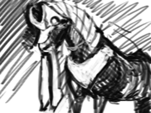

I'm also trying to learn to block out the pictures before starting properly.
As the character is meant to be a villain, and reminds me of a killer animal movie, I think a lot of dark inks would fit it well.
Learning to actually use contrast instead of just throwing it around will probably help me a lot in the long run, and it's hight time I stopped sitting on my hands and just did it.
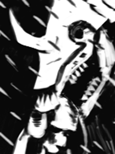
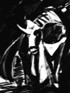

Cracking Skulls: Thank you for the tip. It got better with some tweaking, but it's still very weird. There isn't much control in the inking stage, but when I tried Gimp or Krita it worked way better with the exact same pressure configuration.

What exactly do you mean by tightening up? I feel like I wiggle around a lot and don't commit properly to the lines. Is that what you mean too, or is there something more that I can't see from the inside? I'm really thankful for any help pointing this stuff out.

Also, do you think making it traditionally with brushes and nibs would teach me more effectively? Would that translate to the digital medium well or would I need to learn it all over again in the pc?
« Last Edit: Nov 19, 2015, 09:49 AM by Rama »


Newest Comments -


Newest Characters -

 
Morrigan KingAugustus ThomasTheakonRod ChirpwoodHuskMizz BonzaiSpidella WidowsMyrmidonGhoulArcher Heart Mercury
 

Open Challenges -

 
No open challenges
Create a new challenge


Latest Topics -

 
Revelarts images 
Last updated: Revelarts - Apr 16, 2024, 02:38 PM
Revelarts-ubator  
Last updated: Revelarts - Apr 15, 2024, 10:25 PM
All News, All The Time 
Last updated: Staff Bot - Apr 14, 2024, 08:23 AM
Clown Jam 
Last updated: Radji - Feb 11, 2024, 04:51 AM
INTRODUCE YOURSELF 
Last updated: Maz - Nov 06, 2023, 04:13 PM
 

Latest Members -


Users online -

 
560 Guests, 1 User


[]

Most Online Today: 643.
Most Online Ever: 1,184 (Jan 13, 2020, 06:21 PM)


About Us

We exist to provide an environment for artists to learn and improve their sequential art skills competitively. Our community is designed to give critical feedback and encouragement to our many members the world over, at all skill levels.

Follow Us