Glad you finiushed the first part of this comic, dan, I liked it. I was gonna say few crits but spaceninja already told what I was gonna say.. but I'll just re emphasize that you prolly should loosen your figures more, they felt like action figures atm, but man, your backgrounds are pretty ace, still try to be more loose and less detailed in some places (liek facial features.. sometimes simpler is better) I like the writing, I can't wait to see more from youse.
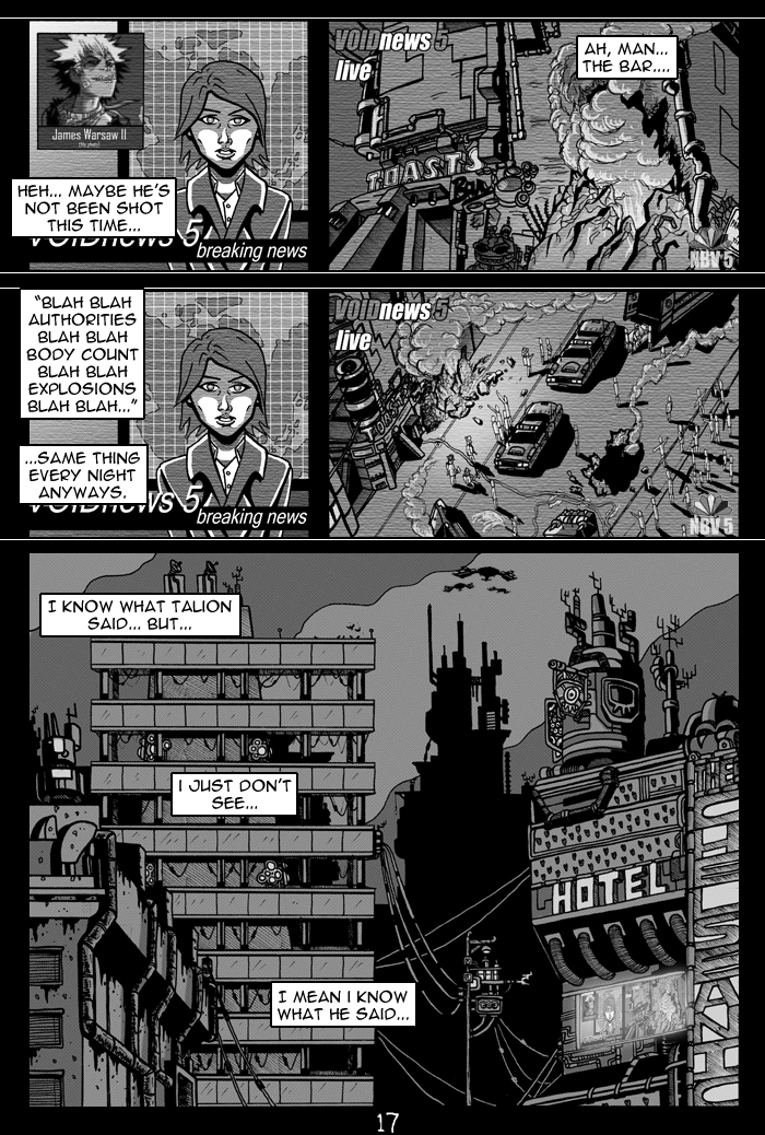
That's my bad what I said wasn't exactly right. The biggest problem with that panel is that the closest building is drawn like the viewer is just a bit below the bottom of the panel, and the building behind is seen from straight on and without significant perspective, when it should be seen from below as well. The building on the right being diagonal to the other buildings and the building in the foreground being angled slightly to the left aren't the problem per se, but with the already confusing perspective it's difficult to discern what can be attributed to the angle of the buildings and what's just inconsistent perspective.
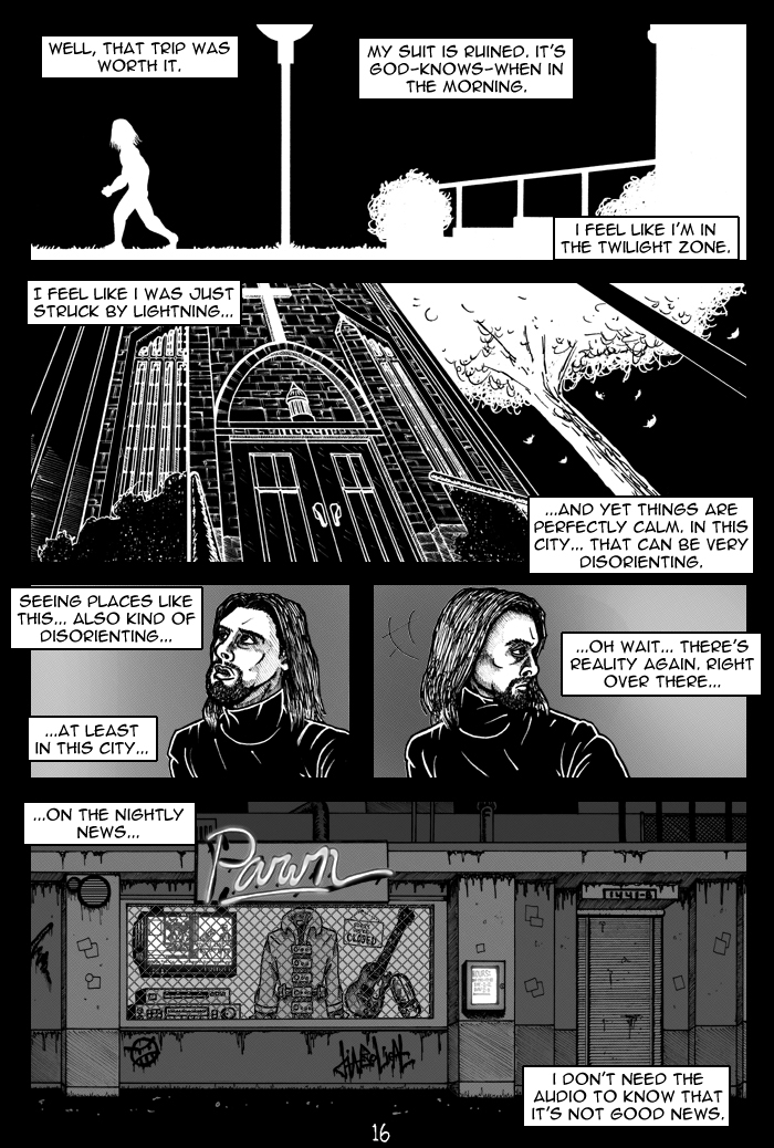
hahaha most in-depth crit I've ever received on this site right there, I think. You are right about everything I think, but I wanna defend that panel on the bottom of page 16... in a lot of big cities, not all the buildings will aim the same way, or be on the same plane of perspective as each other. Some streets run diagonally to other streets that are perpendicular, some are curved, ect... so it makes sense that some of the buildings would aim differently... at least to me. I could have drawn more in and whatnot to better illustrate that... I'll make up for that in part 2. Other than that though, thanks for putting such an effort in, spaceninja. That was awesome.
Lots of improvement and effort here. By far the best comic you've done, quality wise. That said, there were a number of areas you could improve on. I won't go into detail on stuff that's already been covered but I definitely agree about the hair.
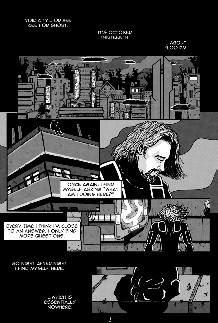
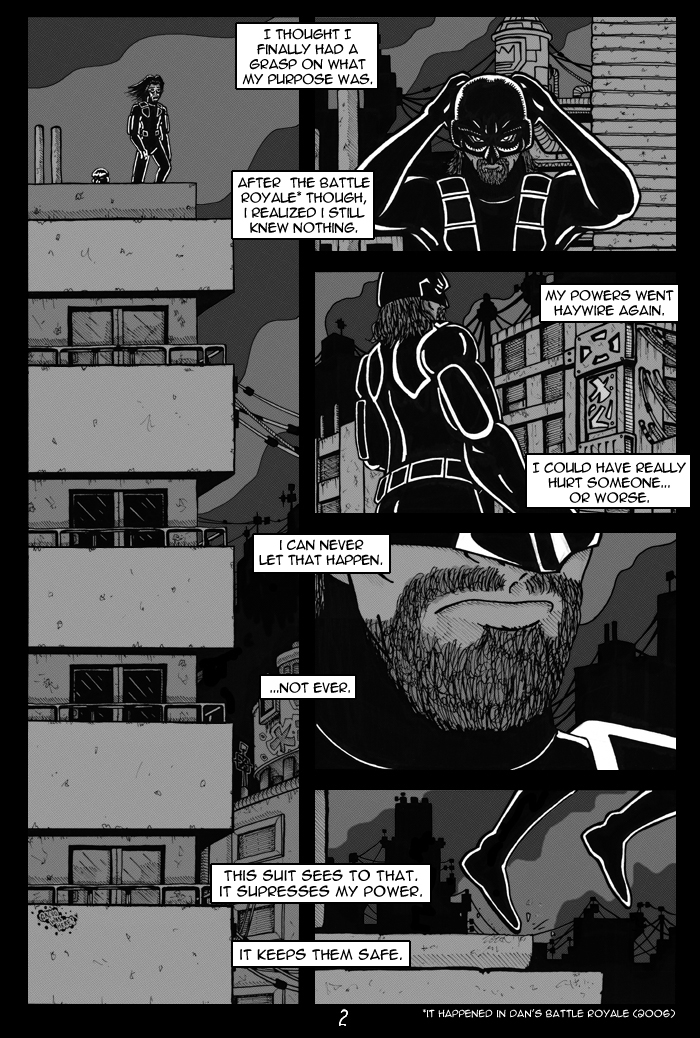
Perspective was one of the first things I noticed. Many of your cityscape backgrounds lack depth. They look like a picture taken from a mile away. For example, page 2 panel 1. We see the overhangs on the building receding diagonally downward, implying that we are viewing from below. However, the angle is the same from the highest overhang to the lowest. This panel was a great opportunity to use perspective to emphasize height creating an extremely eyecatching image, but instead it just looks plain and slightly off. Using a vanishing point at the bottom of the panel would have done wonders for it. Page 16 panel 5 seems to have a different vanishing point for each building as well as the aforementioned flatness.
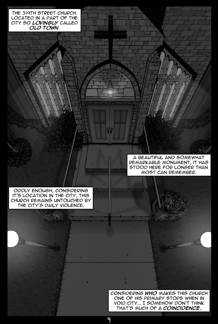
On the other hand, I thought the church page was great. It conveyed depth far better than your other panels and was easily your highest quality page. The one problem was that the walkway gets wider at a constant rate, even at the very bottom. With a wide angle shot like that, you can't use perfectly straight lines from the vanishing point. As the walkway gets to be directly below the viewer, the widening should taper off until the edges are parallel. The lamps convey this perspective, but the walkway doesn't and it's incongruent.
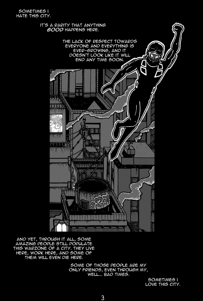
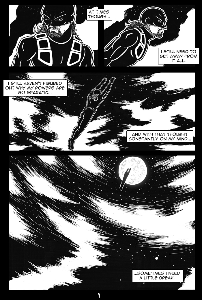
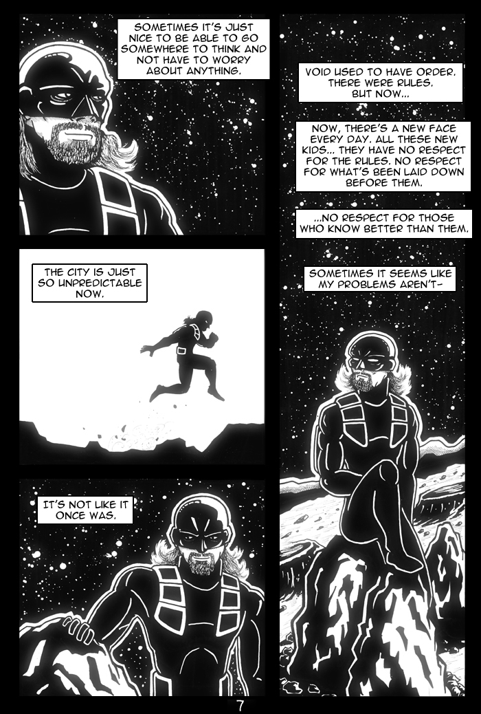
You need to work on loosening up your figures and giving them more energy. They tend to look angular and awkward. There are many examples of this: in page 2 panel 5 you show Dan leaping off the building, but there is no force conveyed. The foot that he's launching off with should be bent at the ball of the foot, with the toes flush against the roof. Page 3: the proportions are off (his head is too big) and his pose looks goofy. Page 4: the pictures of him flying don't convey forward motion. Page 7 panel 2: very angular and silly looking. The legs are at a 90 degree angle, as are the bends in the knees. I won't go on from there, but there are similar problems throughout.
You should work on your figure drawing and just spend more time roughing out poses. You clearly spent a great deal of time on the backgrounds, so there's no reason to cut corners with the figures. If nothing else, spending a little less time on the backgrounds to spend more time roughing out poses would improve your work.
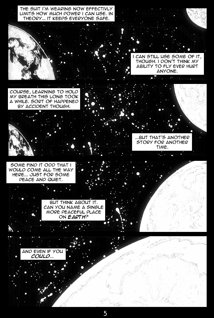
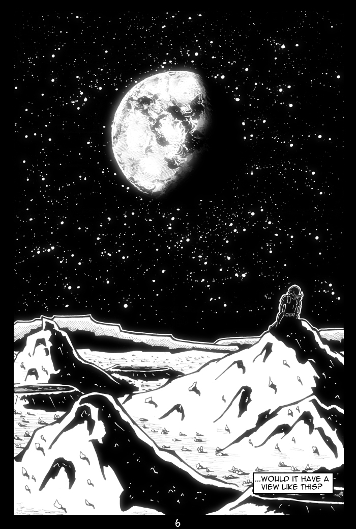
This last comment may just be personal preference, but I'll lay it out anyway. I didn't like your frequent use of white outlines. I find them distracting, and think they should be avoided whenever possible. Certainly, they shouldn't be as thick as you often made them. I understand that, when working in black and white, you sometimes need them to convey form, but in your comic they were largely superfluous. You put highlights around the edge of Dan's costume in almost every panel, so you didn't need an extra white outline to convey shape. Omitting the white outlines would have been less work and would have given a better result, so I think you should seriously consider it when drawing your next comic.
so I'm kinda too much of a newbie here to be terribly familiar with the character and some references, but it has a classicy void vibe to it, if that makes sense [or doesn't sound to dumb haha].
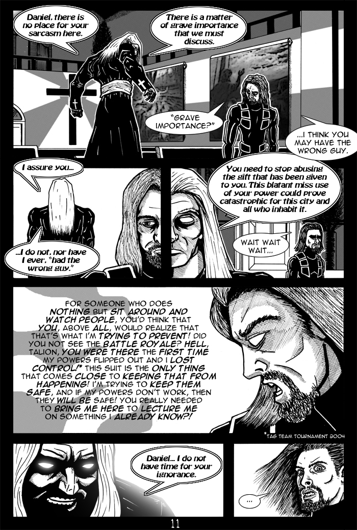
I'll have to go with phil on the less-is-more thing, for hair, and for hatching maybe. you've done an admirable job with it no doubt, but it looks to heavy in places. either lighten it up or maybe try making it look more gradual or something. urgh I'm failing at this crit sorry. a few anatomy hiccups here and there, but really this looks super swell! I wish I could do big stories, I'm jealous. :I
so definitely do more, I wanna see what happens next!
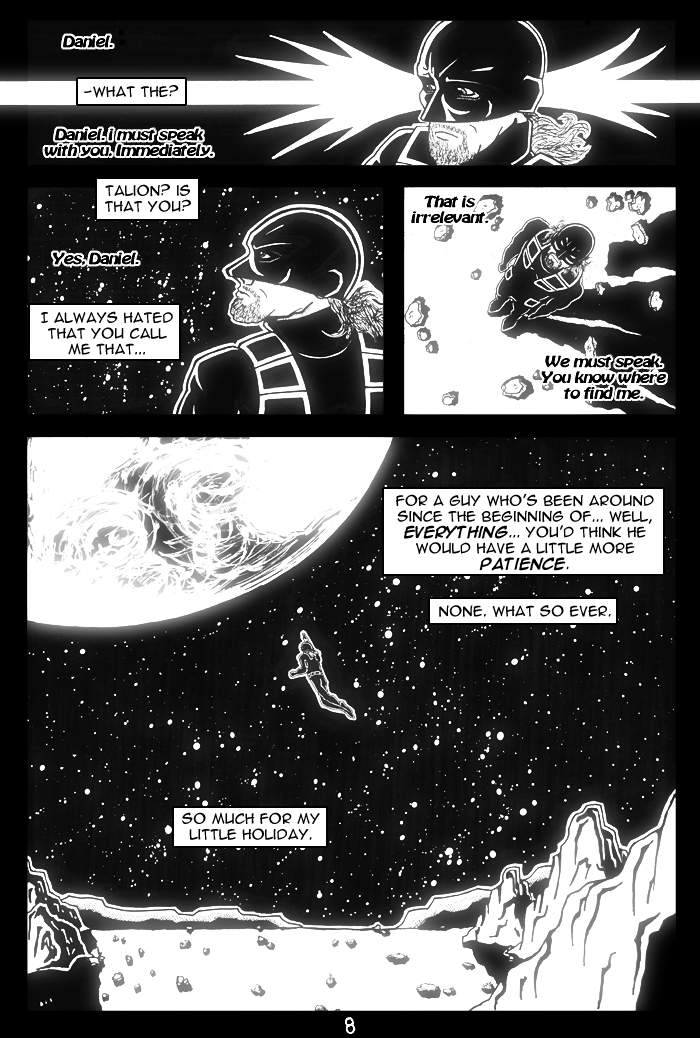
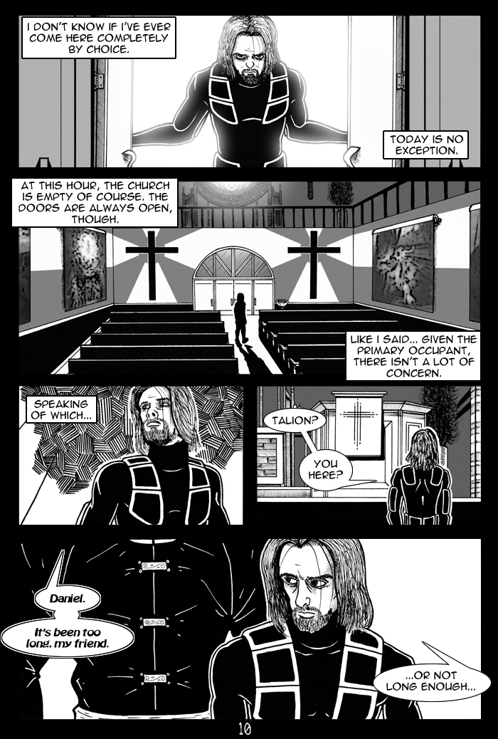
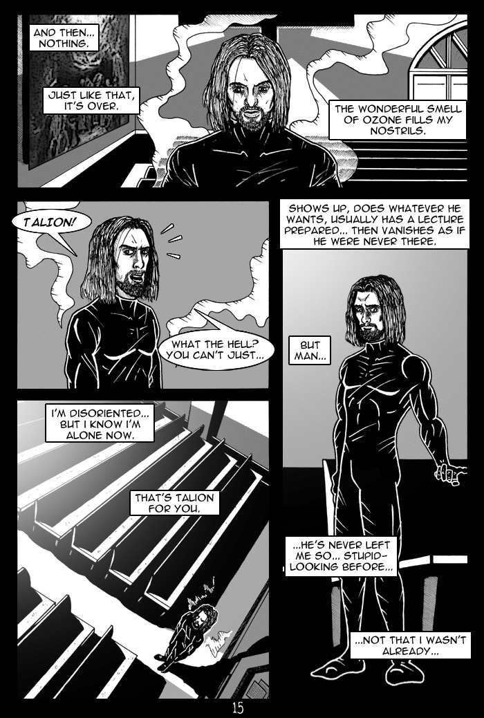
Hahaha Phill... if I had a nickel for each time i was told about the hair and beard... I dunno why, but I just can't shake that. It'll be different soon enough though (as in Dan's whole appearance will be changing a bit) and hopefully for the better. As for James influence... when I think of Void City... I think Blade Runner, Equilibrium, and well, how James draws the city. He's nailed it dead on... and while I'm not gonna dead out copy him, I want to keep that look alive, the look he brought us. I think it captures the city's vibe the best. As for what Toast's bar looks like... he DEFINITELY caught that best, and I wanted it to look the same for continuity's sake. This story is going to have a LOT of cameo's and event tie-ins. That doesn't happen enough in Void... and it should. There weren't really any cameo's besides Talion in this one yet (well, and James on tv) but I DID try to sneak a few \"Easter Eggs\" in there... such as graffiti on the ledge of the building that Dan is on reading \"Galvo was here\" (it's one of his many old pads)... a Pulpo billboard on page 3, a glimpse on page 12 of my new version of Toolio, Page 16 had Phill's original Void coat in the window, along with Wei's character's little side kick guy (who's name escapes me), and of course page 17 has the Void News 5 gal from the Void news page, and scenes from the James vs. Monday scar match.
Part 2 will feature more cameos... and more familiar events, and will continue the Count Down... To Final Hour.
OK, I'm glad you're back in the game Dan, Shelde certainly did a number on ya. But now it's time for me to nit pick! BWA HA HA HA HA HA!!
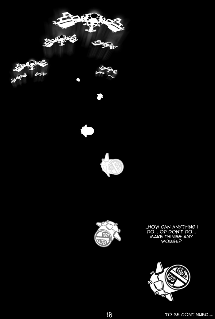
OK, first of all the comic overall looks great dude, you've got a nice set of inks, and tones and any negative space is properly filled up with great details. I do wonder why you made pixel ships/flying cars on page one though, it's a nice look and all, on that toned background, but it seems so out of place to me, and I would of liked to see some more detail on the ships that are closest to the viewer.
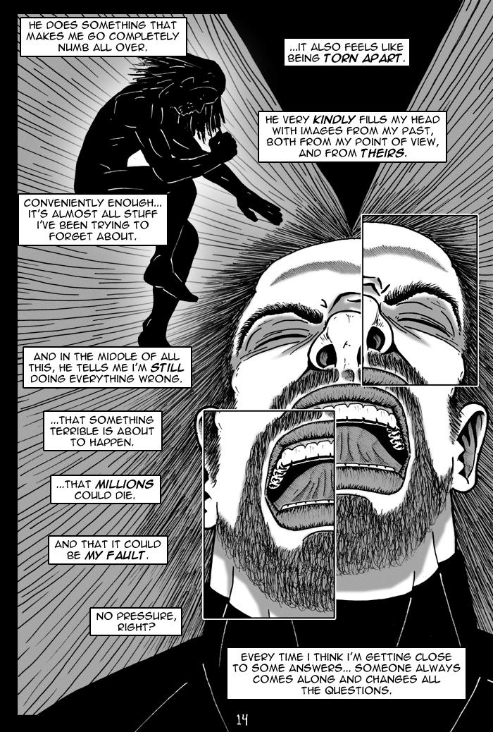
I do have a slight suggestion about the hair on Dan the fighter for ya. Lighten up on the details! You don't need to draw every single strand of hair on the top of his head or his chin, page 2's up-close shot of the bottom half of his face looked more like he had a bad case of the scribbles than hair dude. Take an example from your current fighter icon, I believe Jing drew it? Anyway, notice how there's not a whole lot of detail and yet you know the guy has long hair and a nicely trimmed beard and mustache, but you can also see it's detailed enough so it looks a bit messy as well. What I'm basically trying to say is less is more. You don't need to have a ton of details in the hair to make it look like hair. Ya dig? ;3
Now I'm loving what you're doing with the backgrounds, though I'm sensing the influence of James within them, it's nice to see so many details and dark tones, but I'm curious as to how you'll handle a daylight scenario now. I did love that shot of the church though, but I must say that lawn is awfully hairy lookin'.
Other than that, the story was pretty straight forward, it was a nice read overall and a breath of fresh air from the other stories that have been put forward lately. I also noticed a familiar looking coat in one of the backgrounds, also despite my long critique this is a very impressive looking comic so far. High marks for ya, but some things need to be tweaked a bit.
Sorry for the long critique BTW. Now you've got me interested in seeing this finished. Better not disappoint and submit the next half as soon as you can!
Hahaha, thanks man. That's the aim. I've got a list going of any issues anyone comes up with with this part, and will be addressing all of them in part 2.
Triple A Biaa your anatomy can still seem wonkety at times but damn, some of these backgrounds just bleed hours of work in them.
The writing pretty much CARRIED this piece and flew with it to the moon and back- I find myself actually thinking of things to do in void with such hulk strong continuity tie-in which I dont see a whole lot these days.
And hell, Dan's concept of classical values is very well portrayed here as the theme even if read by itself.
But yeah- I'm gonna hold you to get part two done = and major pluses if you can get it done better than this one, and in a shorter time.
Haha, part of the reason for actually POSTING it, my friend. If there's something out there that people have seen (and they hopefully liked it) then I am more pressed to get the next part done faster. Thanks for the comments! Keep em coming!
Very enjoyable read Dan. But that's not the surprising part. The surprising part is that you actually drew a comic! AHHHH!
haha.
I have to say, your environments look amazing. Totally groovy.
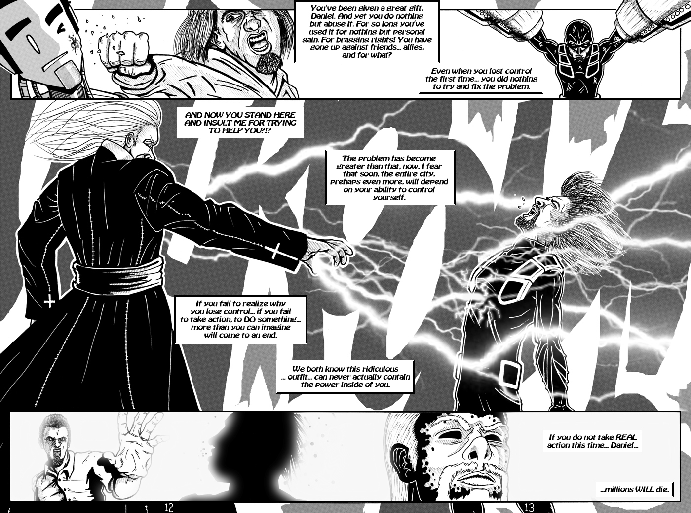
Page 13... He's totally chargin' his laser.
good job, and I look forward to part deuce.... which could take who knows how long to do. haha.

Comments (13)