

betito: Your linework is really crisp and clean, and I like how you stylized your opponent's characters. However, the lack of backgrounds, action lines and similar elements makes the comic feel a little bit empty and motionless. I think you fell into the same trap I did in my battle, focusing on the characters without giving enough time or attention to the life of their environment and motion. And since I don't know anything about medarot, the comic left me with a WTF moment. It felt really anti-climactic. I hope we can see more complete, finished comics from you in the future! I really like your style!
abi: I love your informational pages at the beginning of each battle! Keep doing them! It's cool and thematic! My biggest pet peeve with your comics is that the pages are always so huge on my screen. I can't even fit the first panel of page 2 on my screen at once! It very much breaks up the action and makes it harder to follow what's going on. Other than that, your artwork is beautiful. On page seven, first panel I could hear her robotic parts moving, gears or whatever making that buzzing sound of a machine transforming. I could hear Kuno's robotic, but still human voice in my head. I don't know what you did, but you did it. That was awesome. And I love how you used colors to display character and build up tension up to that page. Also, CAMEOS! Oh my gosh! I love cameos too much probably, and you just made my day. The story was very well done, and I honestly have no complaints. My only other nitpick would be that there is some inconsistency in the characters' faces and bodies and a few points where they don't look quite natural. I also had a hard time distinguishing Voltaica and Gota from each other sometimes, probably just because of how much was going on all the time. Overall, though, AWESOME BATTLE MAN!
Voltaica y Gota vs. Hakase and Kuno
Critiques & Comments
# 11
Posted:
Feb 8 2013, 01:46 PM
# 10
Posted:
Feb 8 2013, 12:03 PM
betito: It took me the second to realize it was a medarot reference - as Mintely already pointed out, this can be confusing when a reader doesn't understand the context. While it was nice and simplistic, the fact that it was a silent action comic wasn't too effective to convey the story. On the plus side, I love your inks and I hope next time you have more time to put out a more complete story.
ABI: First off, thank you for the cameos! It was a very pleasant surprise.
I can see that you have put a lot of thought into your characters and that you have a lot planned for Hakase and Kuno in terms of story. I like how you made your opponent's characters fit seamlessly into your world as well.
My only nitpick is that I think your lines are sometimes a bit too thick, especially when you do curls. On the other hand, you seem fine with the straight edges, like Kuno's straight bangs and Voltaica's jagged ponytail. For example with page 7 and 8 of your comic, the lining of Gota's twin tails feel like they stand out unnaturally and look segmented. You can try making the lines finer for an overall crisper look.

# 9
Posted:
Feb 6 2013, 10:44 PM
@betito: I thought your side was really cute, especially because I loved medabots (and honestly still do), but I also realized something when looking through the comments and saw Kozi's. While a comic like this is interesting in its own right, it can be very confusing for people who don't know your character - the designs are pretty different here, and there's no text either to back up what you have, so it's possible people may look and see your characters as they are drawn within your first few pages.
I think one thing that could've happened here is to have the normal characters before hand and have it transition into the tweaked style, just to give a clueless audience member a better idea of who your character actually is. Liken it to picking up a spinoff series by accident and thinking the entire series is like that - depending on the interperetation here, some people may be really turned off by it, and bypass the whole thing, or really enjoy the spinoff, and not enjoy the 'different' main style.
@ABI: Overall I think you had a lot of great movement in this comic, and I also think you really succeeded in generating interest in the character. The real turning point for me, or I guess I should say he point I got hooked on your comic, was the panel with Danielle making her comment on page 7. It also a really unique idea which you pulled off very well. I do have a couple nitpicks here and there though.
The first would be page 2, the building at the top of the cliff - the way you had drawn the building to the left so that it appears three-dimensional feels like it detracts from the remaining two buildings. Also with the largest, middle building, lines coming down from its roof on both sides just kind of end, and I was a bit thrown off by it. That one building combined with the super detailed rocks and waterfall really takes away from the scene here, I think.
My only other gripe here is on page 5, panel 2, where the outer edge of the ring is visible. The line remains uniform as it goes across the page, intersecting with your speed lines and kind of causing a sort of separation. The speed lines above and below, again this could just be me, appear to not really mesh well due to the arena border's presence. Not to say it shouldn't have existed at all, but maybe that it could have faded out in the same manner as the rest of the scene behind Ethos.
Whew! I hope you guys find something useful in this textwall haha, I thoroughly enjoyed both of your comics and hope to see you both battling soon!

# 8
Posted:
Feb 6 2013, 03:41 AM
Betito: The medabots idea was really cute! I was hoping there would be a bit more to it, but I liked the silent comic style that you did. Even your 'regular' Kuno was cute.
ABI: This blew me away. Also, what's the scoop on the characters you drew for the board of directors? I'm curious about them.
ABI: This blew me away. Also, what's the scoop on the characters you drew for the board of directors? I'm curious about them.

# 7
Posted:
Feb 5 2013, 10:31 AM
@betito: It took me a while to get it, but i'm guessing you're making a medabots gag? I found it troublesome when i had to differentiate one figure from another and what limbs were which to the point that they became abstracted, especially once figures began to interact with each other or moved in different perspectives, a problem that arose from a lack of differentiation from kind of line with another. I could the spindly nature of your figures as a factor, but because that's the style you decided to use for your characterizations, it was an issue you were going to have to deal with. There seems to be evidence that you tried by using line variations to show one object closer than the other, but in the end your attempt to create depth with just lines wasn't working.
@badidea: This is a battle in the fullest sense of the word, which is pretty uncommon to read here in void. The shonen manga battle sequence including all the sideliner explanations was entertaining to read and i even chuckled a bit at your semi-satirical plot. Your panel work however is suffering a bit because all your lineart is similar in size to the panel borders and gutters, which made differentiating one sequence from another on a page a little troublesome. The reading experience too suffers from your over-average pixel dimensions, 500-700 pixels in width usually works well, anything above could detract from the reading experience.
@badidea: This is a battle in the fullest sense of the word, which is pretty uncommon to read here in void. The shonen manga battle sequence including all the sideliner explanations was entertaining to read and i even chuckled a bit at your semi-satirical plot. Your panel work however is suffering a bit because all your lineart is similar in size to the panel borders and gutters, which made differentiating one sequence from another on a page a little troublesome. The reading experience too suffers from your over-average pixel dimensions, 500-700 pixels in width usually works well, anything above could detract from the reading experience.

# 6
Posted:
Feb 4 2013, 11:37 PM
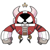
BETITO- Hey there! I don't think I've seen your fighters before, but talk about a tantalizing trinity! The characters designs were great and I love how you stylized Kuno into a spindly robot to match your fighters. Definitely something that worked to your advantage I think in terms of cohesiveness. I'm not going to lie that all in all it was all just pretty pictures. I have no idea what was going on...or if there was anything going on. Didn't quite read as a a story much less a comic battle.
A-BAD-IDEA- I think I learn more about fighting reading your battles, haha! Such a great match up- not only because of the battle sequence, but the build up to it. The world you've woven around Hakase and Kuno is really engaging and complimentary to their theme. The board of directors was an especially nice touch in order to explain where they get their money. You did justice to your opponents fighters by portraying them in a very flattering light. I feel I got to know them better in your comic!
A-BAD-IDEA- I think I learn more about fighting reading your battles, haha! Such a great match up- not only because of the battle sequence, but the build up to it. The world you've woven around Hakase and Kuno is really engaging and complimentary to their theme. The board of directors was an especially nice touch in order to explain where they get their money. You did justice to your opponents fighters by portraying them in a very flattering light. I feel I got to know them better in your comic!

# 5
Posted:
Feb 3 2013, 05:47 PM
ABI, how intense! You sure can do a battle sequence! I liked your limited colour palette too! Betito, I liked the adorable mini-style of the characters as drawn in the comic they were reading! Though I hard a hard time following why they were fighting the first read through, had to go back. Both of you have really great lines and black and white. I don't even know what else to say lol great job guys!
# 4
Posted:
Feb 2 2013, 11:22 PM
Uploaded
Sorry, I haven't had too much time
Sorry, I haven't had too much time

# 3
Posted:
Feb 2 2013, 12:42 AM
Uploaded! LET'S SEE SOME SCIENCE!
# 2
Posted:
Jan 13 2013, 01:47 PM
all right! great matchup!
# 1
Posted:
Jan 13 2013, 01:44 PM
SCIENCE! FIGHTING!
Comic Details

Regular Match
Drawing Time:
2 weeks + 1
Ended:
Feb 9th, 2013
Votes Cast:
25
Page Views:
1878
Winner:
A Bad Idea
Add to Playlist
Newest Comments

Help Needed
Theakon
@ 2:19 PM Apr 16th

einsam
Colbitzer
@ 6:46 AM Apr 16th

The Great Switcheroo
Louise Ambre-Aliona vs. Luniel Gekka
@ 3:26 AM Apr 15th

The Great Switcheroo
Colbitzer vs. Veruca Chance
@ 5:22 PM Apr 14th

Monsters of Nature
Dairyu vs. Rickter & Gus
@ 5:06 AM Apr 5th
Newest Characters


Open Challenges
Random Comic
Most Wanted


Latest Topics
| ||
| ||
| ||
| ||
|

Latest Members
Users online
155 Guests, 1 User
Most Online Today: 181.
Most Online Ever: 1,184 (Jan 13, 2020, 06:21 PM)
Artist
ABI: I love your clean style, and the dynamic way you present the girls in action sequences! I don't really like that crosshatchy tone you use on a few of the backgrounds--looks a bit busy to me--but overall your background work is great, especially both the interior and exterior designs on the temple. Keep up the great work--these science martial artists are really interesting to read! (also, yeah the pages are really big to me too!