
Amazing David... Page 14.
One of my favorite things on Void ever.
Thought you should know.
Ethel Chu vs. Kaniq
Critiques & Comments
# 24
Posted:
Mar 1 2010, 05:48 PM

# 23
Posted:
Feb 27 2010, 02:40 PM
Haha I enjoyed the Ethel Chu story lots, but like Galvo, I thought she was really hairy at first during the flashback. The sex scene is fine and whatever.
Monkey, the penguin is a formidable dude haha. But your shading could go further, it feels very conservative.
Monkey, the penguin is a formidable dude haha. But your shading could go further, it feels very conservative.

# 22
Posted:
Feb 23 2010, 07:13 PM
This was a fun battle to read =).

# 21
Posted:
Feb 23 2010, 04:27 PM
Mr. Amazing: ah loved the story line, well illustrated without much dialog. Good mixture of comedy, romance, flashbacks, and that fun movie jazz. The inkwork did well with your style for this comic. Seems a bit rushed at some points.
Monkeh: Nice work, though the "yellow-action expressions" may work out better if a bit brighter. Then again it could be my monitor. The pen can be a rather mighty weapon.
overall nice work guys
Monkeh: Nice work, though the "yellow-action expressions" may work out better if a bit brighter. Then again it could be my monitor. The pen can be a rather mighty weapon.
overall nice work guys

# 20
Posted:
Feb 22 2010, 09:23 PM
Coatl: I like the ninja nazis.
Quote
Nazinjas !!!!
# 19
Posted:
Feb 22 2010, 09:16 PM
I like the ninja nazis.
# 18
Posted:
Feb 22 2010, 03:00 PM
david-- man i was CRACKING UP when it went to 1963, looked like ehtel was HARRRRRYYY AS HELL, but then i realized it was just shadow scratch work, -- and then the embraced and i fell in love-- GREAT work with the action man, and the b&w work is fucking superb.
monkey-- the colors man, i love yer color palletes -- but the story was just bland, cute but bland amigo..
gave the win to the hard working david!
monkey-- the colors man, i love yer color palletes -- but the story was just bland, cute but bland amigo..
gave the win to the hard working david!
# 17
Posted:
Feb 22 2010, 01:29 PM
Philly C: Right on...You know what's funny about the sex scene...I thought that was the Phillip C version I actually took your advice from the last go round...I was gonna put like a "Penguin Sex" banner across the nether bits but then I said whatever...Also with the break up scene I had a bunch of exposition to explain it..then I was thinking "Less is more" but after looking at it again it does come off a bit sudden...IF it makes you feel any better I was going to explain the whole thing in the next comic...if I get to do one...
thanks Philly C
thanks Philly C

# 16
Posted:
Feb 22 2010, 01:00 PM
Alright alright, if you insist.
The one thing that popped out the most was the text at the beginning, I know you've got a week of time, but I think you can get away with a font like Letter O' Matic and it'd still look nice and clean. The first couple of comic pages were OK, but I think you do the same thing Knome does with his inks, it looks like it was scribbled in and it really makes your pages a bit too chaotic, the flashback pages are what you should do more often, very clear and clean.
The story I thought was OK, the past was pretty clever I'll admit, but (this might get everybody on my ass once again), I really think the sex scene could of been downplayed a bit. I'm not saying you should remove it, but I think the shot could of been better if you weren't focusing on the two, like a silhouette of the couple in the bed in the background and maybe some clothing in the foreground? This is just my way of thinking "Less is more", the less you see of something (violence, sex) the more impact it usually has. Just don't get bleedman with the action scenes and you should be AOK. The actual story however wasn't so great, why did the two break up? One page they're making out, the next they're shouting at each other? What just happened? Ethel has no real motivation to kill Kaniq other than they just broke up.
This is one moment that you could easily get away with some exposition, explain why they broke up and a little about their past, give the reader a reason to cheer for Ethel otherwise she'll just look like some bitter ol' bitch.
That's all I really have to say.
# 15
Posted:
Feb 22 2010, 12:59 PM
michaelharris: um... by my recollection, this is at least the third time you have bastardized the alphabet. It is getting better, but it's better in the way that spraying febreeze on a dead body hoping to cover the odor is better.
Quote
Nah I'm pretty happy with my progression...I think it's more like...The way a 2 yr old eats..it's not pretty but it's getting the job done...So Ima still say fuck you...

# 14
Posted:
Feb 22 2010, 09:44 AM
um... by my recollection, this is at least the third time you have bastardized the alphabet. It is getting better, but it's better in the way that spraying febreeze on a dead body hoping to cover the odor is better.
# 13
Posted:
Feb 22 2010, 08:49 AM
You know..this might be the only place in the world where you are only given 1 chance to get better at something and if you don't do it immediately you are shat upon...
Fuck you Mike Ima keep hand lettering just to keep reading your complaints...
Fuck you Mike Ima keep hand lettering just to keep reading your complaints...

# 12
Posted:
Feb 22 2010, 08:18 AM
Dave: I've never seen the point in hand lettering in digital... traditional yeah, digital... not really. If you're going to insist--make your letters into photoshop brushes or something! I've done that with magic symbols....
Monkey: Still got that funky halo thing goin' on around some of your lines. Set your line layer to multiply and color under them. Tuts in the forums.
Monkey: Still got that funky halo thing goin' on around some of your lines. Set your line layer to multiply and color under them. Tuts in the forums.
# 11
Posted:
Feb 22 2010, 08:06 AM
Monkey: this was pretty fun, I want to see some more quality backgrounds from you though, they were pretty good, but if they were better it would greatly improve your style. I liked the color scheme.
Dave: Please stop hand lettering. Please. Please... Pretty please with sugar on top. There has to be a font that looks like hand lettering out there somewhere. Please.
Phil: Quit crying, if you have something to say, say it.
Dave: Please stop the hand lettering. For the love of God.
Dave: Please stop hand lettering. Please. Please... Pretty please with sugar on top. There has to be a font that looks like hand lettering out there somewhere. Please.
Phil: Quit crying, if you have something to say, say it.
Dave: Please stop the hand lettering. For the love of God.
# 10
Posted:
Feb 22 2010, 07:09 AM
Phillip C: I'd comment on yours AD, but I don't think you and Michael like hearing what I have to say. Regardless, I gave you my vote.
.
Quote
WHAAAATT!!!??? I solely credit your advice on lettering for getting better at all...I've always valued your advice because you say what you think....I'd really like to hear what you have to say...
# 9
Posted:
Feb 22 2010, 06:17 AM
I'd comment on yours AD, but I don't think you and Michael like hearing what I have to say. Regardless, I gave you my vote.
Holy Monkey: Not bad dude, linework was very pixelated and whatnot in the first page, could of used some backgrounds. Story was kinda funny, but the ending was pretty much the same thing I've seen in every SDT.
Holy Monkey: Not bad dude, linework was very pixelated and whatnot in the first page, could of used some backgrounds. Story was kinda funny, but the ending was pretty much the same thing I've seen in every SDT.

# 8
Posted:
Feb 22 2010, 03:41 AM
David- SWERVE! nice
Monkey-This came off as an old people fight!Can't argue it at all.
Monkey-This came off as an old people fight!Can't argue it at all.
# 7
Posted:
Feb 21 2010, 04:14 PM
Uploaded...woot woot!
# 6
Posted:
Feb 21 2010, 02:49 PM
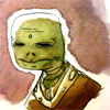
Yeah my votes going to the old person.
well the one with the saggy face.
you know the one that I wouldn't be surprised if they knew martial arts.
well the one with the saggy face.
you know the one that I wouldn't be surprised if they knew martial arts.
# 5
Posted:
Feb 18 2010, 10:18 AM
DrasticFantastic: This better take place in a retirement home. Or I'm gonna be REEEEEEEEEEEEALLY UPSET.
Quote
I'll do it just for yooouu..

# 4
Posted:
Feb 16 2010, 06:42 AM
Granny battle!
# 3
Posted:
Feb 16 2010, 01:40 AM
This better take place in a retirement home. Or I'm gonna be REEEEEEEEEEEEALLY UPSET.

# 2
Posted:
Feb 15 2010, 04:20 PM
Amazing David vs. Brazil ROUND 2!
# 1
Posted:
Feb 15 2010, 02:08 PM
Two old birds are gonna go at it.
Comic Details

Speed Death Tournament Match
Drawing Time:
1 week
Ended:
Mar 1st, 2010
Votes Cast:
45
Page Views:
2372
Winner:
amazingdavid
Add to Playlist
Newest Comments

einsam
Colbitzer
@ 3:32 PM Apr 17th

Birthright
Saal, Louise Ambre-Aliona, and Llaana
@ 3:44 PM Apr 16th
Help Needed
Theakon
@ 2:19 PM Apr 16th

The Great Switcheroo
Louise Ambre-Aliona vs. Luniel Gekka
@ 3:26 AM Apr 15th
The Great Switcheroo
Colbitzer vs. Veruca Chance
@ 5:22 PM Apr 14th
Newest Characters


Open Challenges
Random Comic


Most Wanted


Latest Topics
| ||
| ||
| ||
| ||
|

Latest Members
Users online
433 Guests, 0 Users
Most Online Today: 452.
Most Online Ever: 1,184 (Jan 13, 2020, 06:21 PM)
Artist
Monkey: Your art was consistent and nice and clean throughout. Like Gabe said though, it was just bland. I think it was too run-of-the-mill plot-wise and the odd dialogue didn't help. Overall very solid work in the tourney, you are definitely talented at comics and I hope to see more from you here on void.