William_Duel's Crap(lots of it)

William_Duel's Crap(lots of it)
« on: Feb 26, 2009, 07:48 PM »
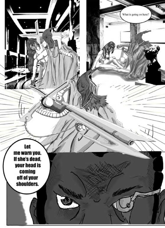
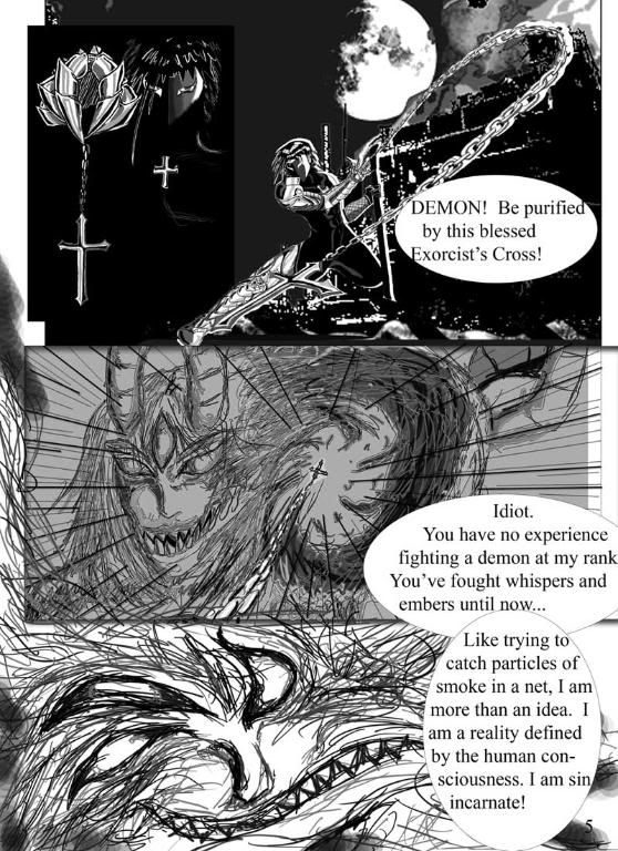
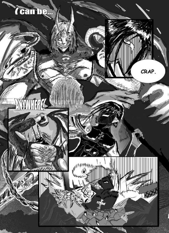
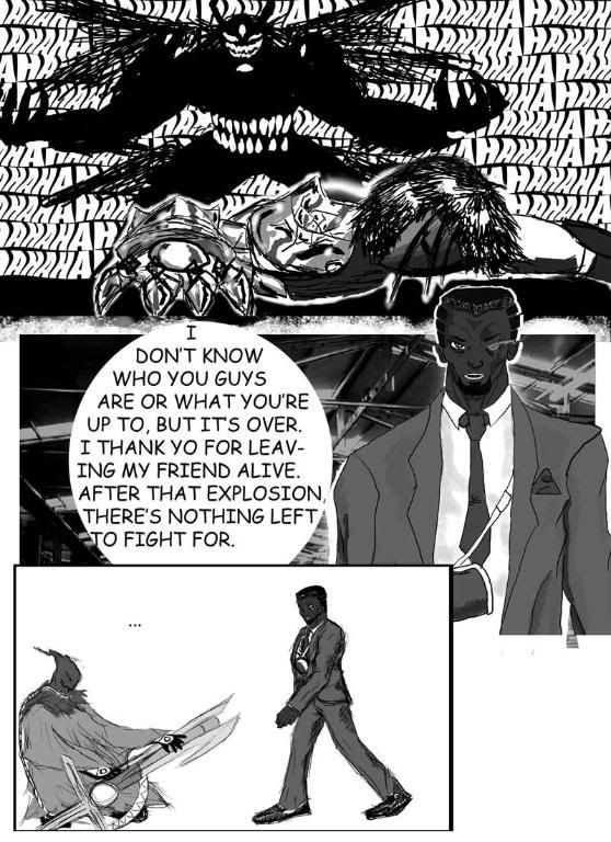
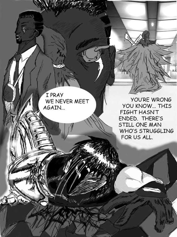
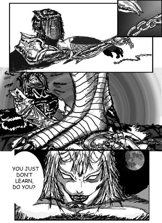
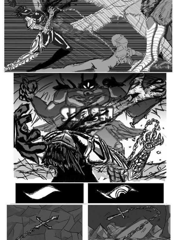
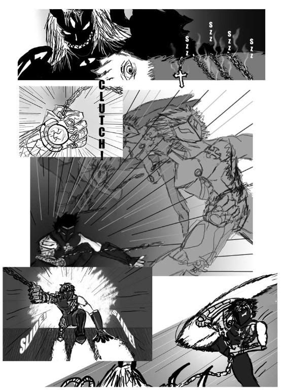
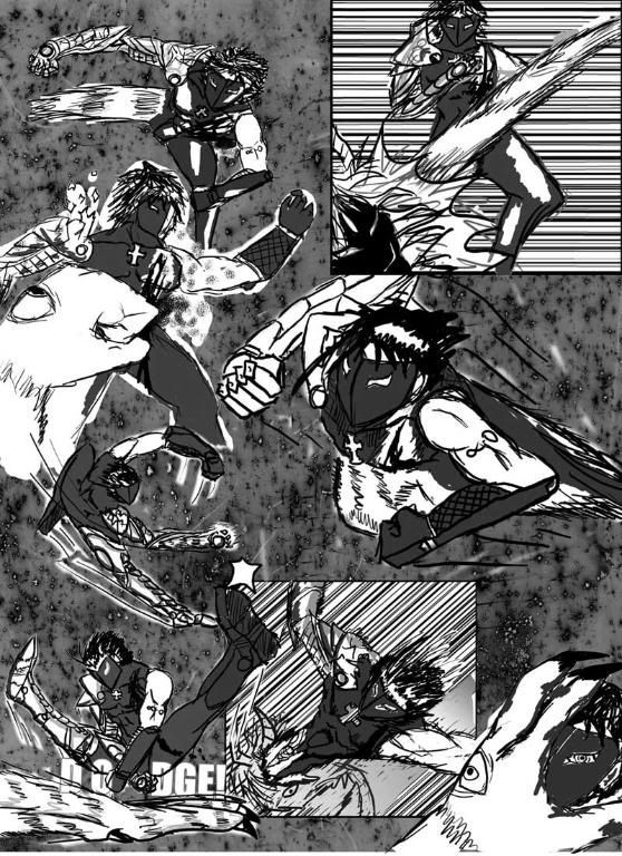
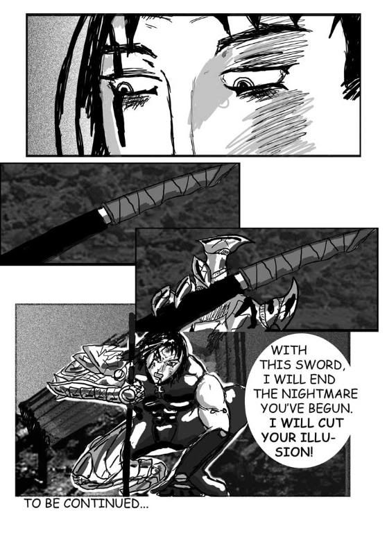
So I present to you my crap.  This is a comic I did for my photoshop class last semester.  It is also my first attempt at using the tablet.  I just want to point out a few things first.  Up until about page 7 or so, I used my sketches and traced over them and that's what the first seven pages are composed of.  Then I started to think that the process took too long, so I abandoned my pencil and began to draw solely on the tablet because it was faster.  The last five or so pages were done in one day (the day it was due) and the text was added rather hastily at the end (to me it's the worst part of it but it's not like I had fancy fonts to work with, it was school comp). 

I tested out various ideas and techniques, some things worked, some things came out rather crappily.  But it's nice in that it was my first completed comic.  There were other attempts and I present one of them towards the bottom.  The story isn't intended to make sense to anyone who reads it other than me, because it's actually a section far into my original story.  I just kind of wanted to see it for once.


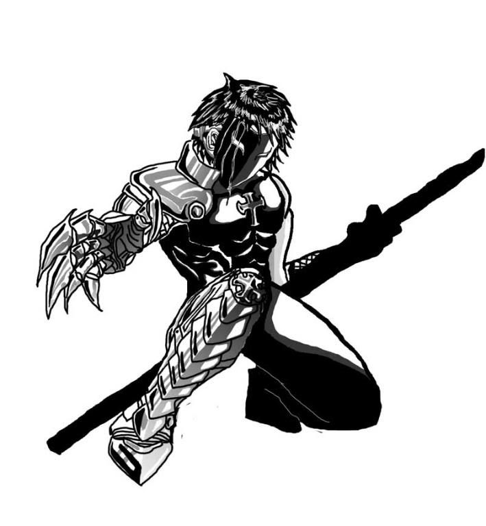
Most of my stories revolve around this character.  I invented him in elementary school and he is my dearest character, despite consistent claims that I ripped off Vega from Street Fighter (I will never stop being annoyed when I hear that...I thought I was pretty original back in the day).  His unmasked self, well it can be said that the Void character I am submitting is essentially a female version of him.  I'm sort of testing the waters in a way.

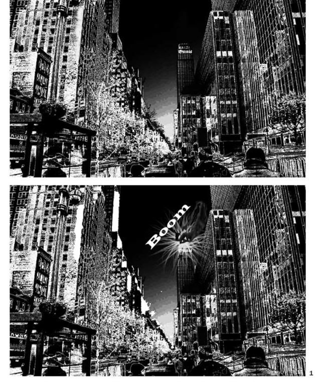
Obviously photo use here...there is much photo use in this comic.


This one is rather interesting because the background is the silver that comes up from an unfixed photo.  I thought the texture was interesting so I scanned it.


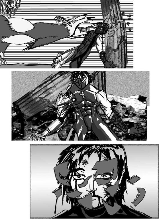
This is the full image of what is in the background of page 6:

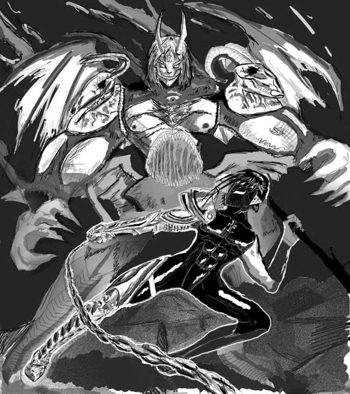
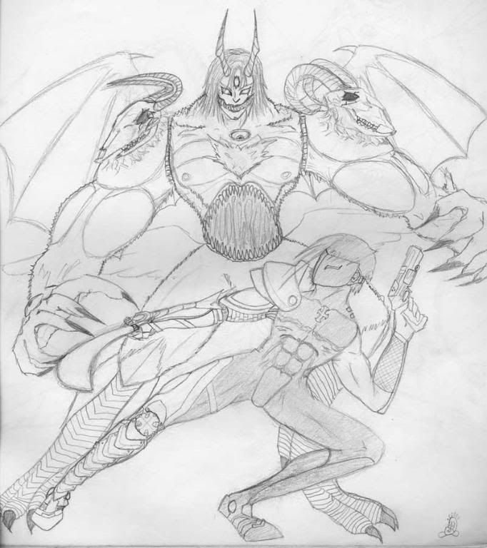
And this is the original pencil sketch.  This is actually a few years old but I always liked it and always wanted to do something with it:

Cutey Honey Fanart:

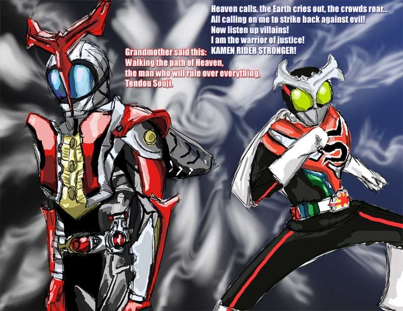
My two favorite Kamen Riders Fanart (old school meets new kinda thing):

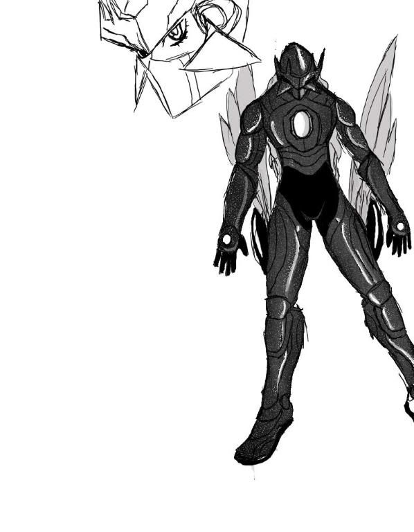
Potential Future Voider?  Just a quick sketch so I could remind myself of the design.  There is supposed to be something on the left but again, just a quick crappy little sketch...:

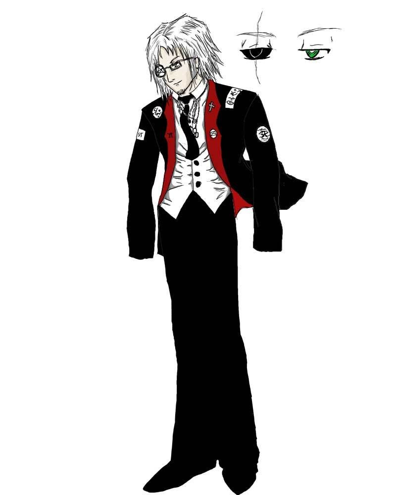
If I am able to get Soldat accepted and become comfortable and familiar with Void and prove I am capable then this will be the second character I will attempt to push through.  Mr. Magician.  Yes he should have hands but this is an incomplete drawing.

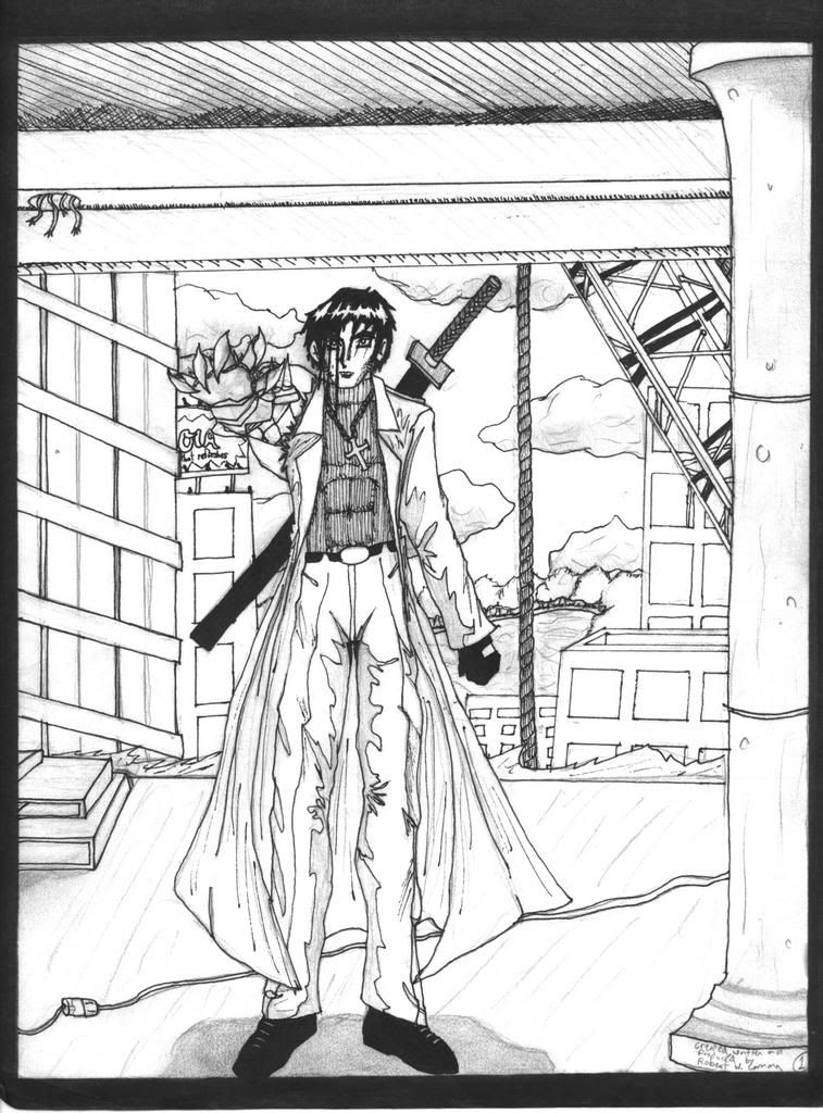
And to top off, an older comic book attempt with the same character done during high school.  Just pencil and ink:

There are more pages somewhere but this is probably enough.  If this is too much tell me and I will erase a few entries.  So yeah, most of these, basically all of these except for the too done in pencil (one in ink) were done on my tablet. 
« Last Edit: Feb 26, 2009, 10:27 PM by William_Duel »

*
Re: William_Duel's Crap(lots of it)
« Reply #1 on: Feb 26, 2009, 11:38 PM »
you need to draw your own backgrounds
MOST IMPROVED ARTIST 2016
MOST IMPROVED WRITER 2016

Re: William_Duel's Crap(lots of it)
« Reply #2 on: Feb 27, 2009, 12:19 AM »
you need to draw your own backgrounds


Quoted for emphasis, you need to draw backgrounds more often, you've got the pictures, it's time you start referencing them and learning from them. Other than that you've got some good stuff here, just try to get some facial studies under your belt if you can.
;-)

Re: William_Duel's Crap(lots of it)
« Reply #3 on: Feb 27, 2009, 10:44 AM »
there's too much texture in that comic... and lots of dense tones without any real light source. It makes it very confusing to look at. The lines too are very sketchy, try to make them more precise. And darker.

Re: William_Duel's Crap(lots of it)
« Reply #4 on: Feb 27, 2009, 01:23 PM »
Well the sketchy lines are a product of the tablet.  It was my first time using the Wacom tablet and it was how I compensated for my inability to draw good lines on it, and while I feel I got a little better, yeah everyone's been saying how rough my lines are.  While I want to improve on the tablet and be able to draw at a natural level, I will make the effort in pencil and ink and see if that is better.  Since the lines have been called to my attention I'm starting to wonder...if perhaps the way I naturally draw lines is a problem in itself...>.>;

Your too much texture comment... I wonder if you are referring to my grays?  You see I took note of the fact while I was drawing that yes at times, even if its in pencil, my grays begin to blend together especially if I draw a full scene (background and all).  I wonder if perhaps, the solution is contrast?  Like you said about light source, I suppose that making a fixed light source will fix my problem?  Because I wasn't really sure how to fix it myself while I did it and played around with a few things. 

Backgrounds...yeah I was afraid of the idea of drawing them.  I was afraid that my inexperience with cityscape would really shine through (as if my general inexperience doesn't) so I copied what some manga did which works in black and white as well anyways (since they often use photography as backgrounds as well).  But no excuses, I will start to draw my own backgrounds.  But is it alright, to use some photography in some instances?

Re: William_Duel's Crap(lots of it)
« Reply #5 on: Feb 27, 2009, 01:56 PM »
Well the purpose of Void is to improve and work on your weaknesses, so if you're afraid of drawing backgrounds it's a good idea to start practicing them. When I came to Void I HATED drawing them, sucked at them and had very little experience with them

http://entervoid.com/view.php?id=1334&side=2&iid=2
to
http://entervoid.com/view.php?id=2056&side=1&iid=8

What I encourage people to do is to look at references and look at other artists with amazing backgrounds to see what kinds of interesting and unique things you can do with them. Remember that you don't have to draw super realistic boring buildings, give them your own personal touches and you may actually have fun with them. A lot of people get in the mindset that they have to try to do photo realistic boring backgrounds and the fun is sucked right out of it. Obviously you still need to know important things like perspective and how structures work to pull them off. I strongly discourage people from using photographs in backgrounds, while some manga does it, I really really hate it when they do. (Ai Yazawa is one of the many abusers of photo backgrounds)
Kittens wearins mittens

Re: William_Duel's Crap(lots of it)
« Reply #6 on: Feb 27, 2009, 02:03 PM »
I have to admit, that example is very inspiring, thank you.

Re: William_Duel's Crap(lots of it)
« Reply #7 on: Feb 27, 2009, 04:18 PM »
Your too much texture comment... I wonder if you are referring to my grays?  You see I took note of the fact while I was drawing that yes at times, even if its in pencil, my grays begin to blend together especially if I draw a full scene (background and all).  I wonder if perhaps, the solution is contrast?  Like you said about light source, I suppose that making a fixed light source will fix my problem?  Because I wasn't really sure how to fix it myself while I did it and played around with a few things.

Well you over-use tones as well, but no, texture is like this spongy-looking background here..

that's texture. And some of your filters in other panels, such as the grain. And the photo backgrounds give texture as well. Texture is anything that gives a kind of 3D effect.

Having a light source in mind will definitely help, but I think you also need to restrain the usages of tones and textures so that you don't use more than necessary. Right now, with all the tones, textures, effects, the pages just look like a huge mess and nothing is really working together. Maybe pull back and limit yourself to black and white and a few middle tones.

Re: William_Duel's Crap(lots of it)
« Reply #8 on: Mar 07, 2009, 10:22 PM »
Example of my crosshatching skillz or lack thereof.  I should have looked at a picture or something, my niece looks like she's 80.  My nephew came out fine.  I think I came out...like me for the most part.  So yeah.  Go me~!

Re: William_Duel's Crap(lots of it)
« Reply #9 on: Mar 09, 2009, 05:24 PM »
The proportions are way off in some places... like on the person on the right, his features are not lining up correctly; his lips are sliding too much to the left and his eyes are too far apart.
Everything is pretty flat; there is not really any volume or depth being conveyed here. One thing that could help is to not emphasise outlines so much; instead, use tones to show shape...
The crosshatching is not too bad, but it could be a lot more controlled. And in the places where you have outlined shadows, it sort of looks like dark patches on the skin.

Re: William_Duel's Crap(lots of it)
« Reply #10 on: Apr 09, 2009, 10:38 PM »

I was bored at work and started doodling at the office with my pen.  I know, it's pure crap and the proportions are all wonky and shit, but I kinda like the composition, or rather the idea of it.  The background?  An hour after I drew the characters, I was still bored so I started doing more random crap.  Hell, most of the lines you see are there to distract or cover one mistake or another.

Re: William_Duel's Crap(lots of it)
« Reply #11 on: Apr 10, 2009, 12:27 AM »
aww come on I don't want to hear this "it's pure crap" stuff. You need to be more confident dude. You can definitely tell the difference between a confident and an unconfident line. I like the composition as well. Like I said before, you've got no problem with making interesting and dynamic compositions and panels.

but when I say be more confident in your lines I mean to try to cut back on the sketchiness. I know this is just a pen sketch you did at work so I'm not going to be a nazi haha, but here's a little red (black) line


anyways , try to get a consistent light source. Try some more solid shadows rather than the cross hatching. From what I've seen of your stuff, I think you are more successful with the more solid shadows. umm what else did I do? uhhhhhh oh the hair... you know that sketchy highlight on her hair drives me nuts haha. I also made a more natural looking shape at the bottom of her hair, try to relax and make a more fluid line.

also, EYES


the best thing you an do is look at real eyes for a reference. But, try to simplify your strokes to create the shape. Personally, I make them in 3 simple strokes. You tend to make the eyes pretty big... and again the best thing you can do is look at real life for reference.

What kind of pen do you ink with normally?

Re: William_Duel's Crap(lots of it)
« Reply #12 on: Apr 10, 2009, 01:00 AM »
To add onto the sketchiness train, if you want to crosshatch, it's a good idea to control your lines and let them flow with the shape of whatever you're shading. For example, if you're shading a cheek that's being lighted from the left, draw them curving right, as a shadow would curve along the contours of the cheek. From there, adding depth to your shadows is just a matter of putting down layers of hatching.

Here's a pretty basic tut to show what I'm talking about:
http://www.ehow.com/how_2097625_draw-crosshatching-hatching.html

What I do like about your art is the way you play around with all these crazy dynamic poses and perspectives. It takes balls to do that, and it's so good to see! All you've got to do is clean up your presentation and your ideas will shine through  ;D

Re: William_Duel's Crap(lots of it)
« Reply #13 on: Apr 11, 2009, 06:12 PM »
do you ink with your hand or your arm?  to me it's easier to get consistent hatching once you learn to put your whole arm into it.  I don't think that your art is too sketchy, plenty of people pull it off, you just need some consistency to pull it all together and I think setting your shading in one direction instead of all over the place would help a lot

Re: William_Duel's Crap(lots of it)
« Reply #14 on: Apr 15, 2009, 10:19 PM »

Honestly, I think this is the best thing I've ever drawn, ever.  Sure improvements could be made but...it is what it is.  It's all pencil. I tried adjusting the levels in photoshop in such a way as to not to lose detail.   The idea is basically the whole thing is one massive multi dimensional monster and there is my character in the center, Alpha Zero, trying to smash the heart of it. 

Re: William_Duel's Crap(lots of it)
« Reply #15 on: Apr 16, 2009, 09:08 PM »

This is something I drew today with my mechanical pencil.  I've been working on it intermittently throughout the day.  I used this sports biker magazine I bought for the main reference.  As I drew I realized that I neglected to give the bike design lights, so I did that here and I'll have to do that on the design sheet.  Also I made the front shield thingy a lot bigger.  Will be rectified on the design sheet at some point...  Yeah there's some problems, I tried to make the back wheel match the front but eh...I tried.  Hmmm now I need to go and practice the one thing I have the most trouble with: female anatomy.

Re: William_Duel's Crap(lots of it)
« Reply #16 on: Apr 24, 2009, 12:10 AM »
So I drew this in less than an hour and it's an experiment in every sense of the word.  I didn't use any references (I know I'm supposed to and all) because I wanted to test what I thought I learned.  So it's basically a combination of pencil, ink and ps.  I think my pencil shading is so so so I want to show it but I'm not sure how well it translates on the scanner.  On the other hand I think I've levelled up when it comes to the female form.  I know it's not the best but I wanted to see how this combination of things would work out.

Re: William_Duel's Crap(lots of it)
« Reply #17 on: Apr 24, 2009, 07:09 AM »
The leg on the left looks more or less alright. The leg on the right, however, is backwards. Her foot is twisted so much that it's probably broken. Normally, her foot would be facing around the same way as the other. I think you have a good grasp of the torso area.

Re: William_Duel's Crap(lots of it)
« Reply #18 on: Apr 24, 2009, 07:45 AM »
The digital shading in combination with the pencil shading doesn't look very good--one or the other. Actually I'm not sure how well pencil *generally* works in combination with ink... they're like oil and water...

Anyways, this doesn't look too bad... I really don't like the hair though; looks like yarn. And her shoulder/neck area bothers me because of the odd way the neck is connecting to the body. The big muscle of the neck that you've outlined, the one that pops out when you turn your head a certain way, connects to the collar bone, but here it looks like it's connecting to her right shoulder somehow.
Also, you started drawing a thick outline on her legs; I think you should've continued the line for consistency..

Re: William_Duel's Crap(lots of it)
« Reply #19 on: Apr 25, 2009, 03:52 PM »
ohhhh you fixed her hair and eyes quite a bit from your previous stuff! I think it looks a lot better now. Squid already pointed out her neck, it's really thick. I think the hair is better, but the ends are still a little stringy... try to think of the hair as a more solid object to avoid that. Sorry, this is the first example that popped into my head:
http://www.quizilla.com/user_images/F/fireyprincess4u/1059423405_rieldisney.jpg
lol


Soooo, you seem to be pretty comfortable with pencil, but still shaky with digital stuff. The problem with traditional is that when you scan it, it usually turns into poo ... it's so hard to get it to scan properly. I do a mix of traditional and digital personally...I'm sure you're going to find a balance between them eventually. Just concentrate on learning right now... keep experimenting with digital and traditional. I think you're steadily improving, which is great. I'd suggest looking at some real faces and practice from those as well. I know you have this style and artists you admire, but drawing from life will help you understand facial structure a whole lot more.

I dunno if I linked you to this before but http://www.posemaniacs.com/?p=18 take a look at that site, it's a good alternative if you don't have loads of life drawing books around. i dunno if you do this already or not, but I'd get a sketch book and just fill it with quick, small drawings. Don't finish them or anything... they are just for practice. The idea is to make drawing feel more natural... I think I told you before that your lines lacked confidence... so do a bunch of drawings that no one will ever see just for your personal gain. For example, just fill up a few pages with hair... just the shape of the hair, or eyes...quick gesture sketches of the figure etc etc etc. Anyways, keep going dude... it's looking a lot better.

Re: William_Duel's Crap(lots of it)
« Reply #20 on: Apr 29, 2009, 05:52 PM »
This is...stress relief.  I don't actually know what it is.   I just drew it.  It has no name and no story attached to it.  But I think it looks cool and it suits my tastes.  So I wanted to scan and preserve the lineart before I irrefutably screw it up with some crosshatching practice.

Re: William_Duel's Crap(lots of it)
« Reply #21 on: Apr 30, 2009, 08:07 AM »
what's with his knee caps? how would his legs bend? and where is his left arm? it bends & foreshortens the hand a bit but there's no fore arm behind it. i like some of these designs but i really think you should give more thought to how things would work in 3 dimensions. a lot of the segment-y split action going on only seems to suit the angle you're looking at it from. And take in consideration that even if the design of the costume's symmetrical, if a characters not in a static pose & arms & shoulders & shins & whatever are bent in different directions, we won't see the design details of the costume in the same angle.

Re: William_Duel's Crap(lots of it)
« Reply #22 on: Apr 30, 2009, 02:33 PM »
OMG CLEAN LINES??? YAYYY!

Look at how crisp and clean those lines are dude, great job! You have a little bit of line variation going on, but I think you should pump the shadows up a bit, like so: http://totallylamerobot.com/void/willduellineweight.jpg

Establish a light source, then begin to add some darker spots. The armor seems like it's got overlapping panels, so I darkened up underneath them. Also, I made the shadows curve a bit to go with the shape of the armor. I didn't do it all over the place, just in a bit it demonstrate. If you don't want to mess up your drawing, you could always just practice this in photoshop.

Re: William_Duel's Crap(lots of it)
« Reply #23 on: Apr 30, 2009, 04:32 PM »
Heh while drawing it I kept in mind what you said (and Angie) about confident lines.  I've been thinking about that phrase alot.  It probably seems silly but its something I really had to keep repeating to myself.  Now that it's been scanned I don't mind messing it up so I am gonna practice some shading on it with ink. 

As for Kuro's questions, the knees....the answer is...I don't know XP  Looking at it, yeah my foreshortening needs work in some areas.  His left leg is indeed a little weak and the forearm is missing.  IT's a mistake I make often when drawing arms from that sort of angle and something I need to keep an eye on. 

Well thanks for the feedback.

Re: William_Duel's Crap(lots of it)
« Reply #24 on: May 01, 2009, 09:49 PM »


Newest Comments -


Newest Characters -

 
Morrigan KingAugustus ThomasTheakonRod ChirpwoodHuskMizz BonzaiSpidella WidowsMyrmidonGhoulArcher Heart Mercury
 

Open Challenges -

 
No open challenges
Create a new challenge


Latest Topics -

 
All News, All The Time 
Last updated: Staff Bot - Apr 22, 2024, 11:47 PM
Revelarts images 
Last updated: Revelarts - Apr 16, 2024, 02:38 PM
Revelarts-ubator  
Last updated: Revelarts - Apr 15, 2024, 10:25 PM
Clown Jam 
Last updated: Radji - Feb 11, 2024, 04:51 AM
INTRODUCE YOURSELF 
Last updated: Maz - Nov 06, 2023, 04:13 PM
 

Latest Members -


Users online -

 
260 Guests, 0 Users


Most Online Today: 430.
Most Online Ever: 1,184 (Jan 13, 2020, 06:21 PM)


About Us

We exist to provide an environment for artists to learn and improve their sequential art skills competitively. Our community is designed to give critical feedback and encouragement to our many members the world over, at all skill levels.

Follow Us