

I really enjoyed this~ Pretty much everything I wanted to say has been said already, so I'l try not to repeat stuff too much.
Magi: Lovely colours, and the action scenes were very well done. I thought Mammon's flashback was particularly cool. I agree with Bobo about the shading looking too...rounded? Not quite natural? It is rather difficult to explain. But looking at it again, its not so bad really. Your shading does get better in the rooftop scene; it's actually quite good on Mammon. I think your backgrounds really need just a little more care and detail. It doesn't have to be just random bricks or cracks in the pavement - many artists use the backgrounds to actually help with the story, putting emphasis on certain things, or hiding little jokes and references to see if anyone will notice.
Hats: Your style is so amazing. Your expressions are so...expressive I guess? The colours here are very pleasing, as is the soft, subtle shading. Backgrounds are a little sparse, but I barely noticed when I was reading it through for the first time. You still included enough so that the viewer knew what was going on and I did notice the detail put into Wizzie's room in the 34th page.
All in all, great job to both of you~
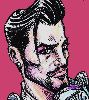
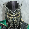
Whiplash / Wizzie Belles and Mammon
Critiques & Comments
# 18
Posted:
Sep 11 2012, 07:12 AM
# 17
Posted:
Sep 10 2012, 07:50 AM
So nice to see some SLAW action, I appreciate the cameo for Toro Joe- this is the sort of story that makes me wanna make comics.
Wonderful colors as always Magistelle, ever improving your lighting is perfectly played in the sparse night alley. Your forms are so nice and the various effects for the flashback sequences impress.
Hats your charming colors and expressions evoke such warmth and care, the final few pages are especially strong. Pitch perfect dialogue and characterization that lends depth to both Wiz and Mammon's motives- can't wait to see where it all grows from here.

# 16
Posted:
Sep 10 2012, 04:44 AM
Whoa! Yes, it does! @_@

# 15
Posted:
Sep 10 2012, 04:41 AM
Is my internet tripping out or does it say that the voting ends in 31 days?
# 14
Posted:
Sep 9 2012, 06:31 AM
Bobo: But when do they start making out?
Quote

# 13
Posted:
Sep 9 2012, 05:57 AM
But when do they start making out?
Seriously, I enjoyed this comic so much, and I absolutely love all the personality you two put into your characters. It's nice to see more of a good side of Wizzie (mostly I just associate her with swearing and shutting down Roy hahah). It's very endearing to see her fight so hard to protect innocent people. It's also interesting that it's never really clear whether there were people in the building or not. I think that adds a level of suspense to the motivations behind different characters.
Mags, I loved your colors, but I agree that the shading style felt a little odd to me. I think the problem for me is that there seems to be some shadows in places I don't expect them to be. It's hard to pinpoint exactly what it is. Some of the shading makes things look too rounded or something. I wish I could articulate this better, but hopefully you can figure out what I'm trying to say. Your use of lighting was really good anyways.
Hats, I really liked the coloring style you used here. The colors really went well together, and I wasn't bugged at all by the lack of serious shading in some places. Hospitals are really bright all around, anyways, so that made perfect sense to me. Uh... I don't really have any crits because your style is beautiful and all of the characters looked so great and I want to be like you when I grow up.

# 12
Posted:
Sep 8 2012, 03:59 PM
I loved this little "scarmatch + Beyond Battle" you all put together. Loved the colors and the animated poses. Can't wait for more Wizzie and Mammon comics 
# 11
Posted:
Sep 8 2012, 11:41 AM
Thanks for all the feedback, you guuuys. Yeah, I'll wholeheartedly admit that I really need to stop slacking in the background department, and I'm gonna try to fix that problem. Apologies if I start slipping in that regard again! Also, yeah, seems like most people aren't diggin' the shading style either; I'll either refine how to go about it or just drop it all together and save it for illustrations. Either way, thank you guys for the critique! It'll only help us to make even better comics in the future.

# 10
Posted:
Sep 8 2012, 11:12 AM
This is so delicious I could eat it up~! what a fun project, I want to see more! I do agree with everyone that I wasn't a huge fan of the soft shading on your part Mags but really thats my only critique, everyone did a great job!
# 9
Posted:
Sep 8 2012, 10:51 AM
Sooooo, Joe is not a fish? Good to know.
Wonderful collab you two, it was a lot of fun to read and look at. Totally worth the wait.
(sorry I'm not the best at crits, but basically what I was going to say has already been said.)
Wonderful collab you two, it was a lot of fun to read and look at. Totally worth the wait.
(sorry I'm not the best at crits, but basically what I was going to say has already been said.)

# 8
Posted:
Sep 8 2012, 07:56 AM
Great job, you too! I won't bother pointing out the little things, for the risk of sounding like a broken record. You both have a ways to go, but you're breezing through the ranks at an amazing pace. Just keep it up.
# 7
Posted:
Sep 8 2012, 06:29 AM
Will: Thanks for the heads up! Yeah I tried doing research into private hospital rooms to see what detail I could throw in but it was sorta hard, I did my best but I understand that I probably could have pushed it a lot further then I did. As for the shadows I totally understand that too... It wasn't till looking back by about half way I realised "well shit" because I was trying to go for a really bright room with soft light as well as trying a new colouring technique, but because all the characters are so fricken' pale it was difficult in places to get really dark areas and then keep them consistent through out the pages... learnt from that though so I'll be putting it into practice in my next comic!
Fun!: I'm glad you like the panelling!! I'll experiment around with Wizzie's shoulders a bit more, Wizzie has a huuuuge noggin and with her blonde hair it can make her shoulders look tiny in comparison to her head.... and yes, perspective is an area I constantly need to work on, definitely when I place characters into the composition, I'll be working on that too.
Tofu: TOTES MY FAULT COZ IM STUPID, I should have triple checked all the pages were the right sizeeee....so so sorry about that :'D
Kura: Thank yooouuu~~!

# 6
Posted:
Sep 7 2012, 11:33 PM
mmmm, delicious delicious collabs. Brings me back to the old days of void where people did those left and right. Great work you two.
# 5
Posted:
Sep 7 2012, 07:31 PM
IT'S BEEN WORTH THE WAIT. Great work, you guys! Love the coloring, love the interactions these two characters have, love how your stories managed to transition well into each other even though your styles are wildly different.
I'm going to second fetus on the backgrounds, Magi, because they really could use more work to them. Try not to cover it up with dark shades! There's ways you can be minimal with backgrounds and still use the space well.
One minor nitpick: some pages are absolutely massive and maybe should be resized? I'm viewing this on a laptop, so unfortunately I can't see all your neat splashpages haha.
# 4
Posted:
Sep 7 2012, 07:02 PM
Awesome work, you two! Solid drawing and storytelling throughout, and the character interactions were fun. I was a bit confused about what was going on story-wise in the beginning.
Magistelle, I thought your portion could've used more backgrounds. The coloring was also very soft throughout, with very few strong plane changes. It also looks like most of your light sources are coming from directly in front, like photos taken with a flash camera. If you move the light source off to one side, it'll allow you to more effectively model your forms.
Hats, I love the paneling on your side. The way you used minimal modeling in the colors works very well with your lineart. Great poses and expressions throughout.
In that shot of the hospital exterior, the perspective looks a bit wonky. When Wizzie looks at the scar on her shoulder, I actually missed what was happening at first, because her eyes don't really look like they're looking at the scar. I imagine that might have something to do with Wizzie's proportions, and the fact that her shoulders are proportionally much "further in" than real people's are, so maybe there's no good solution there. I don't know.
Once again, wonderful work!

# 3
Posted:
Sep 7 2012, 06:56 PM
I applaud the effort and time seen here. Large page count epics don't come around nearly as often as we'd all like. The style and linework doesn't seem bad and it's pretty clean. But I am not so much a fan of the coloring because there seems to be several things going on that sort of takes away from the style. The bright colors that are present perfectly fit the tone and is appealing to look at, but the often render/painterly styte is often at odds with the rest of the art. I'm also not a fan of the soft edge shadowing. I believe a lot of the rendering is limited to the heads and the rest of the shadows extending into the background lack the detail and consistency of the rest of the art. This also brings up the fact that backgrounds are severely lacking. I understand the need here to get the story done especially with such a large page count but in all honesty it sort of takes away from the story. Yet at the very least we do have a sense of location even if the lighting remains too consistent in this case from scene to scene.
The second half, Hat's side is pretty strong and fixes issues with brighter and more detailed scenery. But in a complete reversal of Magi's side drops all shadowing on the characters with minimal effects on the background.
In short, you've both got a relatively simple but strongly character driven story that is an enjoyable read and you both have great linework. Magi needs more work on backgrounds, and you could both definitely push details in that regard but most of all I'd like to see you both work on shadows.
# 2
Posted:
Sep 7 2012, 02:45 AM
WELL SHIT. NOW IM NERVOUS AS HELL.
# 1
Posted:
Sep 6 2012, 11:18 PM
IT'S
HAPPENING
HAPPENING
Comic Details

Beyond Battle
Drawing Time:
7 weeks
Ended:
Sep 14th, 2012
Votes Cast:
30
Page Views:
2608
Add to Playlist
Newest Comments

einsam
Colbitzer
@ 6:46 AM Apr 16th

The Great Switcheroo
Louise Ambre-Aliona vs. Luniel Gekka
@ 3:26 AM Apr 15th

The Great Switcheroo
Colbitzer vs. Veruca Chance
@ 5:22 PM Apr 14th

Help Needed
Theakon
@ 9:04 PM Apr 5th

Monsters of Nature
Dairyu vs. Rickter & Gus
@ 5:06 AM Apr 5th
Newest Characters


Open Challenges
Random Comic


Most Wanted


Latest Topics
| ||
| ||
| ||
| ||
|


Latest Members
Users online
111 Guests, 2 Users
Most Online Today: 144.
Most Online Ever: 1,184 (Jan 13, 2020, 06:21 PM)
Artist