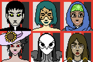
Character- Audreymeda

Character- Audreymeda
« on: Feb 15, 2015, 09:09 PM »
Hello! I'm-- not certain if I'm doing this right-- so here's my wip of my character reference, and bio. I'm still working on the pages but I'll present those when possible.

(Again this will be inked + colored, and the text portions typed, but I wanted feedback to make sure I have everything and if it's otherwise right for VOID submission standards)

If there's anything that there's too much/too little/should be changed or drawn out, please tell me!! Thank you!


Bio: There are three rules to being a demon: one, your job is to fulfill orders to your lord by capitalizing on human weakness; second, you never let human experiences make you develop your own identity; and third, you never fall in love with humans.

Princess Audreymeda ultimately failed at all three-- during a crucial political maneuver-- and was, well, eliminated. However, her curiosity and enduring zeal have led to her spirit persisting after death-- though her demonic abilities are severely weakened.

After addressing her unfinished business with her lover, she finds herself in Void City rather than any sort of afterlife. Her spirit wanders the streets, but she is far from shy...

Re: Character- Audreymeda
« Reply #1 on: Feb 15, 2015, 10:27 PM »
Ahhhhhh my gosh I am in love with her already! I'm diggin her bio so far, and the design is hella cute.


If I were to say anything, I would advise you fully color your design sheet, since that is a mandatory thing when submitting, and don't be afraid to add any additional info to your character bio, adding too much on the design sheet itself can get cluttered and distracting. Can't wait to see more, and welcome to void!

Re: Character- Audreymeda
« Reply #2 on: Feb 16, 2015, 03:02 AM »
Ahhh alright! I think I'll add some to the bio to trim the text some from the sheet. Thank you!!!

Also here are my comic WIPs-- I detailed-sketched them out bc the gestural doodles were....... kinda illegible.
I was too hyped and maybe I didn't sleep last night but


EDIT: for some reason the first page sometimes doesnt load? There are four pages
« Last Edit: Feb 16, 2015, 03:42 AM by mortooncian »

Re: Character- Audreymeda
« Reply #3 on: Feb 16, 2015, 11:16 AM »
a few points for moving forward;

the gutters are much too big(made moreso by being white on on top of our white forum background)

you REALLY should not be 'cutting' up your artwork to make it fit into panels after you draw them....plan, sketch out and design your pages and panels ahead of time.....this includes the script and where you place text

'pasting' the text overlapping the panels and into the gutters is a big convention breaker and really discomforts the reader

I have other stuff but most of it might have been addressed or will be addressed with more effort and time put in
-draw like you love it.... not like your mom told you to do it-

Re: Character- Audreymeda
« Reply #4 on: Feb 16, 2015, 02:39 PM »
Oh, thank you! I just have a few questions about you mean though:

-by not cutting it up and planning, do you mean like... drawing out everything in-sketch that will be on the page first, and then making borders after the fact? Or do you simply mean, plan ahead with text in mind?

-about thinner borders-


Sans sloppiness from trying to trim it, is this about the thickness that is best? Or is it some amount in the middle?

-A third question, sorry-- is the comic readable? Like, even if the panels aren't fixed right now, would its current pacing still be readable? admittedly I tried to squeeze a lot into four pages so if it's too fast-paced, I don't mind redoing it + going for something smaller for the 2-4 page intro (I'd just rather know this all before I go into more depth on this one!!)

Thank you once again soooo much for the help it means a lot!

Re: Character- Audreymeda
« Reply #5 on: Feb 16, 2015, 04:45 PM »
-by not cutting it up and planning, do you mean like... drawing out everything in-sketch that will be on the page first, and then making borders after the fact? Or do you simply mean, plan ahead with text in mind?

i think what he's getting at, at least what i'm seeing, is that drawing details & then running a gutter through them feels disconnected & does your pages a huge disservice. better preplanning about framing, composition, pacing, text placement, & angles would really up both the quality of the work & the readability. right now, the way you break the page up after the fact feels rushed & just sorta arbitrary, whereas, take the middle tier of that first page, if you sketch things out & figure placement  of the focal points & text beforehand, the left hand panel could have way less dead space & the right hand side wouldn't feel so cramped. AND you could try adjusting the angle for a more dramatic composition rather than dead on & breaking the 180 rule.

the gutter thickness is improved, but just think in terms of optimizing the page for your art. thick gutters mean lots of negative space. that negative space pushes your work back & forces it to compete for attention.

i'm not digging the captions. it makes everything seem like narration rather than dialogue. adding balloons to separate the two would help.

Re: Character- Audreymeda
« Reply #6 on: Feb 16, 2015, 05:20 PM »
Oh oops! They're intended to have been speech balloons in a later draft-- I just didnt draw the balloons + tails around them because it was for placement purposes.

But I think I can see what you mean. So pretty much... balancing the pacing, angles, and text while having the least amount of negative space, and not drawing panel-by-panel? Put in as much as possible and have it be dramatic-- but not cramped?

(Ahhhh I'm sorry if this seems like really novice stuff to you guys... I'm so glad to finally have direction with these things!!! I appreciate it a lot a lot)

Hmmm... I think I may redo it, not only because of these technical problems but also since I'm kinda dissatisfied with the pacing + it doesn't show her personality all that much.

I'll also probably submit my thumbnails + plans earlier on instead of just zooming forward without planning. Though if people still would like to tell me what to improve on from that sketch/wip version I would also super appreciate it! And thank you again

Re: Character- Audreymeda
« Reply #7 on: Feb 16, 2015, 06:07 PM »
Hidey ho and welcome! I totally gave your comicide/ghosthuntercomic a read through and am THRILLED you are bringing your artsy chops to void!

I don't know if its your excitement over submitting something (which, trust and believe, I totally get!), but your character sheet doesn't seem up to par with the work I've seen of you.The far right full body ref where her legs are splayed out almost makes her look like she has club feet. just seems to be an odd way to stand. Also the far left full body ref where her legs are rubberhosing is always something I'll dig, but I get the feeling your character wasn't meant to be a toon.

I think its great you're not afraid to start over based on the comments you've gotten so far. You obviously love comics, so it's super exciting to see you here. You'll definitely be getting your full of sequential funtimes and elbow rubbing with other comickers. Looking forward to seeing more!

Re: Character- Audreymeda
« Reply #8 on: Feb 17, 2015, 04:27 AM »
Very cute character design(s)! I love their eyes and noses. The comic isn't hard to follow in my opinion, and does look better now with the thinner gutters. I'd like to see you develop this further--its a creative concept I'd like to see in action on Void!
« Last Edit: Mar 02, 2015, 02:02 PM by Mister Kent »

Re: Character- Audreymeda
« Reply #9 on: Mar 02, 2015, 12:53 PM »
Hello!! Thank you Kaiser Spoon + Kent-- I didn't want to reply again until I had more content to offer to the thread but I really appreciate it and ohhhhh go d you read my comic kaiser i sskfjlkdsf

Yes; I love toony proportions but I'm also trying to make sure that like, limbs have the flow of rubberhose but are still discernible? like a set bend for joints
In the reorganized character sheet, which is much bigger [but covers all my bases visuals-wise] the rough sketches for her poses are now:


I'm about halfway through my character sheet so I think I'll just post the full part of that when it's totally done, but here is the rough [and I mean rough] sketches + paneling for my second attempt--


Any comments/tips/critiques are again super appreciated!! Thank you <3

Re: Character- Audreymeda
« Reply #10 on: Mar 02, 2015, 04:48 PM »
Much better layout and pacing going on for your intro pages, keep it up! I would shy away from the neon red you got going on your design sheet, that can hurt someones eyes, but other than that can't wait to see more!

Re: Character- Audreymeda
« Reply #11 on: Mar 02, 2015, 10:51 PM »
Thank you! I desaturated the red. Eye-straining colors are best in moderation, anyways-- so now only her eyes are the glowing bright red.

Here is my completed character sheet, click on the thumbnail for the full-size/high-res version

EDIT: Nevermind, image-based link isnt working,  so it's HERE

This covers front and back views, backstory characters, drawing her horns from different angles, alternate forms [for backstory only-- but why not???] and some detail. Is there anything else that could be needed?

After this I'm gonna start work on lining the pages!
« Last Edit: Mar 02, 2015, 11:03 PM by mortooncian »

Re: Character- Audreymeda
« Reply #12 on: Mar 03, 2015, 02:55 AM »
Hello there and welcome! Your second attempt definitely has nicer flow and composition to it -- and I'm so glad your character shows up in her usual form a lot earlier compared to the first one because it gives a clearer intent of who you're introducing.

Ref sheet is looking good and I don't think there's anything you're missing... I am just very confused about the dotted font things? that you have round the other text? I don't know if it's just for decoration or if it's spelling out something (in that case I have no idea what it says!) it just adds unnecessary clutter in my opinion.
Other than that, keep it up and I hope to see your character officially on void soon, I love Audreymeda's design :D

Re: Character- Audreymeda
« Reply #13 on: Mar 15, 2015, 12:51 AM »
Thank you so much! Yes it does spell out something; I like doing those really tiny unnecessary details that add something, but aren't needed to understand. It's a bonus! If you wanna know it's lyrics to a relevant song, with each lyric corresponding to that section of the ref sheet. I organized the ref sheet so that the lyrics fit and go in order. Yes, this is something nobody will probably take the time to decode but I love it...

Anyways, here is the first page of my intro comic, completed! I will not have as much time to polish and render in rounds, so I figured, might as well make my intro round look as nice as I can...


Re: Character- Audreymeda
« Reply #14 on: Mar 15, 2015, 03:28 AM »
OMG SO BEAUTIFUL

One thing id say it looks slightly odd with lineless enviroment and liney characters. They kinda don't belong. So i would either go all the way or have some lineage in the bacgrounds too.

Re: Character- Audreymeda
« Reply #15 on: Mar 15, 2015, 08:41 AM »
I actually kinda disagree with that, I think the lineless backgrounds work with the character. The only thing where it looks off is that the first few panels have a bit more definition until the sequence where she enters the house. I think the indoor area could maybe use a little bit more rendering since I think without it it starts to look a little odd.

But the way it gels in the first few outdoor panels looks really appealing to me.

Re: Character- Audreymeda
« Reply #16 on: Mar 15, 2015, 01:15 PM »
I will also chip in that it is a common feature of anime.  Anime uses lineless backgrounds to contrast with the characters who do have outlines typically thin lines.   So I think it is a step in the right direction since we always have to use different techniques to make characters stand out whether its line variation or color.  What I'm not a fan of is what I perceive as muddy shading.  It's not my forte so its hard for me to recommend techniques.  But I think you need more blending or harder shadows to create depth.  I love the rainy scenes though and they are the strongest panels.

Re: Character- Audreymeda
« Reply #17 on: Mar 15, 2015, 04:18 PM »
Ahh thank you! I tried to add more definition/rendering to the inside-scenes, and a bit more lining-definition on some contours.
also haha wow I cant believe I had forgot to give the girl shadows

Here is the improved version:


Thank you again so much for the feedback!

(EDIT: Noticed and fixed a couple tiny errors, sorry)
« Last Edit: Mar 15, 2015, 04:30 PM by mortooncian »

Re: Character- Audreymeda
« Reply #18 on: Mar 15, 2015, 09:34 PM »
Ah, yeah, all the little details you added really help. That looks a lot better to me :). Keep going!

Re: Character- Audreymeda
« Reply #19 on: Mar 16, 2015, 02:25 PM »
Ahhhh, that page is so awesome! I'm losing my mind at that colour scheme, SO NICE!!! I love the combination of how geometric, clean, and soft everything looks. You have such a cool aesthetic!

Re: Character- Audreymeda
« Reply #20 on: Mar 24, 2015, 03:58 PM »
Your art is super pretty, I love the detail of the rain and the way it hits against the person  ^.^
My only nitpicks are that in Panels 4 and 7, it looks like the character is floating, Especially in 7, where you did put in a shadow, but put a red outline around the foot so it looks like it's not touching the ground at all.
// get on my finger, carl! \\

Re: Character- Audreymeda
« Reply #21 on: Mar 26, 2015, 01:52 AM »
The small details have really flesh your artwork tremendously.

Re: Character- Audreymeda
« Reply #22 on: Mar 29, 2015, 11:33 AM »
Hi, Mortooncian!  The improvements in your latest page are fantastic!  Although I really liked the 4 pages you posted originally, they didn't work so well as an introduction to Audreymeda, and that's their whole purpose.

My one critique (and on something fairly inconsequential, at that) is her "real form", the six-eyed cat.  It's a cool design, but it doesn't have horns.  If Audrey's design is that of an attractive girl with three notable features - black horns, black hands, and red eyes - I feel like those three features absolutely need to be represented in her "true" form, or it doesn't seem to correlate at all.

Anyway, just my 2 cents.  I really enjoy all the love you put into your character sheets, and you're obviously having a lot of fun, so keep at it!  I can already tell Audrey's gonna be a fan favorite around here.

Re: Character- Audreymeda
« Reply #23 on: Apr 12, 2015, 11:15 AM »
Hello again!
I have a weird way of jumping around pages so I've not wanted to post WIPS for a while-- but I figure I'm far enough along again on each collectively that I can post more WIPs!
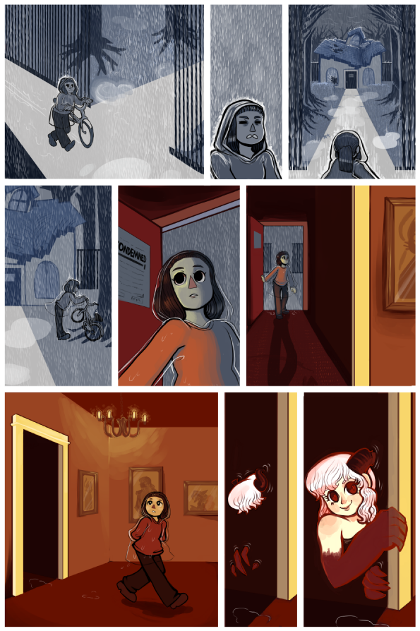
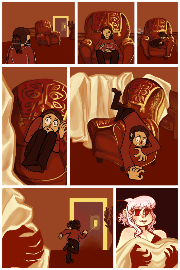
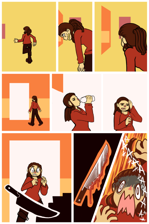
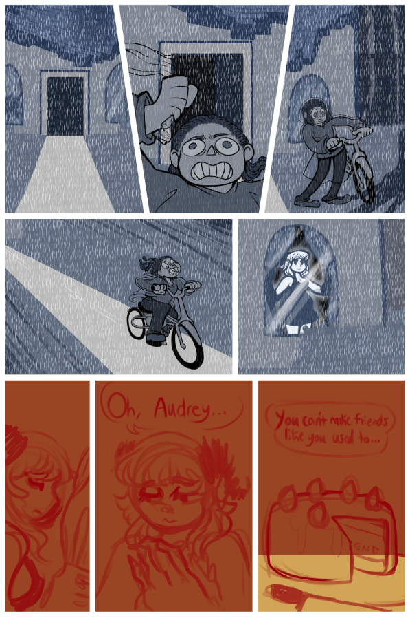


As you can see, I'm not COMPLETELY done with the following three pages, but I've made significant progress!  I actually draw a lot faster than this, but I am very intent on polishing these up and making them as nice as possible also because I dont really have a deadline Im making sure I prioritize other lifethings you understand

@Charlie- Aye aye!!! C:

@Puzzle- Actually nobody's ever mentioned it looking like that, I'm really flattered!! fjdhfg. Ill keep up the work!!

@Rob- I think I fixed it! Thank you! c: I forgot you meant panel 4 too so I'll amend that soon too!

@Devon- aaaa thank you!!! I'm a really big fan of extravagant detail, and tiny tiny details that nobody will notice ;u;

@Dino- Ah! I agree-- I'm not used to working in a set page limit, but I am much more glad for the newer one. Also because I prefer using as little dialogue as possible [whereas there was soooooo much in my first draft ewwww]

About the horns-- you're right! They aren't part of her original appearance. Her current appearance is actually a long-developed self-identity. [I include the forms on the ref, but they're mostly for backstory. Identity is a very large part of her character]

The horns are her own symbolic way of owning up to, and accepting, that she's a demon-- and that there's nothing wrong with it. A pledge to self-love kind of thing! Her red cat-eyes and the cat-claws are another indicator.

There's also parallels in her appearance to someone else in her story who has horns..... but thats for another time...


Newest Comments -


Newest Characters -

 
Morrigan KingAugustus ThomasTheakonRod ChirpwoodHuskMizz BonzaiSpidella WidowsMyrmidonGhoulArcher Heart Mercury
 

Open Challenges -

 
No open challenges
Create a new challenge


Latest Topics -

 
Revelarts images 
Last updated: Revelarts - Today at 02:38 PM
Revelarts-ubator  
Last updated: Revelarts - Apr 15, 2024, 10:25 PM
All News, All The Time 
Last updated: Staff Bot - Apr 14, 2024, 08:23 AM
Clown Jam 
Last updated: Radji - Feb 11, 2024, 04:51 AM
INTRODUCE YOURSELF 
Last updated: Maz - Nov 06, 2023, 04:13 PM
 

Latest Members -


Users online -

 
147 Guests, 0 Users


Most Online Today: 181.
Most Online Ever: 1,184 (Jan 13, 2020, 06:21 PM)


About Us

We exist to provide an environment for artists to learn and improve their sequential art skills competitively. Our community is designed to give critical feedback and encouragement to our many members the world over, at all skill levels.

Follow Us