

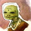
Slaggs: something you should look at is i the panel where Jimmy is pinning the guy who stiffed him to the ground and has just started to cut him. He's got the guy's arm pinned with one food, torso pinned with a knee, an arm gripped and throat razored.
That's all well and good, but the issue I had with that is that it doesn't seem plausible to me that they would end up in these positions. Using a foot to pin someone is actually risky damn business given that you're not balanced or anchored which is why knees are better with as much of the legs touching the ground as possible. Pinning someone isn't any good if you're on the verge of falling over, after all.
Gripping the guy at the bicep is odd as well, that's a really easy thing to weasel out of. All in all what I'm getting at is that you're not going to see that kind of posturing in a real tussle between a frightened individual and a sadistic hitman type unless they're mannequins and have been set up in a pose. The advice I have I guess is to really picture the events that transpire in full motion before you pick what moment to capture in panel form and focus on getting the little details right.
All that said I enjoyed it. I really like what you do with color and between that, lighting, and architecture you gave this particular borough of Void City a really unique vibe. Almost has a bit of a Central American feel. I'm also a big fan of reimagination done right and your noncartoony Jimmy is solid nightmare fodder.
Jimmy Killem vs. Amelia & Lucas
Critiques & Comments
# 17
Posted:
Mar 8 2013, 11:14 AM
# 16
Posted:
Mar 7 2013, 07:20 PM
Ah, you guys are too kind. I'm glad you all liked it though, and thanks for the critiques. Anatomy and perspective are something I'm constantly trying to work on, so hopefully I can show some improvement in those eventually.
And Bobo, I'm definitely working on a second half to this. Half-finished comics just aren't my style.
And Bobo, I'm definitely working on a second half to this. Half-finished comics just aren't my style.

# 15
Posted:
Mar 7 2013, 11:46 AM
Really awesome battle, Slaggle! I love your work, and it was good to see you being able to get more done this time around. I really love the detail in your work, especially the backgrounds! Everything is so beautiful. My one critique is that the ending felt more like a lead-in to the body of a story instead of an actual ending. I don't know if you planned on doing more with this, but that's what it felt like. I hope we get to see the rest of this story, but, if not, maybe you can work on simplifying your stories in the future. I'd especially like to see more of Amelia and Lucas themselves! They seem to be missing a little too much in some of your comics, and I'd like to get to know them a little more.
Del--Sorry you had such a rough time of this, but I love what little you did have and am still a big fan.
Del--Sorry you had such a rough time of this, but I love what little you did have and am still a big fan.
# 14
Posted:
Mar 7 2013, 11:04 AM
So odd to see del's characters drawn by someone else, i dig it.
LOVE that establishing shot pg 1 Slaggle- LOVE IT.
del, ima beat you up. <3 lovingly so.
LOVE that establishing shot pg 1 Slaggle- LOVE IT.
del, ima beat you up. <3 lovingly so.

# 13
Posted:
Mar 6 2013, 04:04 PM
That was really cool! I enjoyed your take on Jim. :] Your colors were really nice, too. Great mood setter. I'm so sorry again for my complete lack of content, Slagglle. I hope your next opponent can deliver, 'cause you deserve it.

# 12
Posted:
Mar 5 2013, 10:13 AM
Unfortunate, Delya.
Slagglle, it's great to see you making a full comic and I wonder if this is because you have more free time or because you've been able to do better time management, either way you've made many people happy. Your figures are solid for the most part but I think they suffer most at angles. At one point, Johnny's head is a little too small and his neck is too long. The perspective is indeed a little wonky and a bit noticeable throughout the comic especially as different buildings don't relate to each other on the same plane. While a background can have multiple perspectives (like houses and buildings on hills and such at different distances) you don't show us much of the ground so we can't assume that this is anything but a mistake. I enjoy your colors, and your composition and the level of detail you strive to imbue your artwork with is wonderful and makes the world feel 'real' and vibrant. I really like your work and can't wait for more.
Slagglle, it's great to see you making a full comic and I wonder if this is because you have more free time or because you've been able to do better time management, either way you've made many people happy. Your figures are solid for the most part but I think they suffer most at angles. At one point, Johnny's head is a little too small and his neck is too long. The perspective is indeed a little wonky and a bit noticeable throughout the comic especially as different buildings don't relate to each other on the same plane. While a background can have multiple perspectives (like houses and buildings on hills and such at different distances) you don't show us much of the ground so we can't assume that this is anything but a mistake. I enjoy your colors, and your composition and the level of detail you strive to imbue your artwork with is wonderful and makes the world feel 'real' and vibrant. I really like your work and can't wait for more.

# 11
Posted:
Mar 5 2013, 08:26 AM
YES. Slagglle, when you fight I never know if I should be excited or just prepare to be dispointed, but when you do deliver, it so totally makes up for the times you don't because they're so great.
I really like how A&L just kinda stumble on the situation you've established and everyone's just like "OH, OOPS." And I also like how you interpreted Jimmy to a more realistic form.
But the thing I love the most are the textures on the backgrounds, they give a lot of life to the comic. Good stuff, man.

# 10
Posted:
Mar 5 2013, 06:05 AM
Del:  wish you could have done more, I love your stuff!!
Slagglle: I'm in love with your color choices, they are just perfect. You put such nice details into your backgrounds too, I'm really impressed but the quality. I think you did an amazing job on this, despite some slight anatomy and perspective wonkiness, it's a very solid comic. The only thing is the hand writing. It's not bad, it's just not that great. I think it takes away a bit from your awesome comic. If you want suggestions for fonts, feel free to ask.
wish you could have done more, I love your stuff!!Slagglle: I'm in love with your color choices, they are just perfect. You put such nice details into your backgrounds too, I'm really impressed but the quality. I think you did an amazing job on this, despite some slight anatomy and perspective wonkiness, it's a very solid comic. The only thing is the hand writing. It's not bad, it's just not that great. I think it takes away a bit from your awesome comic. If you want suggestions for fonts, feel free to ask.
# 9
Posted:
Mar 4 2013, 10:56 PM
Uploaded. It's not much, but consider it the first part of a larger comic.
# 8
Posted:
Mar 2 2013, 09:14 PM
Ah, bummer. I'm sure whatever you have is still awesome though!

# 7
Posted:
Mar 2 2013, 06:06 PM
we still love you~
# 6
Posted:
Mar 2 2013, 11:36 AM
Whelp, I'm sorry guys- and especially to Slagglle. I don't have any real good excuse for not getting very far. Just been struggling a lot with ideas and execution, then I got sick during my extension time and basically lost the will to keep trying. So I just uploaded the two finished panels from what was gonna be my film-style comic. There's another page from a different attempt, but eeehhh it's not worth looking at. :'|

# 5
Posted:
Feb 28 2013, 02:46 PM
So excited for this! I need to battle both of you soon!
# 4
Posted:
Feb 16 2013, 07:34 PM
Extended the deadline because of REASONS. Trying something a bit different with this battle, so I wanna be sure I have time to pull it off.
# 3
Posted:
Jan 28 2013, 07:14 PM
Oh man, thanks for accepting this Slagglle! Can't wait to work with your characters- and see what you come up with, too~ :]

# 2
Posted:
Jan 28 2013, 04:49 PM
TAKE OFF YOUR SHIRT
# 1
Posted:
Jan 28 2013, 04:36 PM
No half-assed, incomplete crap from me this time. I'm going all out on this one.
Comic Details

Regular Match
Drawing Time:
4 weeks + 1
Ended:
Mar 11th, 2013
Votes Cast:
26
Page Views:
2211
Winner:
Slagglle
Add to Playlist
Newest Comments

einsam
Colbitzer
@ 3:32 PM Apr 17th

Birthright
Saal, Louise Ambre-Aliona, and Llaana
@ 3:44 PM Apr 16th
Help Needed
Theakon
@ 2:19 PM Apr 16th

The Great Switcheroo
Louise Ambre-Aliona vs. Luniel Gekka
@ 3:26 AM Apr 15th
The Great Switcheroo
Colbitzer vs. Veruca Chance
@ 5:22 PM Apr 14th
Newest Characters


Open Challenges
Random Comic

Most Wanted


Latest Topics
| ||
| ||
| ||
| ||
|

Latest Members
Users online
255 Guests, 0 Users
Most Online Today: 283.
Most Online Ever: 1,184 (Jan 13, 2020, 06:21 PM)
Artist
SLAGGLE- Speaking of first pages- gosh. That establishing shot was just rich. The character you gave to those buildings was exquisite. It's great to see that quality carried throughout that page into the alley both fighters are in. As someone who struggles with backgrounds this was inspiring to see. The sudden saturation of color in your flashback scenes read well too. I think it really helped to distinguish those scenes from the 'present' storyline. P.S. wowza on that grim ending. The way the world squiggles and bends beyond the poor guys bloody hands was just really cool! I did have to read the comments below me and doublecheck your fighters design sheet to realize your fighter actually came in on the last two pages which is kind of weird. I totally found the poor soul to be more compelling.