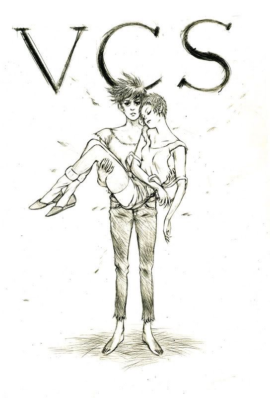
The ladies look nice, but I think the line art is flattening them a little bit. It can be fixed by varying the lines in certain places though. I think I've wanted to point this out before, but I couldn't figure out how to explain it.
Actually I think your quick sketches show more volume then your more refined drawings.. or maybe it's just from the shading. but anyway..
You already thickened the lines to indicate weight, but they are not really emphasising volume. When I ink human figures, I try to find the places on the body not only where there is weight, but also were there is tension or a swell.
here's the theory on linewidths that squid might be referring to:
the thickness of a line is relative to the hardness/softness of the thing you're drawing:
when drawing a face from the 3/4 view, for example, the cheekbone and chin would be inked with thin lines, while the soft, fleshy cheek would be inked with a thick line.
a building would be drawn with a uniformly thin line because it’s comprised entirely of hard material.
here’s the idea behind this:
-lines are the indications of the surfaces of a form that are the most turned away from the viewer (but still in view).
-when lighting a cube, there are clear edges that delineate where light ends and shadow begins. these are your thin lines---narrow and precise.
-when lighting a sphere, light gradually turns into shadow. between light mass and shadow mass is a grey area. this is your thick line.
that’s the general idea. if it doesn’t make sense, it’s probably because I explained it incorrectly…
 your stories consistently rock the casbah in my book.