

mauimicrowave -
Oh my god a new void person hi! Congrats on your first comic in, and fully coloured and completed! To do so much in such a short time is always a feat, and you should be especially proud your first time.
One of the things that sticks out the most to me in this comic is the line art. It looks very laboured and cautious. When you draw too slowly and carefully on a tablet your lines get all wobbly and week, because tablets just can't deal with that. You absolutely need to make line quickly and confidently. Just as fast as you possible can and still be accurate. I usually just hover my finger over undo, or map it to a short key on my tablet. Then you just make a single line over and over and over and over until you get the perfect, effortless line. After awhile, your linework will just improve. It's especially jarring because Kill joy has some really nice shapes and movement in him, and it get's messed with by all the wobbly lines.
Also pllllllzzzz don't shade with grey/black. When you just choose a darker version of the base colour and use that at your shadows, your really limiting what you can say with your lighting. All you can say is "The light source is over there". You don't get say whether the setting should feel happy or menacing or melancholy, if it's the hot early morning or the cold midday. An easy way to get a more intresting shadow is to choose a colour, put a multiply or darken layer on top of the flats, and do your shadows on there. Then you can just mess with the opacity settings to get the intensity of shadows you want. There's always more stuff to learn about rendering, but that's a great place to start!
I with Tofu on this. While I think hand-lettering has the potential to look way better than digital, it's incredibly difficult to do right. Like, it's really it's own skill to learn, and it's just so much easier to get something professional and clean in a short time with digital letters. Unless you're prepared to really muscle down and learn a tedious and beautiful ability, just go digital.
I like how the comic went from serious fight to comedy beating so quickly, and you're slow progression from the colder purples of the opening to the hot reds of the end was great! Kill Joy himself is a great character (almost as good as Sorbet Muscle Man), and I can tell by how well you illustrate him not only how much you like him, but how good you are at drawing. I think you're comics are probably gonna get so much better, so fast.
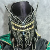
Paavo vs. Kill Joy
Critiques & Comments
# 22
Posted:
Aug 11 2015, 07:07 PM

# 21
Posted:
Aug 11 2015, 12:39 PM
Elge: >=[
MAUIMICROWAVE- Hay man, grats on a pretty groovy first battle (not to mention another one hot on its heels!). Its so refreshing to have a true blue no goodnik tromping round void, kicking ass and taking names. You got this real fast and loose style that I think works I think. some of your pages/panels even give me a bit of a Johnene Vasquez vibe in the way your draw your character. my only critique are technical ones, really. Right off the bat on your first pages/first panel, your word bubble seems weirdly placed. You have that wealth of space, why mash it up right underneath your cityscape? Also, if your intense shadows are behind Killjoy's leg, why isn't the 'welcome to void' sign cast in shadow as well?
This must be a void thing. Fighters meeting over ice cream XD I dunno what it is, but it seems ice cream is a universal unifyer. I'd love to see you punch up your backgrounds more as they seem almost TOO loosey goosey. As in, it almost seems like the backgrounds are running paint and dropping off the page. You especially notice it on page 4. The park ceases to be a park and just turns into paint squiggles. Don't skimp on the environments- they're what make your comic.
I gotta say I laughed on page 9. Its great to see Killjoy is a bad guy, but a pretty funny one at that. Nice he pokes fun and doesnt take himself too seriously. I know you already got some comments on your re-using panels, so I wont touch on that, but I am a bit weirded out this grisyly off camera pummeling had ZERO sound effects. Really bring that impact home with some batman-esque 'BIFF!'s and "whammo's. Well, maybe not THOSE SFX exactly, but you get the idea.
# 20
Posted:
Aug 11 2015, 06:20 AM
D-d-double post sorry!!
# 19
Posted:
Aug 11 2015, 06:19 AM
Elge: :^(
Maumi: Still using black guttering and dark colours from start to finish, eh?
Making sure your comics are easy to read is the first hurdle to getting people interested in your comics. A tidy, easy to read font is essential and I just want to re-inforce that. Make it easy for people to connect with what you're doing.
Going back to what I've said in previous comments: the black gutter and dark colours combo works great for when you want to create drama or a heavy atmosphere. Using it the whole way through your story makes it seem to lose energy and muddies your composition. Give your readers somewhere to rest thier eyes, and use these techniques to build tension later in your stories. The only page where it did you any favours was page 11. (Incidentally this is my favourite part of your comic.)
Remember, contrast is eye catching!
Good luck in your scar match!
# 18
Posted:
Aug 11 2015, 05:11 AM
Mauimicrowave: First of all, I'm super impressed that you've been able to complete and submit a full coloured comic, it's a tricky task and one that I struggle with.
I'm not going to ape the previous comments, everyone down there has made some solid points about how you've put this together and I'd only be repeating them in so many words. However, nobody seems to have mentioned what I think is the weakest part of this comic which is the writing.
This comic reads less "two people meet, have a few differences and fight" and more along the lines of "who would win if these characters fought", a simple kind of Superman vs Thor. The sudden interjection of the full moon feels sudden and unnatural, throw in some foreshadowing to lessen that.
Paavo Lawson's introduction also feels like an afterthought. He's just suddenly there and talking which is quite jarring coming from that red mist panel before-hand. It may have been stronger to have the fight break out straight away from the ice cream death, or to start the confrontation there.
Overall, Paavo feels underutilised as a character and we don't learn anything new about Killjoy, so reading his intro comic could have covered this character arc.
If you want to keep doing these kinds of balls out fight scenes, I'd suggest emphasising the struggle a bit more. We don't want to see someone win easily; we want to see someone fight!
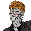
Oh something else I'd like to touch upon is the intro to Killjoy at the start, for some folks this may be the first time we see the character (most folk will go from a battle TO the intro, or just weren't around when the intro was up) and we get that on Page 2, Panel 1. When we do see him, it's just matter of face and not really an introduction. It's hella fun to draw crazy smiles but if you're doing it at the expense of defining your characters it's going to be a hindrance.
Full on heavy stories aren't for everyone, though, if you like how you're working than don't change it because the most important thing is that you produced! Keep at it and you'll be a heavy hitter in no time.
I'm not going to ape the previous comments, everyone down there has made some solid points about how you've put this together and I'd only be repeating them in so many words. However, nobody seems to have mentioned what I think is the weakest part of this comic which is the writing.
This comic reads less "two people meet, have a few differences and fight" and more along the lines of "who would win if these characters fought", a simple kind of Superman vs Thor. The sudden interjection of the full moon feels sudden and unnatural, throw in some foreshadowing to lessen that.
Paavo Lawson's introduction also feels like an afterthought. He's just suddenly there and talking which is quite jarring coming from that red mist panel before-hand. It may have been stronger to have the fight break out straight away from the ice cream death, or to start the confrontation there.
Overall, Paavo feels underutilised as a character and we don't learn anything new about Killjoy, so reading his intro comic could have covered this character arc.
If you want to keep doing these kinds of balls out fight scenes, I'd suggest emphasising the struggle a bit more. We don't want to see someone win easily; we want to see someone fight!
Oh something else I'd like to touch upon is the intro to Killjoy at the start, for some folks this may be the first time we see the character (most folk will go from a battle TO the intro, or just weren't around when the intro was up) and we get that on Page 2, Panel 1. When we do see him, it's just matter of face and not really an introduction. It's hella fun to draw crazy smiles but if you're doing it at the expense of defining your characters it's going to be a hindrance.
Full on heavy stories aren't for everyone, though, if you like how you're working than don't change it because the most important thing is that you produced! Keep at it and you'll be a heavy hitter in no time.
# 17
Posted:
Aug 10 2015, 08:06 PM
RE: Digital text over the handwritten text in this comic:
it's not a knock on you personally, mauimicrowave! Hand lettering is really tough to pull off quickly without it going too scribbly, especially if your bubbles are small and you're trying to do stylistic stuff. If you wanted to hand letter the comic for effect, you could have pushed that, but a week isn't enough time to really get in there with handwritten lettering unless you've got a good handle on graphic design.
Being able to read the dialog is important in a comic, unless it's purposely obscured for story reasons.
I know you've done digital text before, so if time was an issue there's a whole thread on text layout and bubbles in the forums here! http://entervoid.com/index.php?topic=12907.0
PS: Jiisuri brah c'mon mang
# 16
Posted:
Aug 10 2015, 12:53 PM
Sorry for this dick move, guys.
Maumicrowave: I hope my stupidity doesn't discourage you to continue battling. I see you already have a Scar Match against gregly, and I am really looking forward to see what you do with your character.
I'll agree with GPS and add that it is really good to see two characters just beating the crap out of each other.
Keep it up. ^^

# 15
Posted:
Aug 10 2015, 09:29 AM
I would add an asterisk to GPS-Device's warning of copy/pasting panels: There are extremely specific situations where doing this is even ok. Usually for comedic effect. Very rarely does it work for action. Check out Oscar Fuentes' comic in this battle as another example: http://entervoid.com/index.php?action=comic;id=4707 If you need to copy/paste for time saving or whatever you need to make damn sure the panels are varied enough with the gore and whatnot to not be immediately noticeable, even just redrawing the expressions each panel (with the mounting gore) could be enough to pull it off.
# 14
Posted:
Aug 10 2015, 09:15 AM
Elgesugha: I'm done
mauimicrowave: I dig the deep colors but there's some things to work on; everyone brought up improving your swings so i'ma bring up the confusing layout: Study the 180 degree rule to help keep your audience oriented as to where everyone is during the battlefield. Biggest offender is page 5: You set up Kill Joy looking panel left and Paavo looking panel right... but then you have Paavo dashing panel left. I thought he was running away or something. The middle panels of page 8 are also a bit confusing. I'd also refrain from borrowing lines; We just met Kill Joy, he hasn't earned the right to quote Joker yet!
mauimicrowave: I dig the deep colors but there's some things to work on; everyone brought up improving your swings so i'ma bring up the confusing layout: Study the 180 degree rule to help keep your audience oriented as to where everyone is during the battlefield. Biggest offender is page 5: You set up Kill Joy looking panel left and Paavo looking panel right... but then you have Paavo dashing panel left. I thought he was running away or something. The middle panels of page 8 are also a bit confusing. I'd also refrain from borrowing lines; We just met Kill Joy, he hasn't earned the right to quote Joker yet!
# 13
Posted:
Aug 10 2015, 05:45 AM
oh crap! looking at all your critiques, it seems i've screwed up my next comic and i only have a few days haha!
thanks to all the critiques!!!!
im sad to see that elge didnt upload his, i was really waiting for it :> we will battle again elge... when the Twilight comes and the Dawn breaks (get it.. cause he's a wolf..... and the book.....and the movie..... sorry)
thanks again and ill do better next time!
~MAUI
# 12
Posted:
Aug 10 2015, 05:30 AM
Time for my two cents.
Elge. Boo.
Maui: Rare treat to see a comic of dudes just punching each other anymore, so kudos to you. However, as stated by others, your punches lack impact. Really get in there with it man! Show that fist connecting, contorting the jaw, breaking bones and loosing teeth! All you ever really show is the reaction to a punch, and its a pretty wimpy reactiom at that. Biff does not make a good effect for a dude who just got punched in the face. Thats moreso what a pillow getting punched might sound like. Also, your angles! You dont seem to be afraid of hyper tight close ups, but you only use them on the face. Show us a fist in that nitty gritty emphasis.
All of your fight shots take place from perfectly side on profile, and that makes the fight honestly kind of boring. Forced persective is a good trick to look into. It gives you an alternative to those samey profile shots, and it helps add a sense of dynamo to your scenes. We want to feel that fight, so put us right there in the action!
Also never copy paste panels like that. Dont do it. Redraw the panel, it doesnt matter how similar it is. Redraw it. It is instantly apparent when you copy paste, it feels very stale, and very unappealing. Its extra work, but that extra work is the difference of good and bad.
Overall a good showing for your first battle, and I look forward to seeing more from you!

# 11
Posted:
Aug 10 2015, 04:37 AM
Alright sooooooo...
Elge: WAT HAPPENED!? D8
Mixrowave: Alright so, you really need to learn something right now. The 180 rule. Do not switch the view of the camera more than 180 degrees. Biggest violation is on page 5 when Paavo faces towards the right and then you have him face left and leap left. This will completely ruin the flow of action and kick the reader out of the story as they suddenly get disorientated.
Another thing you might wanna take note of is whether your dialog is natural for the character. Page 6 we see Paavo punch KillJoy, who definitely did get hit, and then Paavo says "What!?" as if something is wrong. Doesn't quite feel right.
Also, clarity. You will need to work on making the action more readable and carry more "oomph" to it. As mentioned in the comments below me, try to bring the view out further and improve on your gestures. Also, you might wanna go look up some actiony effects and how they are drawn.
Anyway, decent work for a first battle.
PS: Don't listen to tofu, your handwriting is good enough for me.

# 10
Posted:
Aug 10 2015, 01:19 AM
I had no trouble reading the hand lettering, but it does look rushed. Great job finishing, and with full color. My biggest problem with this comic, though, was how you almost always have the action moving from right to left. The first instance that really threw me out of it was the last panel on page 5. I have no idea why you chose to have Paavo dash in that direction, especially after putting him on the "left" in the previous panel.
Simply flipping half these panels would improve the visual flow of your comic 100%. Next time!
Simply flipping half these panels would improve the visual flow of your comic 100%. Next time!
# 9
Posted:
Aug 9 2015, 11:30 PM
Also, what happened to the digital text? Bring that back, handwriting is way too hard to read D :
# 8
Posted:
Aug 9 2015, 11:25 PM
Elge: Defaulting sucks, but if you can't take a battle, you shouldn't force yourself to do so.
Mauimicrowave: EH BRAH, HOWZIT. Kama'aina? If so, me too! Let's get down to serious business.
Your choice of color and dark shading isn't bad, but you could def use it to your advantage more.
Everything as it is right now is a tight shot on peoples' faces or side profiles--pushing your poses and layout could help a lot more, especially if you're doing something that's highly contrasty+have a character that's supposed to be "wacky-crazy".
Go back to basics, do some life drawing (draw people from life, or refer to senshistock or other photo libraries for poses), and try working on gesture drawing (http://en.wikipedia.org/wiki/Gesture_drawing) so that you can give your drawings the impact they need.
Your composition is confusing. It might be a pain, but really push your backgrounds and how you've posed your characters. Your panel layouts themselves are fine, but the action from moment-->moment in each panel isn't flowing like it should. For example, on page 9, Killjoy isn't quite looking at Paavo, and in the second panel, it's really not clear how he dodged.
Conveying movement is hard, but if you can keep action flowing in the same sort of direction and make it work with your panel layout, you can make your comic that much more readable. For example, here's "action flow composition" in the comic Kamen Rider Spirits: Black (http://img09.deviantart.net/11e6/i/2009/295/0/0/kamen_rider_black_rider_kick_by_neongenesisguyveriii.jpg). See how all the action in the panels make your eye go from right to left?
Speed lines and effects can help lead the eye, but they can only go so far. If you keep pushing your pages and work on stepping outside your comfort zone with composition, you'll improve.

# 7
Posted:
Aug 9 2015, 11:02 AM
ELGE NO
mauimicrowave:
Your punches don't have weight in them (see page 3) and I have no understanding of the space they are in, or move around. Remember head room! Your setup is very regular for Voiders, but it kinda works here. The dialogue is bit cliche, especially since some of them are quotes.
You could easily use so tight shots less and show us the surroundings!
Also, remember your friendly neighbor backgrounds! Most of this is in spaceless mutlicoloured void.
Good work on finishing though! Good luck to your next battles.
# 6
Posted:
Aug 8 2015, 06:44 PM
Ready to see what I'm up against...! Good luck!
# 5
Posted:
Aug 7 2015, 03:54 PM
1 day leffffft!
# 4
Posted:
Aug 7 2015, 03:40 PM
Hoping this is going well for you two

# 3
Posted:
Aug 1 2015, 03:02 AM
I'm hoping for some greatness here from both of you!
# 2
Posted:
Jul 19 2015, 10:10 PM
Been itching to see some more Kill Joy, so I can get ideas for a future battle.

# 1
Posted:
Jul 19 2015, 11:45 AM
Yeah!! Good luck, you two!! Do great!
Comic Details

Regular Match
Drawing Time:
3 weeks
Ended:
Aug 15th, 2015
Votes Cast:
24
Page Views:
1919
Winner:
mauimicrowave
Add to Playlist
Newest Comments

einsam
Colbitzer
@ 3:32 PM Apr 17th

Birthright
Saal, Louise Ambre-Aliona, and Llaana
@ 3:44 PM Apr 16th
Help Needed
Theakon
@ 2:19 PM Apr 16th

The Great Switcheroo
Louise Ambre-Aliona vs. Luniel Gekka
@ 3:26 AM Apr 15th
The Great Switcheroo
Colbitzer vs. Veruca Chance
@ 5:22 PM Apr 14th
Newest Characters


Open Challenges
Random Comic
Most Wanted


Latest Topics
| ||
| ||
| ||
| ||
|

Latest Members
Users online
274 Guests, 4 Users
Most Online Today: 307.
Most Online Ever: 1,184 (Jan 13, 2020, 06:21 PM)
Artist
This is a great first comic. I really appreciate how you really threw yourself into doing an action comic. You have a terrific consistency throughout the comic and don't dip in quality at all, staying strong the entire time and with so many pages. I thought the story really helped introduce your character very well and there's clearly some kind of deep, dark, mysterious past â„¢ that Kill Joy has to offer, so I'm interested to see where you will take him in your future comics.
I think you've got a number of areas to improve (which is exciting because I have a great feeling you will be getting better, real soon) starting with your line art. I think your thickness on your line-width aren't giving your work a lot of depth and the resulting art has you with a very flat look on your pages. I'm not sure if you're trying to have your art with the same sized line thickness everywhere, if you want to have different line widths and you're just starting your brush size way too big, or if you're a bit heavy-handed when doing your inks. But, I don't think it's working for you just yet.
I also have to agree with Tofu about the handwriting. It is legible in certain pages, but in other ones you've squished them down and made it rough to read. You have to take care in your handwriting to make sure it's readable and slow it down. Otherwise, just pick a nice readable font, it'll save you both time and effort AND always be readable.
One of the problems that stood out to me that I haven't seen done in a while is that you break the 180° rule of film making, which applies to comics as well. On Page 5, in the penultimate panel, we see Paavo's face facing to the right. But, he runs to the left? Judging by the previous panels, I immediately was confused, because I thought he was running away from Kill Joy. That's a definitely a mistake and it hurts the reader's sense of direction and action in relation to the characters. Afterwards, you keep the angle there steady, but you have to be careful when changing the camera that way.
Like Geeps said, I'm not a fan of the copy-pasting panels as used. It kind of feels lacking, especially when other angles would have done a more effective job at portraying the brutality in Kill Joy's beat down of Paavo.
I'm sure that's a lot to digest and while your 2nd comic is up at the time of writing this, I hope that when we get to see your next battle, you'll have more to show us, because your character is a lot of fun. Color me interested for sure. This was a great first comic and you did a terrific job!