

I love your blacks, they suit your stuff well, but I'd totally love it if you went in harder with them. Mostly in the backgrounds. Suggest lightsources, create interesting shapes, move the eye and enchance the scene. Right now you use your blacks pretty sparingly, and because of your bare backgrounds, you have so much white space just hanging around.
Also, I might reduce the default size of your between panel gutters, it's a little thick and it makes your comic read slower than such an energetic piece should be read. It also makes each panel feel kinda isolated, and less a part of the whole page.
Dude, the acton in your figures is just crazy good. That shot of Kruger mounting the divider on page 3 was perfection. UGH, AMAZING. It's so gorgeous I just want to die. You're such a stupid good draftsman, it makes me sick. SO BEAUTIFUL BARF.
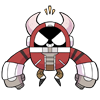
Epiphany part 1 / Kruger
Critiques & Comments
# 10
Posted:
Jan 29 2014, 07:36 PM

# 9
Posted:
Jan 28 2014, 12:30 PM
Ah, yes, agreeing with everyone. Good art, limp punch. I think that 'nooo' coming out flat is a lot more than just font choices though, it's also more than the art and expression, it's also the INTENTION; Upon first read, I did know he was sad for that band's break-up, but after that, read his bio and went 'ooooh, makes more sense.' Because you make it necessary to read the bio to understand the full impact of that moment, and I don't read bios. I shouldn't have to, everything should transpire directly in your comics, so that instead of reading this comic and thinking 'oh, some band he likes his breaking up', I understand 'oh SHIT, the band that CHANGED HIS LIFE is breaking up!' It's kind of an important distinction, dramatically.
# 8
Posted:
Jan 26 2014, 07:16 PM
UmbrellaFrog your art is so rad, it's a shame the font brought the comic down, definitely needed more impact like others have said. If you're having trouble with sound effects and louder noises how about hand-lettering them as part of the drawing instead next time? It's worth a shot. Kruger is such an interesting fellow and I look forward to seeing more of him 
# 7
Posted:
Jan 24 2014, 06:05 PM
gregly: its part 1 of 2 so it is incomplete. Most of the comments on my last battle recommended i make shorter comics and focus on completing them on time, so im trying to do that. I was able to finish this one before my self-imposed deadline, so its a step in the right direction.
kozispoon: this was done in three weeks tho. Having this quality in a week is my goal, but im not there yet. Also, do you have any advice on how to make them more compelling?
Monday & Animeshen: Its true i have been neglecting the fonts. I will give it more thought for the next one.
thanks for the comments and advice everyone

# 6
Posted:
Jan 23 2014, 06:46 PM
I think you could use for some better font choices but oh man your art kicks my ass! Kruger looks so devastated about that band breaking up, and i loved that leap over the barricade! I just wish it was longer, story wise it seems a bit lacking. I see that its a part 1 so hopefully the rest comes soon!

# 5
Posted:
Jan 23 2014, 05:02 PM
That Noooooooooooo looks really feeble. And i
t was the FINAL knockout. Everything in your comic was building up to that moment and it was just
Noooooooooooo. Respect your word art dawg. I needed some real LOUDNESS in that frame.
Good art though, good quality.
t was the FINAL knockout. Everything in your comic was building up to that moment and it was just
Noooooooooooo. Respect your word art dawg. I needed some real LOUDNESS in that frame.
Good art though, good quality.

# 4
Posted:
Jan 23 2014, 12:56 PM
Ugh, I really love your art, but your storytelling leaves me wanting (just like Julz said!) Your stories, admittedly resolve themselves pretty neatly, but to be perfectly honest they aren't that compelling. That kills me because your fighter and artwork really pack a punch when you apply yourself and turn in a completed work like this. Also, kudos for getting something out the door of this quality in only a week! I feel like you may of found your deadline sweet spot. Keep those rich blacks and sharp inks comin'!
Kruger is a cool cat, but I feel thus far as a reader I haven't really gotten a chance to get to know him and what he can do (well, besides eating sandwiches near holes in the ground XD). Lets see some character development!
Kruger is a cool cat, but I feel thus far as a reader I haven't really gotten a chance to get to know him and what he can do (well, besides eating sandwiches near holes in the ground XD). Lets see some character development!

# 3
Posted:
Jan 23 2014, 12:14 PM
I am left wanting D:
# 2
Posted:
Jan 23 2014, 09:19 AM
Seems... incomplete? but man those are some great looking pages! Way to use those blacks effectively!

# 1
Posted:
Jan 22 2014, 08:30 PM
Yayyy! Can't wait for this!
Comic Details

Beyond Battle
Drawing Time:
1 week
Ended:
Jan 29th, 2014
Votes Cast:
22
Page Views:
1311
Add to Playlist
Newest Comments

einsam
Colbitzer
@ 3:32 PM Apr 17th

Birthright
Saal, Louise Ambre-Aliona, and Llaana
@ 3:44 PM Apr 16th
Help Needed
Theakon
@ 2:19 PM Apr 16th

The Great Switcheroo
Louise Ambre-Aliona vs. Luniel Gekka
@ 3:26 AM Apr 15th
The Great Switcheroo
Colbitzer vs. Veruca Chance
@ 5:22 PM Apr 14th
Newest Characters


Open Challenges
Random Comic


Most Wanted


Latest Topics
| ||
| ||
| ||
| ||
|

Latest Members
Users online
422 Guests, 0 Users
Most Online Today: 580.
Most Online Ever: 1,184 (Jan 13, 2020, 06:21 PM)
Artist
Your linework is clean and I like that. Your anatomy is mostly spot on--but there's something off about the singer's arm/hand when he reaches out with the mic on page 2. The wrist, especially. I like when you have scenes in motion--the top of the last page especially, and page 3 when Kruger jumps the fence. Maybe add more shades to make the art feel more fleshed out.
Great job! Looking forward to Part 2!